
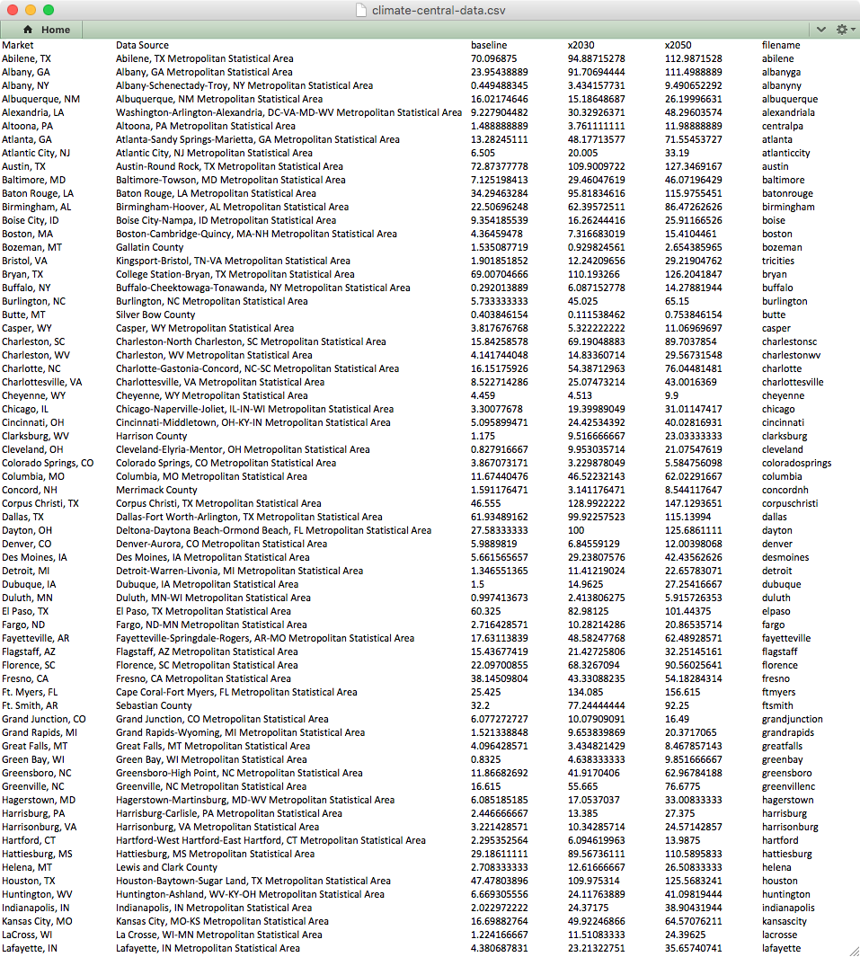
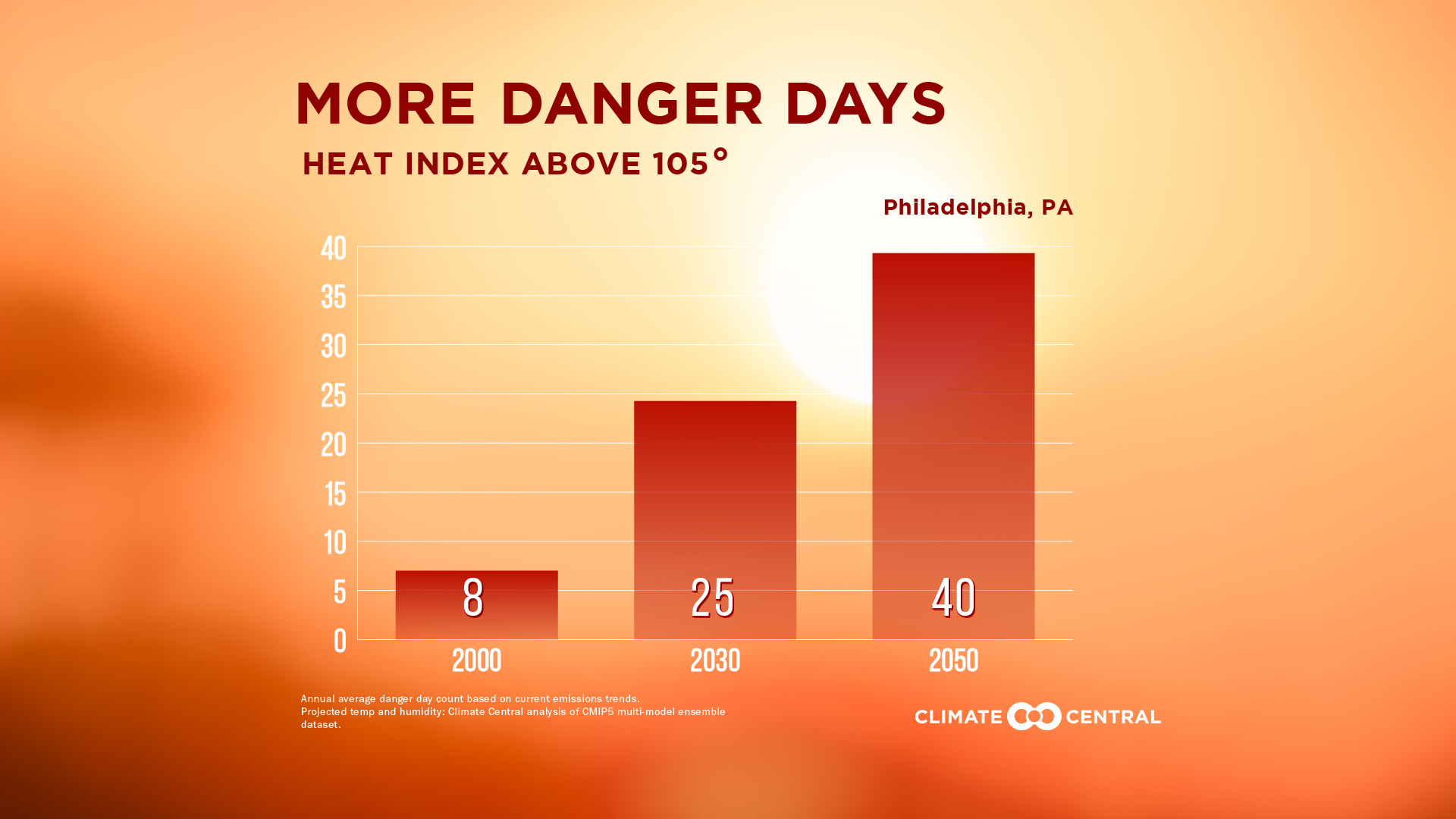
Climate Central's "Danger Days" is a series of data visualizations that display predictions of rising temperatures across 133 American cities. With CC, Radish Lab designed and created the visualizations, developing an automated system to simplify the process. For each city we had the current number of dangerously hot days per year, as well as the predicted numbers for 2030 and 2050.
According to the model, numbers are significantly rising for most cities. We needed to take those figures and show them in an impactful way, making them easy to comprehend and compare. The real challenge was that we needed to do it for all 133 cities.
A simple bar chart would do the trick, but to update such a chart for each city would take way too long. Luckily, Adobe Illustrator, although not primarily a data-centric application, does allow some nifty tricks for dynamically editing images, text, and graphs based on imported data. It also lets you automate tasks to simplify exporting data sets as separate files.
Here's a run through of how we did it.
Cleaning the Raw Data
As with any good data visualization, one of the first steps is assessing and cleaning the data you have.
We used Excel formulas to combine text from multiple columns, round numbers, and used the "Paste Special" command to remove the underlying formula for those columns. Then, we created a column for the Data Set Name which would become our filename, using another Excel formula to combine text with a prefix and suffix. Data Sets must have different names in Illustrator, which was fine with us because so must filenames.
Formatting Data for Use
The next step was the tricky part and does require a bit of coding know-how.
We created a simple bar chart in Illustrator with three vertical bars. Next, we selected the entire graph and in the Variable palette window, clicked on the Make Graph Dynamic icon in the lower left and named the variable. Then we clicked the Capture Data Set button (camera icon) in the Variable palette and chose Save Variable Library from the Variable palette dropdown menu.
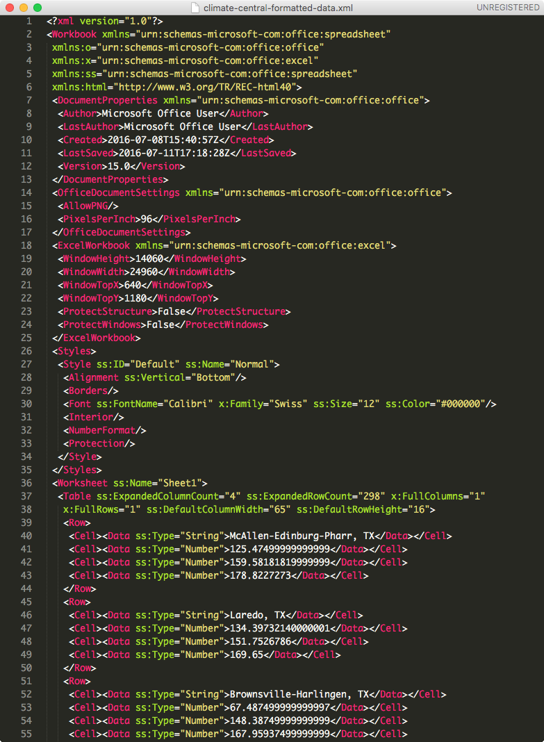
The library is exported as a data format known as XML. Illustrator has it's own XML format that it requires for linking any data up with a graph. So, our plan was to use that XML file as a template for converting our existing data into the correct structure.
The good news is that Excel actually allows you use an external XML file as a schema for mapping data from a spreadsheet. Here's a video of how to do that on a Windows machine, and an explainer. The bad news for us however was that Microsoft Office for Mac 2011 doesn't offer this option.
So, we had to employ a workaround. First, we copied the data from Excel to a TextEdit document formatted for plain text to get rid of any underlying formulas or formatting that might cause trouble (always a good habit). Then, we converted the comma separated text to XML using this handy web app. Lastly, we opened the XML file exported from Illustrator and dropped our newly converted code in the appropriate place.
Visualizing and Styling
In Illustrator, you can change some visual characteristics of a graph by control-clicking on it and choosing Design. This way, we made the horizontal tick marks full-width and specified other formatting attributes of our X and Y axes. We also added the gradient to our bars here and set their width and distance from each other.
Styling a graph this way does have its limits though so, next we needed to select individual elements manually. However, if you ungroup a graph object in Illustrator, you lose the ability to update that graph with data. It essentially becomes just another collection of shapes.
So, we had to keep our graph grouped as a "graph object" and use the Direct Selection Tool (white arrow icon) to target any element we wanted to style. In our case, we wanted to give the axes and tick marks a white stroke.
Using the Group Direct Selection Tool (white arrow with plus sign), you can click two or three times on an element to select grouped elements, for example all the bars of a particular color in a bar graph. Be careful what you're selecting here. Elements in a graph object are nested in multiple groups and can be tricky to isolate. Make sure you're targeting what you intend to target.
Styling a graph in Illustrator can be tricky but there are some good resources out there to help you. Here's one of the more thorough tutorials. And here's Illustrator's documentation on using graphs.
Just remember, you want to finalize the design and the data before you start automating anything, so customize the look completely before proceeding.
Dynamically Automating the Variables
In addition to Illustrator's own overview of using variables to dynamically update elements, this video is one of the best general explainers.
The Narrator goes over linking up objects and text with an XML file as well as creating an action for saving your file in the desired format and applying that action to batch process by data sets. In other words, you can individually save all your newly generated elements in a single step. This is the XML converter he uses, quite handy for updating text and images, as he did.
The video doesn't cover graphs specifically, but we used the same basic process and applied it to a graph object with each bar dynamically connected to a different variable in our XML code.
First, we imported our updated XML file in Illustrator by choosing Load Variable Library from the Variable palette dropdown. The graph may not change at first, but you can confirm it worked by choosing any of the newly created graphs from the Data Set dropdown at the top of the palette.
When cycling, you may get the following error:
"The current values have not been captured, and will be discarded upon switching data sets. proceed?"
Don't worry too much about that. Click "Yes" and continue cycling in the same direction and that error won't display. It's basically saying this new state of things has not been saved as a data set, so before moving on to another data set, you should capture it. But the graph you're viewing actually does exist already as a data set, just not one created manually in Illustrator. Regardless, you're newly loaded data sets and their variables should work just fine.
Automating Export
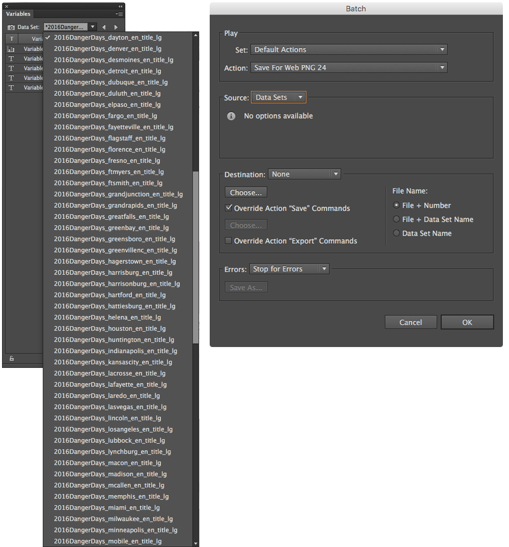
The last step was to convert all those separate data sets into separate files. Once again, we were going to automate the process.
First, we recorded a save action. From the Actions palette, we created a new action, named it, and hit record. Then, we saved the file with our desired settings, location, and file format. We ended the recording, being sure to turn off the dialogue box (second column from the left) in the Actions palette. This tells Illustrator to process each Save Dialog Box with the default setting used originally and not pause with each dialog box.
Then we wanted to use that action to batch process all the data sets. From the Actions palette dropdown menu, we selected Batch… and chose the action we just made. We set the Source to Data Sets and checked "Override Action 'Save' Commands."
With that, our 133 files were auto-generated and ready to deliver to Climate Central.
One parting tip, you may not know this but newer Mac operating systems allow for batch renaming files so if you wanted to edit the names of a lot of files all at once, use this handy trick.
Check out Climate Central's excellent work and see what you can do with variable data sets in Illustrator. I hope this guide helps you level-up your skills and jump into data-driven infographics like a pro!