In the last few months I’ve been moving from using Adobe Creative Cloud (primarily Photoshop and Illustrator) to a relative newcomer, Sketch, for all UI/UX design at Radish Lab.
First, let me warn you that Sketch is only for Mac (sorry PC users) and it costs $99, but I recommend signing up for its 14-day free trial to give it a try. It must also be said that Adobe products are still essential for certain tasks. Photoshop reigns supreme over bitmap editing and Illustrator is still king when it comes to complex vector work. But Sketch borrows some useful conventions from both worlds, combining vectors with layer effects, all in a beautiful, intuitive workspace.
The thing to remember when diving in is that you can’t really do anything in this program that you wouldn’t be able to easily code or implement online. It embraces CSS logic and reflects a front-end coding mindset because it’s meant for the web and nothing else.
So here are some tips I’ve picked up along the way and ideas on how to get the most out of Sketch:
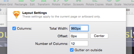
1. Think about development from the start. When setting up a Sketch file, use layout settings to maintain an underlying column grid. This will will help a lot when it’s time to start development. And for complex layers, export CSS attributes as part of your asset prep to take some of the guesswork and tedium out of the front-end setup.

2. Set up a type guide. I recommend creating a separate artboard first thing and keep an example of every text style in your document there to serve as a quick style guide and reference.
3. Learn to love layers. Use good naming conventions for your layers and organize them logically. That way you can use them to navigate your document and select elements quickly. It really helps when collaborating on a file with different team members—and oh the satisfaction of an immaculately labeled and nested layers palette!
4. Use layers to edit. Clicking your mouse within complex artboards becomes unwieldy and inefficient really fast, but if your layers are grouped and ordered well, it's so much easier to target an object by clicking on its layer. This is especially true when working with masks, which I think Sketch simplifies beautifully.
5. Edit in the inspector pane. I recommend doing most of your basic editing here to keep things precise. For example, vector anchors sometimes refuse to align to the grid. For some reason, lines have particular trouble with this. In such cases, just remember that you can manually set the anchors in that inspector pane. You can even do algebra in the field inspector!

6. Use the Color Picker. Sketch has an easy way to identify colors. Control + C will bring up the Color Picker, which will venture outside of Sketch and work anywhere on the screen, similar to Photoshop. If you want this feature as a stand-alone app, try Sip.
7. Symbols: to use or not to use. If you are using a consistent icon set or design pattern across the span of multiple artboards, shared styles and symbols are the only way to fly. But if your project is small and you want complete control over individual icons, steer clear of them.
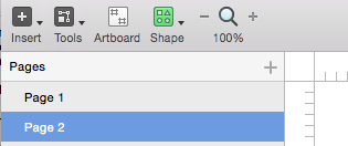
8. Use Pages for large projects. Sketch is meant to contain whole projects in a single file (just be careful of high res images that will increase file size.) Generally, a good setup will use pages for different screens and artboards within those pages as various screen states and iterations. You might even create a symbol for different UI elements or artboards themselves to quickly show the same screen in different states or different states overlaid on various pages.

9. Export with ease. Sketch is the master at exporting slices and preparing assets for development. To quickly export and collect all assets in a given document, go to: File > Export > All. Or create individual slices for export manually. I only wish Sketch allowed for exporting the code for all colors in a document, but I imagine a plugin for that is on its way.
10. Speaking of plugins. Always remember the Sketch refrain, "There's a plugin for that." Check out the resources section below on where to find the best ones. UI kits are also readily available for Sketch and are a lifesaver for wireframing.
I hope those help! And here’s a bonus tip: when searching for Sketch-related info, Google “Sketch App” for more focused search results. To finish up, here are some of the best resources I’ve come across so far to help you master this killer app:
1. Official Sketch documentation: bohemiancoding.com/sketch/support/documentation
2. One-stop shop for all things Sketch: sketchappsources.com
3. Specific tips—concise, clever and insightful: sketchtips.info
4. The plugin manager for Sketch: sketchtoolbox.com
5. Useful compendium of collected Sketch resources: heydesigner.com/sketchapp
6. Integrating Sketch with Marvel for prototyping: marvelapp.com/prototype-with-sketch