For nonprofit websites, user-friendly navigation is essential to convey your organization’s impact, facilitate resource access, and encourage community engagement. Well-structured and thoughtful navigation ensures that users can easily find what they’re looking for, explore based on their interests, or take action. Your navigation is the roadmap that guides users through what you do, what you offer, and how to engage with you. There is no one-size-fits all approach to tackling website navigation, but there are a few solutions that apply to most every one of our clients.
From Sprawling to Concise
California Certified Organic Farmers
Web Design and Development | Environment
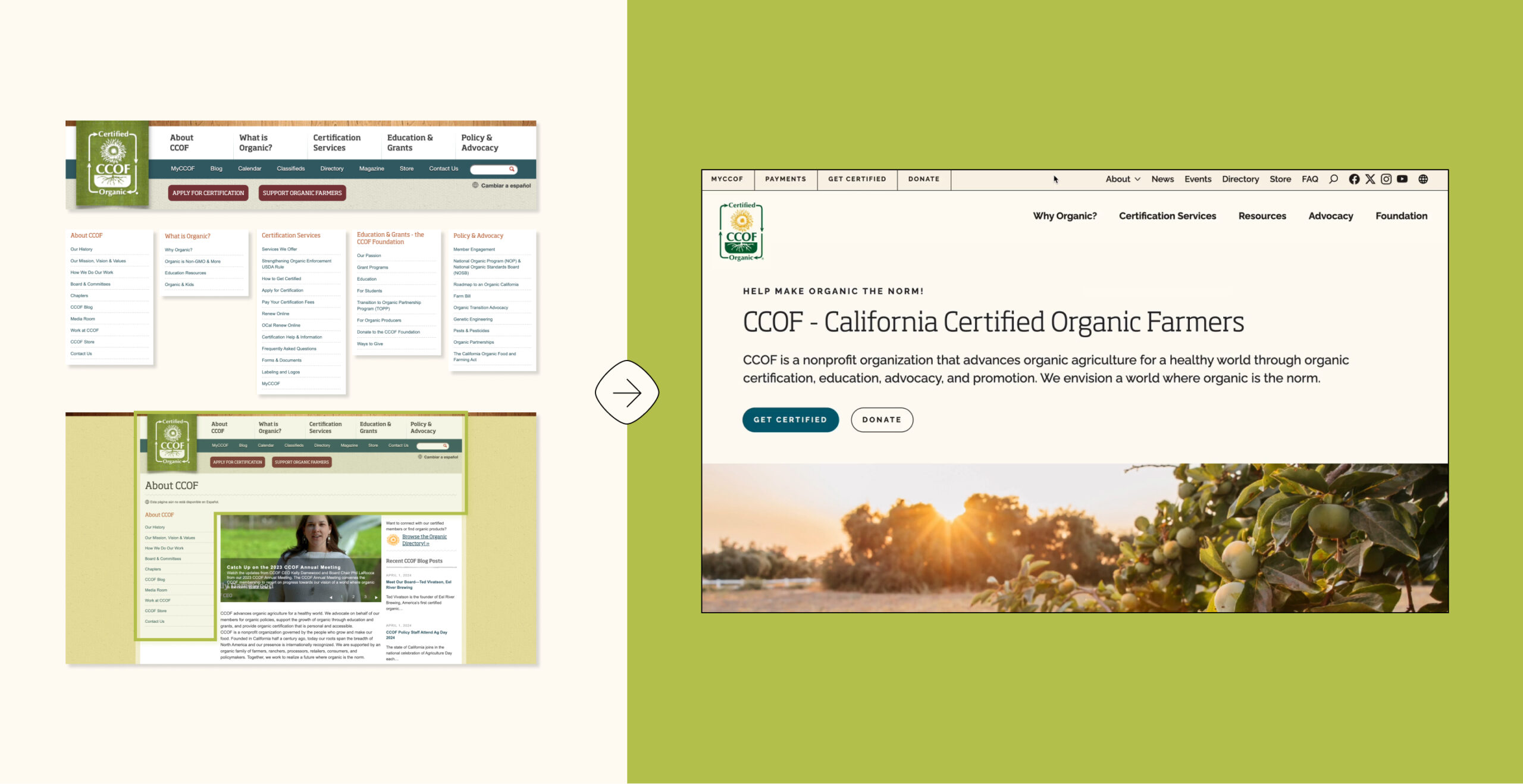
When California Certified Organic Farmers (CCOF) came to Radish to overhaul their website, they were grappling with a sprawling experience: 11,400 pages according to our initial data pull. The sheer scale of the current website made it crucial for Radish to understand their primary audiences, and to distill from the CCOF team’s insights what content was essential, what was removable, and what could be consolidated. To make the site easier to navigate, we needed to reexamine their information architecture with a critical eye.
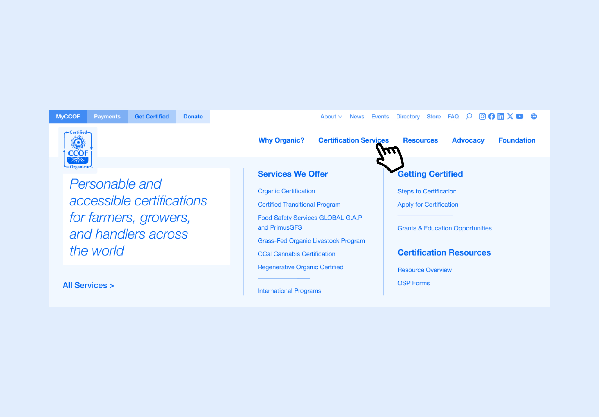
Given the number of one-click key actions their established users rely on, we opted for a robust top navigation rather than a megamenu experience. We eliminated the previous site’s nested navigation and consolidated one-off pages into the main menu’s dropdowns to make information more accessible. Some highlights:
- Critical actions for members, such as the MyCCOF portal and Payments, are kept in a dedicated utility navigation.
- The main navigation starts by addressing food producers considering organic certification, with sections like ‘Why Organic’ and ‘Certification Services’ outlining benefits and offerings.
- The ‘Foundation’ section consolidates all foundation-related information for usability among the foundation audience and for legal purposes since CCOF is actually three separate entities.
- The ‘Resources’ dropdown breaks resources into three sections organized by user: Client Resources, Consumer Resources, and Grants & Education Resources.
Learn more about how we tackled their new site here | View the live site
Minimalism at its Best
For some of our clients, the less-is-more approach to site structure and navigation is the best path forward. When audiences are distinct and clearly defined, the size of the site is small, or content is easily segmented into manageable bites, simple top-level navigations are often the best solution.
Denver Preschool Program
Web Design and Development | Education
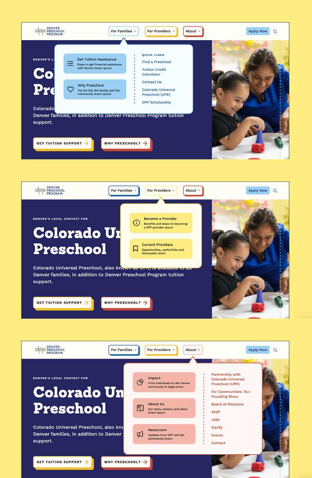
For the Denver Preschool Program (DPP), the minimalist approach to site structure and navigation was the perfect fit. The pre-Radish navigation was cluttered and redundant, attempting to surface too many actions at the top level and utilizing unexplained acronyms and unfamiliar terms. Families, caregivers, and providers needed clearer paths to the information curated specifically for them.
The new navigation is lean and clean, sorting the DPP experience into three sections: For Families, For Providers, and About DPP. By naming two of the dropdowns directly after their intended audiences, we ensured users know exactly where to click to find information relevant to them. We moved contact information and social icons to the footer, removing clutter around the “Apply Now” action so users are always able to quickly enter the application process.
Analytics showed that more than half of users come to DPP’s site from their phones. The simplicity of the new navigation and page structure had the added benefit of allowing for a seamless translation to smaller screens.
Learn more about how we tackled their new site here | View the live site
Two Sides of One Experience
Occasionally, clients come to us with specific navigation needs that require radical solutions. When organizations grow in multiple directions – dispersing information across domains – consolidation is not always the answer. Informed by the right data and reasoning, Radish sometimes builds sites with dual navigation, creating one website with two parallel experiences tailored to user needs and content.
Scratch
Web Design and Development | Human Rights
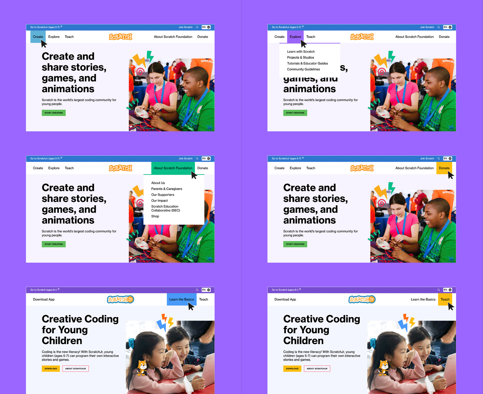
Scratch, one of the world’s leading coding education platforms for kids, has seen exceptional growth since their beginnings as a graduate student project at MIT. But their digital presence has developed in isolated microsites curated to speak to individual audiences or fill specific needs. A key goal of their project with Radish was to unite everything from their five websites in one experience , making it easier for users to access resources, answer questions, and make donations. During Discovery, we identified three key audience segments: Scratch Jr (parents and caregivers of 5-7 year olds and educators), Scratch (learners ages 8+, educators, parents and caregivers), and Scratch Foundation (partners, donors, and grantees).
We discovered through strategic conversations at the beginning of the project that – due to age restrictions and the fact it is still a downloadable app, not a web-based tool – we needed to treat Scratch Jr content differently than Scratch and Scratch Foundation content. The new experience still houses Scratch Jr, Scratch, and the Foundation under one domain in one easily manageable CMS, but the navigation splits: Scratch Jr is segmented out into the utility nav so when users navigate to that section of the experience a unique navigation streamlined to the younger demographic and app users takes over the primary navigation. Users can navigate back to the Scratch and Foundation content in the same way, where the primary navigation clearly segments information for Users, Parents/Caregivers, and Funders.
Learn more about how we tackled their new site here | View the live site
The Case for Mega Menus
A mega menu navigation can be an excellent choice for complex websites as it provides a comprehensive outline of the website’s content in a single view. By displaying multiple levels of site information simultaneously, mega menus allow users to quickly scan content and reduce the number of clicks needed to reach desired pages. For some clients who have few audiences , this makes a lot of sense because they have few audiences but each has a very specific user journey; for others with many key audiences with overlapping priorities, it allows the user to self-identify what is most important to them.
HLW Architecture
Web Design and Development | Sustainability
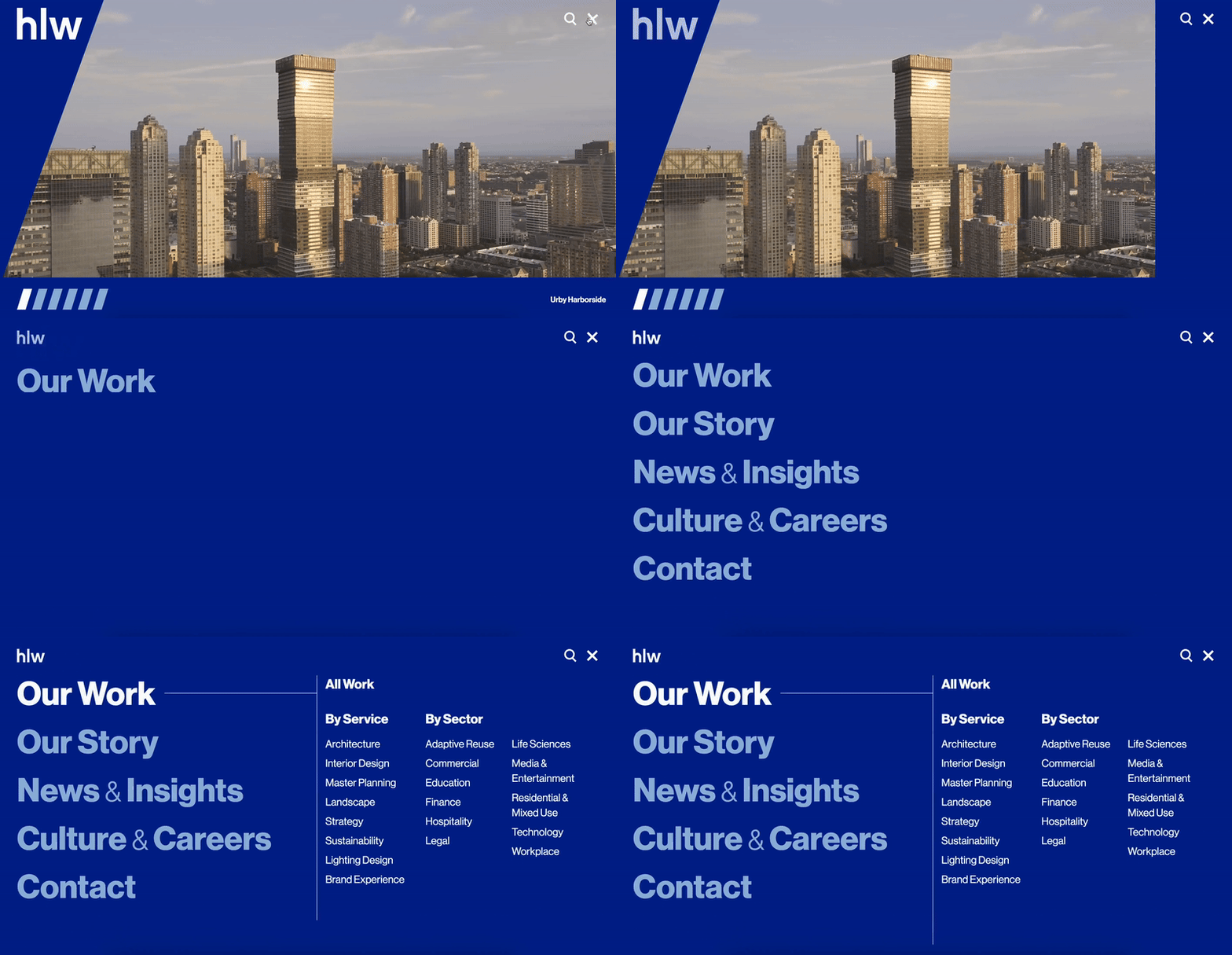
HLW envisioned a sleek, sophisticated, and elegant website to reflect their leading status and excellence in the architecture space. To maximize visual impact without sacrificing clear information architecture and organization, Radish utilized a mega menu approach to display all of the necessary information without cluttering the top of the page.
Through Discovery and strategic research, we found that users – including prospective clients – primarily engage with architecture firms’ websites through searches for specific services and sectors. By prioritizing “Our Work” as the mega menu’s default screen, we put those two distinct user paths front and center. . The “Our Work” section allows users to jump directly to pages about their services or sectors of interest rather than rummaging through case studies and other secondary-level pages. A key reason for embracing the mega menu approach for HLW was born out of the need for this particular screen: the full-width screen takeover layout provided space to showcase HLW’s full service and sector lists without feeling visually overwhelming as it would have in a hover state dropdown.
Through Discovery and strategic research, we found that users – including prospective clients – primarily engage with architecture firms’ websites through searches for specific services and sectors. So, a key reason for embracing the mega menu approach for HLW was born out of the need for a particular screen: a full-width screen takeover layout providing space to showcase HLW’s full service and sector lists to be showcased without feeling visually overwhelming as it would have in a hover state dropdown.
Learn more about our process | View the live site
New York Community Trust
Web Design and Development | Philanthropy
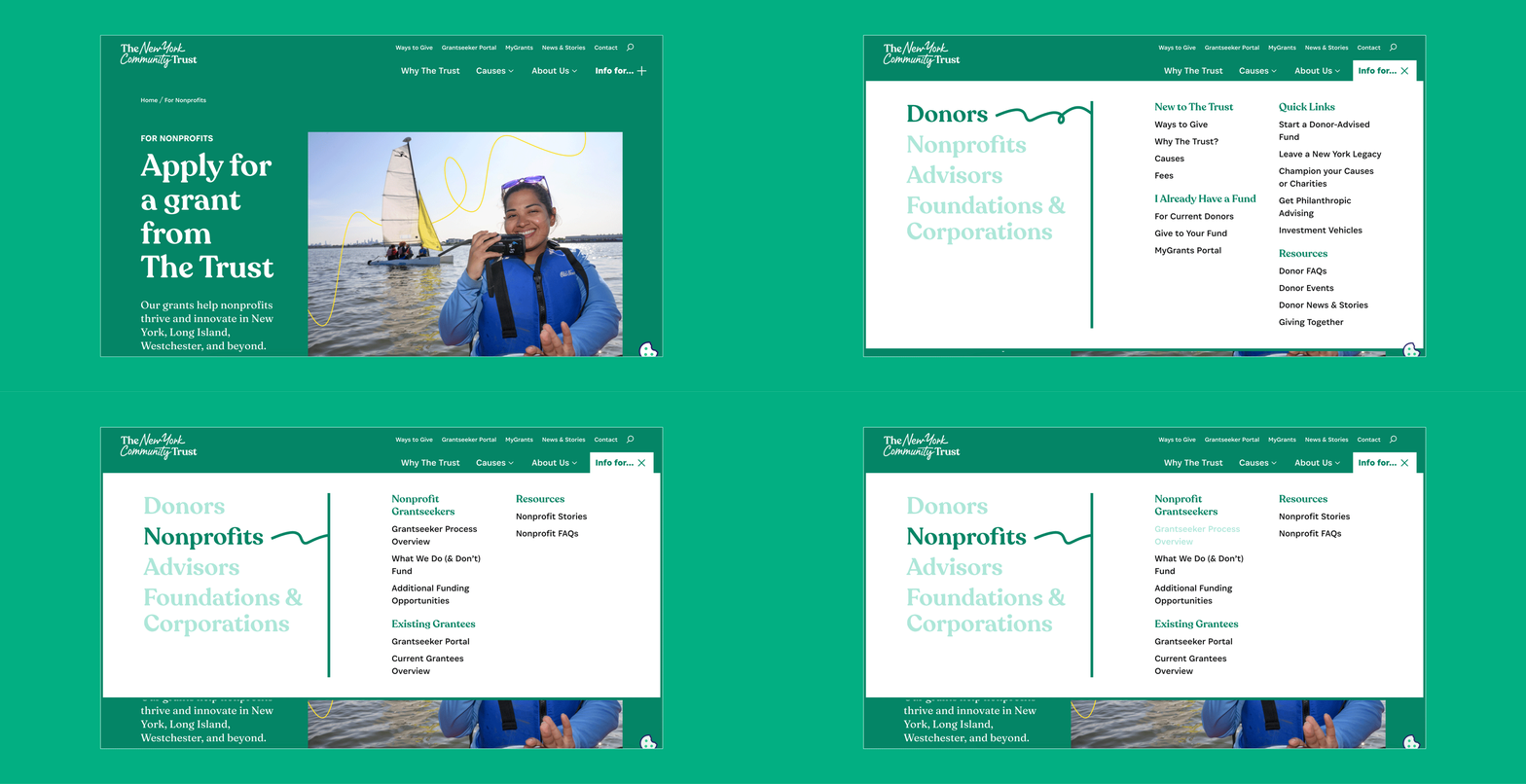
For the New York Community Trust (NYCT), Radish took a hybrid approach to their unique navigation challenges. NYCT’s vast range of audiences– prospective donors with no knowledge of how trusts work, experienced financial advisors, nonprofits seeking funding, region-specific users, and more – made prioritizing information in a streamlined navigation a challenge. Their existing site attempted to cover every audience within a layered navigation system, which resulted in a confusing and cluttered experience for all.
In the new site, a top-level navigation bar that helps users navigate universal New York Community Trust information combines with a mega menu that houses information segmented by audience, allowing for a best-of-both-worlds solution to their complex information architecture.
By clarifying language and reorganizing content, the new navigation system effectively addresses the distinct needs of each user group, streamlining their journey through the site and enhancing overall user experience. This tailored approach ensures that each audience can quickly find the information they need, whether it’s about trust operations, funding opportunities, or cause areas, ultimately supporting NYCT’s mission more effectively.
Learn more about our process | View the live site
