Everybody’s talking about data these days—how to get it, what to do with it, and how to decipher what it means.
Just about every organization has data of some kind that contains a good story. Even if it’s just the Google Analytics account you have running in the background on your organization’s website, it’s a good bet there’s some interesting information in there. And more importantly, a story.
Data’s overwhelming. If you squint at it, it’s nothing more than sheets and sheets of numbers. And, unless you’re one of those math people, it’s pretty hard to make sense of it all. The cool thing about data is that if you find a way to visualize it, it can be pretty transformative.
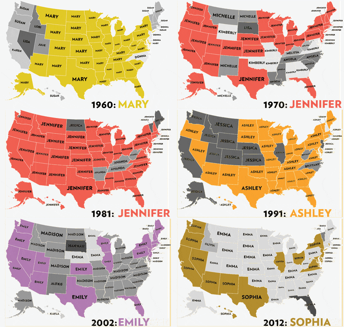
Here’s one of my favorite examples (borrowed from this post in the Atlantic):

This isn’t a fancy interactive visualization. It’s actually just a gif file that animates historic data about popular first names for baby girls across U.S. states. What I love about this is the irresistible story it tells—there’s history, nostalgia (it certainly takes me back to elementary school!), politics, pop-culture (Isabella became popular in 2008 when Twilight was in its heyday). The map uses public data from the Social Security Administration that is otherwise kind of a pain to sift through on their site. But when revealed in this way, it’s hard to stop watching the animation (over and over and over).
Using data to tell a story is trendy, but it can also have a lot of impact. Here are five questions we ask our clients when we’re diving deep into a data set and planning an interactive visualization.
- What’s the elevator pitch? If you had to sum up the data story in two minutes, what would it be? And better yet, if you had to sum it up in one sentence, how would you do that? I also like to call this the ‘dinner party take-away.’ What would you want someone to bring up about your data story at their next dinner party—something short, sweet, and smart.
- Could a 6th grader get it? Not all of it, but most of it. Could they grasp the key idea? The average literacy level in the U.S. is about 8th grade. The average literacy level online is around 6th grade. We’re not telling you to dumb down your data, but we are asking you if you can simplify and clarify. Even if you’re someone who has a couple of PhDs, chances are a clearer data visualization will be way more fun for you to digest than a complicated one.
- Is it intuitive? A couple of weeks ago, in a design meeting for a data visualization, we were trying to figure out how to help users understand that the units on a graph would be changing if a button was clicked. Someone suggested putting a pop-up with instructions in the experience. Needless to say, we didn’t go that route. If the goal is to create an intuitive data visualization story, it needs to be intuitive. Whether accomplished through design and interaction or through culling the data to make the story simpler, your end-product should be very straightforward. Look at the baby names map as an example. It doesn’t tell you how many girls were named Jessica in New York in 1977, or how close it was between Jessica and the second most popular name, but it doesn’t really matter in this case.
- Is your margin of error explained? Have you normalized any of your data? Have you omitted things to simplify the story? Are there factors you can’t account for but need to mention? Working with data means that accuracy is king. Even if the majority of our creative process centers around simplifying stories for data visualization, we work hard to make sure scientific accuracy isn’t compromised. Whether you include a link to the original data set, have a small disclaimer about any adjustments, or accompany the interactive with a contextual blog post, it’s important to cover your bases.
- Can you personalize it? Last summer, we produced this interactive. Part of its incredible success was the simplicity of the personalization of the data. With more than 1,000 cities in the data set, most major U.S. cities were included, meaning that most people using the interactive could have a personal experience. The baby girl map works the same way—everyone has a name, and everyone knows a Jessica or and Ashley or has a friend who named their baby Isabella. It feels personal, and humans like that.
Go forth and tackle your own data sets. If you don’t have one lying around, take a look at this great compilation of Awesome Public Datasets.