This blog is part of a three-part Design Accessibility for Nonprofit Brands series. Check out parts one and three: What is design accessibility for a nonprofit brand? and How to create accessible typography. Do you have a branding project in mind? We’d love to hear about it.
Whether you’re redesigning or revamping your organization’s visual identity, using accessibility guidance to inform your color palette selection is a must. For more information on what design accessibility is, check out: What is design accessibility for a nonprofit brand?
Here are some tips to keep in mind as you create your palette:
1. Accessibility guidelines for color palette
At Radish Lab, we always consider how a color palette will show up in digital spaces. When it comes to color accessibility, contrast is key; it’s a decisive factor in the readability of your content.
WCAG Level AA (accessibility guidelines for websites) sets standard ratios for the required color contrast between foreground and background elements in order to be accessible to individuals who have color vision deficiency (CVD), low-vision, or blindness.
Importantly, color accessibility is not subjective. A color combination either meets Level AA criteria, or it doesn’t. And conveniently, there are online tools (like Stark) that tell you whether a color combination passes or fails at the push of a button.
You want your brand to transition seamlessly between print and digital spaces. In order to do that, you need a distinctive, consistent color palette – which means considering accessibility at the early stages of creative direction is imperative.
2. What if your existing palette fails?
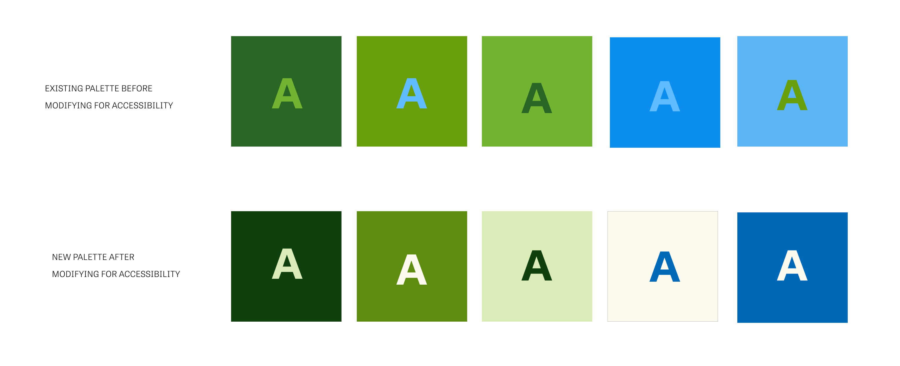
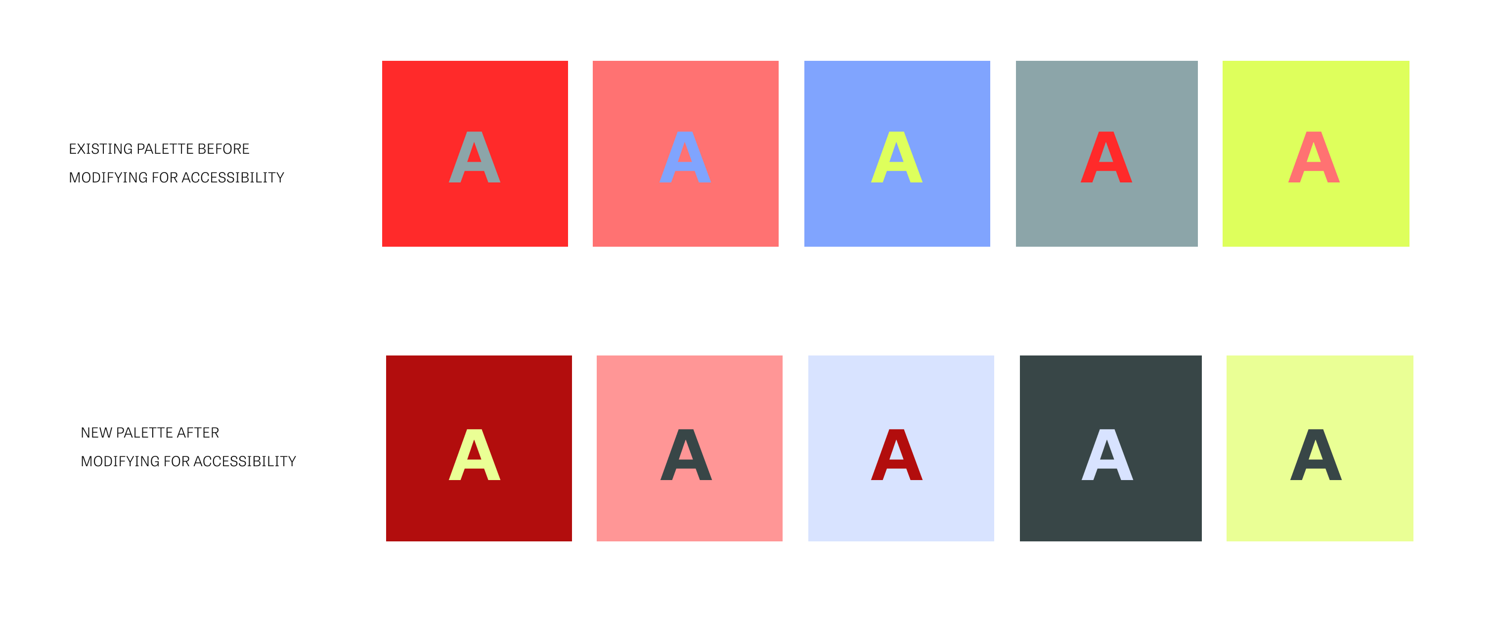
Sometimes, small shifts to your existing color palette can bump up contrast enough to satisfy accessibility requirements (make this blue a little darker, bring this green up a touch, etc.). The graphic below shows one brand’s colors before and after altering for accessibility – a relatively easy fix that keeps brand recognition intact.

In other cases, the adjustments necessary for a color palette to become accessible make a significant (even detrimental) difference to a visual identity, which reinforces the importance of designing for accessibility from the beginning of a branding process.

3. The bottom line: Always consider accessibility
Whether your organization is tweaking your existing brand or rebranding, accessibility should always be a consideration in the early stages of your project.
If you’re working with a creative agency, be sure to communicate that having an accessible color palette and typography is important to you (though a great creative agency will already have this in mind). You’ll not only dodge spending thousands of dollars for a brand that doesn’t work, but you’ll also avoid the need for changes to your brand that diminish recognition and dampen your impact.
Ready for next steps? Check out the next blog in our Design Accessibility for Nonprofit Brands series for more on how to create accessible typography.
