“How can my organization’s website be more inclusive of the LGBTQ+ community?”
Response by: Alexa Hassink, Director of Partnerships & Strategic Communications
Whether you’ve recently redesigned your website, or you’re considering a major overhaul, there’s something you can do to make your website more inclusive of the LGBTQ+ (Lesbian, Gay, Bisexual, Transgender, and Queer) community.
But, where to start? As an LGBTQ-managed creative agency specializing in website design and development, we have a few tips: Integrate images of LGBTQ+ people (and fill gaps in representation), publish your policy and healthcare commitments, remove unnecessary binaries in your language, and prioritize web accessibility.
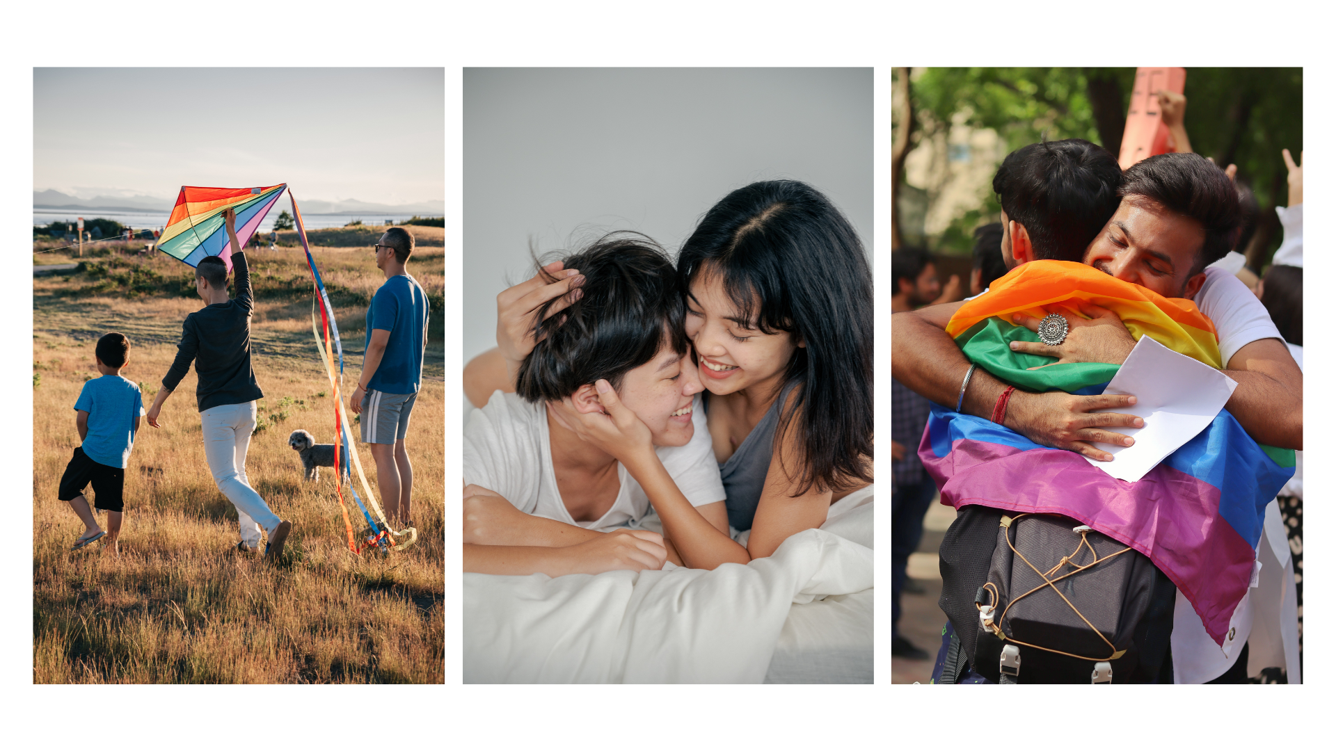
1. Feature images of LGBTQ+ people.
Simply put, there is just not enough representation of the LGBTQ+ community online. According to Visual GPS research from Getty and GLAAD, only one-fifth of respondents around the world said that they see LGBTQ+ people regularly represented. That’s not surprising, because, in the United States, for example, less than 1% of visuals include LGBTQ+ identities. LGBTQ+ people deserve to see ourselves represented on an individual level, and it may have broad sweeping correlations: The same study suggests that individuals living in countries which have less representation of the LGBTQ+ community report more experiencing more discrimination and bias.
Looking for inspiration on imagery you could add to your website? Getty images, in partnership with GLAAD, has put together a Best of the LGBTQ Collection. You can also check out these libraries of Editorial Images and LGBTQ+ Archival Content.

2. Fill representation gaps.
When LGBTQ+ identities are represented, those images can be narrow: The majority of visuals feature general lifestyle and leisure activities (72%), while many fewer feature business or professional settings (5%), school (1.06%) or travel (15%) — areas where LGBTQ+ people may experience discrimination. And, while people of color appear in more than half of LGBTQ+ visuals: People of Asian descent have low representation (8%), and interracial relationships with a white partner are most likely to feature a Black/African American person (58%). Furthermore, some stereotypes persist, and these representations can be narrow and at times, cliched: LGBTQ+ people tend to be overrepresented in relation to tragedy, casual discrimination, and as tokens.
Where is there space to expand? When you’re selecting images for your website, consider featuring: LGBTQ+ people at work, school, and traveling; people of Asian descent who identify as LGBTQ+, Black LGBTQ+ couples, Interracial LGBTQ+ couples where both partners are people of color, LGBTQ+ elders in everyday living scenarios, and trans, nonbinary or gender non-conforming people with diverse sexual orientations. Seek to show images that feature support and joy, queer culture, activism, total inclusion, and individuals reclaiming their cultural and/or Indigenous understandings of gender and sexuality.
3. Think beyond Pride month.
Pride month in June is an excellent time to highlight the LGBTQ+ community on your website: To make it clear that you stand for gay rights and to highlight the ways in which you serve the LGBTQ+ community. However, if you only bring this content forward during Pride (think: updating your logo to a rainbow), but don’t work toward LGBTQ+ inclusivity otherwise – you are in danger of “rainbow washing,” and reducing your credibility with LGBTQ+ individuals and supporters.
Consider how your organization authentically shows up for LGBTQ+ people. Explore if there’s a more permanent way to include that story on your website. Some ideas from SHRM: You could highlight pro-LGBTQ and pro-inclusion company policies and attitudes on your website (think: parental leave for adoptive parents), as well as mention health benefits relevant to the LGBTQ community (think: coverage related to fertility treatments, hormone therapy, surrogacy, and/or top surgery, etc.).
4. Make your language more inclusive.
It’s hard to feel welcome, or engage with content if the language on your website makes it clear that the work does not consider LGBTQ+ individuals. Use gender neutral language (e.g. individuals, adults, youth rather than ‘men and women’ or ‘boys’ and girls’), and inclusive language (e.g. all genders rather than both genders) when possible and accurate. Check your language against glossaries, guidance, and resources available online (for example, from: GLAAD, the ACLU, and HRC) to make sure that your word choices are up-to-date, as language evolves.
5. Prioritize web accessibility.
Accessibility in website design is always a priority; The LGBTQ+ community is significantly more likely than non-LGBTQ+ adults to self-report having at least one disability: 36% LGBTQ+ adults self-reported having a disability, compared with 24% of non-LGBTQ+ adults; and more than half (52%) of transgender adults self-reported a disability, According to the Human Rights Campaign Foundation analysis of a nationally representative US survey.
Check out our blog on design accessibility, tips for an accessible color palette and typography for advice on how you can make your website and brand more accessible. There are many guidelines available to help ensure your website is accessible. At Radish Lab, we look to the WCAG (Web Content Accessibility Guidelines) Level A+AA guidelines, which offer testable standards to ensure that web content is accessible to people with disabilities, ensuring that content is perceivable, understandable, operable, and robust.
This is not an exhaustive list, but hopefully it can help you as you plan for a more inclusive web presence. You can also check out our post Making Sure All Voices are Heard in a Website Redesign for tips on how to make your website discovery phase a more inclusive process.
Check out our profile here. Want to get in touch? We’d love to hear from you.
