The Women’s Refugee Commission (WRC) is a non-profit organization focused on building a better, safer world for refugee women and children displaced by crisis.
The WRC wanted messaging that resonates beyond the halls of the UN and to raise awareness to secure essential funds. But their digital experience at the time wasn’t doing either.
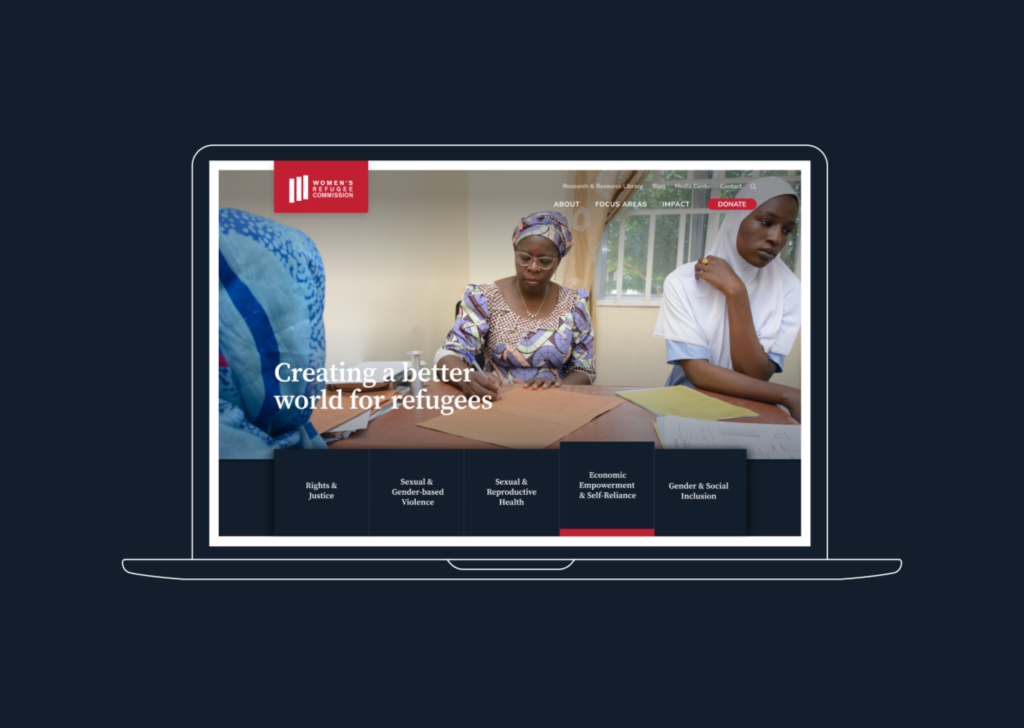
The WRC needed a website that was intuitive and easy to use. The language had to be universal. With clearer information, people could easily learn about and support their fundraising efforts.
With a bold new strategy, their website now rallies support through the following.
We needed to develop a deep understanding of how WRC had changed as an organization since the launch of their existing website.
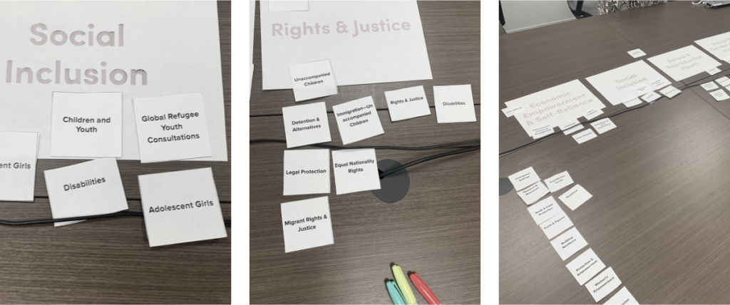
Diving deep into a discovery process spanning ~4 months, we gained a solid understanding of the diverse perspectives, opinions, and goals of program directors and staff.
It was essential to hear their voices.
By building these close connections, we were able to produce a messaging architecture in sync with their humanitarian goals. And visual messaging that had an impact while being sensitive to the subject nature.
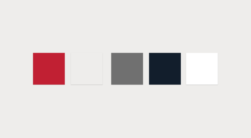
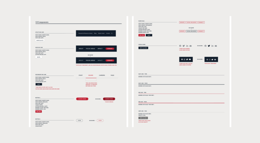
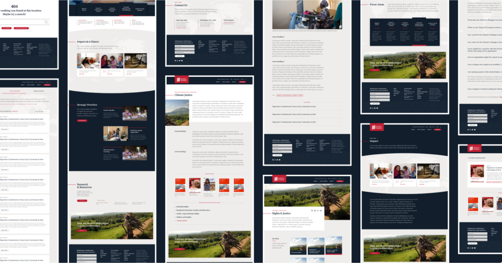
We restructured their color palette, shifting their signature red from a foundational color to a highlight. Neutral grey and charcoal tones were introduced to create balance. Now their brand color provides a distinct accent while preserving brand equity.
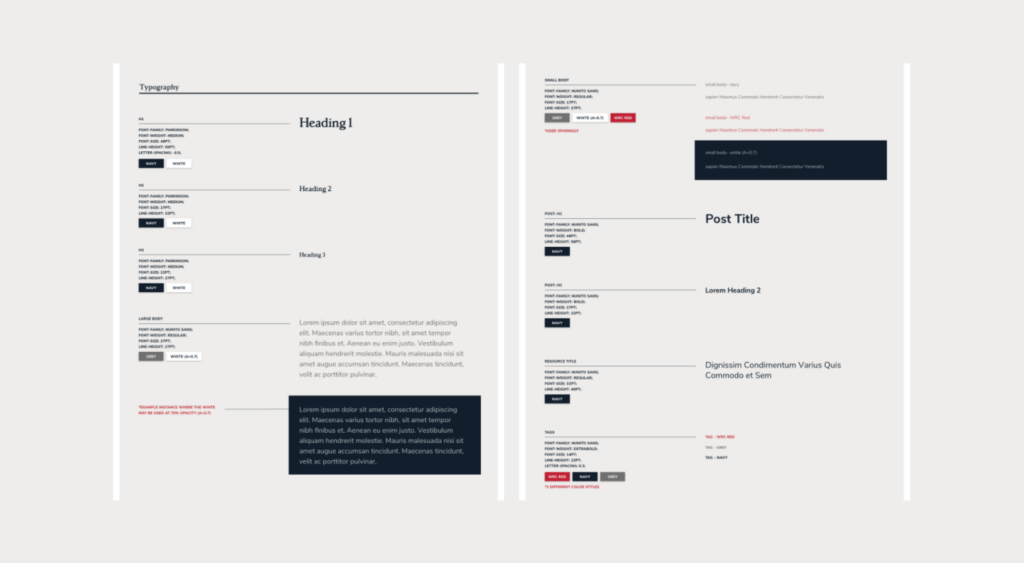
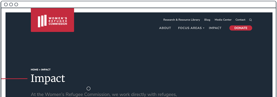
Nuanced typography was introduced, with a serif font used for impactful headers.
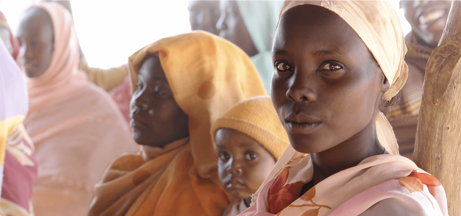
Images are core to visual messaging, but they have to be picked thoughtfully. We selected photos that elevated and brought dignity to the people photographed.
To make their website user-friendly, it needed restructuring and reorganizing. There was no clear navigation or page hierarchy, causing users to leave the website before getting to know what the WRC was about. We started by migrating their old website from Joomla to WordPress.
With the move, we were able to build a better URL taxonomy and categorize pages in a way that made it much easier for users to find relevant pages and take action.
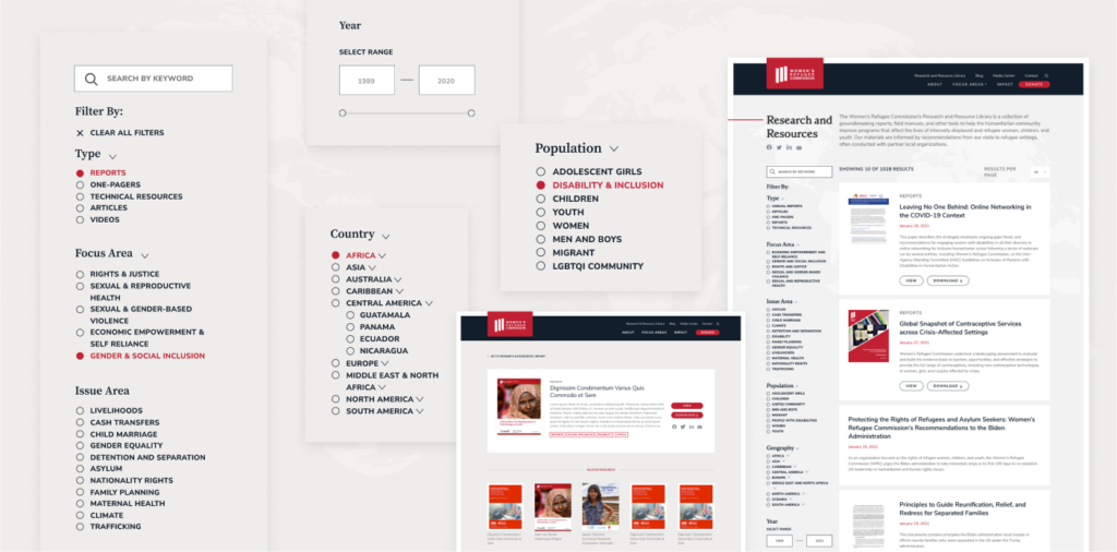
We worked with the WRC team to inventory and audit decades of materials. Publications and reports, toolkits, presentations and more were reorganized, retagged, and migrated into a format that allowed users to view this large body of work while also being able to quickly access specific and related resources of interest.
The WRC have been happy to keep us onboard to track analytics and fine-tune pages to optimize performance. We also converted their “I’m Here” training course into a web package for users to receive training while self-isolating due to COVID-19.
It has been a joy working with Noelle and the wider Radish Labs team to bring our renovated websites to life! The team worked with us through every step of the process, from design accessibility, to site maps, to ensuring a fluid user experience for each of our audiences.
It’s always a joy to work with Radish on brand and web strategy projects. Their enthusiasm and commitment to our mission shines through in the final product. We couldn’t be happier with our new site!
Radish Lab’s research-led approach to refreshing our visual identity made all the difference and meant that this process could impact much more than our brand visuals. It has truly been transformative.
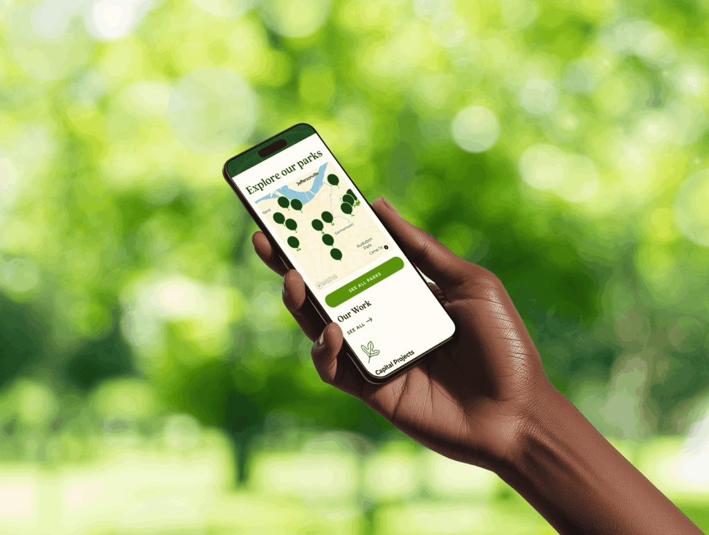
"Radish Lab’s strategy enabled us to grow from simply showcasing our identity to engaging park users online. The team analyzed data about park users and built an inclusive, focused user experience that will inspire support for our Olmsted Park System."
Radish Lab has been a trusted partner in helping us reimagine a new digital home and approach for engaging our partners and audiences in the story of the Foundation’s work and impact.
"We are so proud of and grateful for our collaboration with Radish Lab on Wings' brand refresh and website overhaul project. From day one, the Radishes approached this project with extreme care, compassion, creativity, and reverence for the needs of adult survivors of childhood sexual abuse.
They brought what is intrinsic in their DNA as a company to this effort, which fully aligned with all aspects of trauma informed care – and partnered with us to achieve a beautiful, resilient, impactful outcome. This project exceeded our expectations and sets Wings on a powerful trajectory going forward."
"We have had the pleasure of working with Radish Lab for several years now, and they have become a trusted partner and close collaborator of ours. They guided our rebrand process with creativity and have consistently exceeded our expectations with their high-quality work.
The Radish team demonstrates a deep understanding and dedication to our mission and goals, which shines through in the products they create for us. They are an invaluable partner in our work."
Our monthly search meetings with Radish allow us to take a step back, think big picture and move beyond what’s up, what’s down to focus on true goals and objectives.
For us, Radish’s biggest strength is their strategic advice. [...] They don’t just dive in to make something look nice. They force you to think about audiences, purpose, usability – and for that we are very grateful.
The site is beautiful and functions so well. We are very excited to share this product with our partners and have a site that demonstrates how we are evolving and expanding our work. [...] You have made this experience so seamless, painless, and enjoyable for us.
What was really impressive was their willingness to stand behind their creative vision, which is really what we were paying them for. They did more than offer technical expertise or put up a website; they gave us guidance on how to best demonstrate our strengths to the world.
They foster good communication and make sure both teams are on the same page. Their support makes it much easier for us to make informed decisions.
Their exceptional communicative style made this project run more smoothly than I've experienced with other vendors; they were open, honest, and clear, which are incredibly beneficial to the successful execution of a project.
Radish Lab takes an amazing, holistic approach to client work. They were extremely adept at helping us develop our vision for the site, keeping to our established schedule, and finding creative solutions for any obstacles that arose. They are highly talented, motivated, and exceptionally personable.