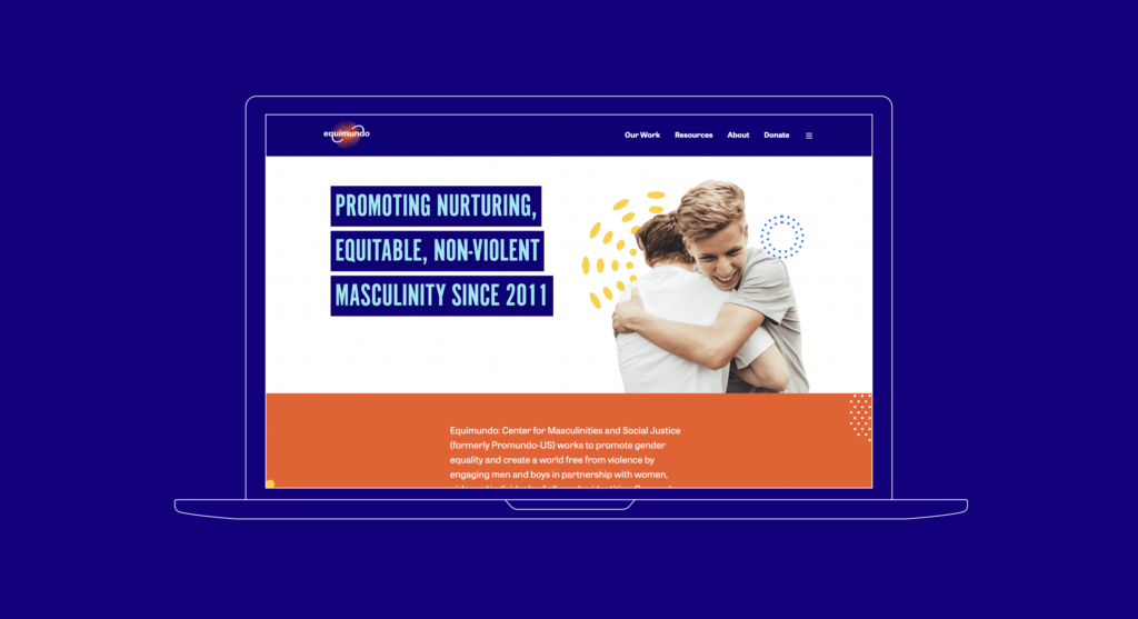
Gathering data, to inform the organization’s new, external face.
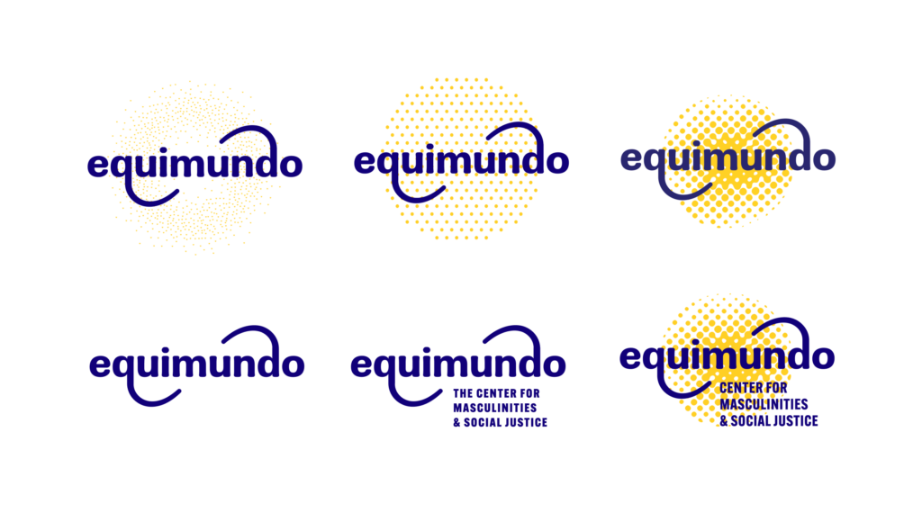
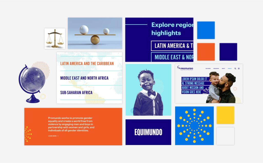
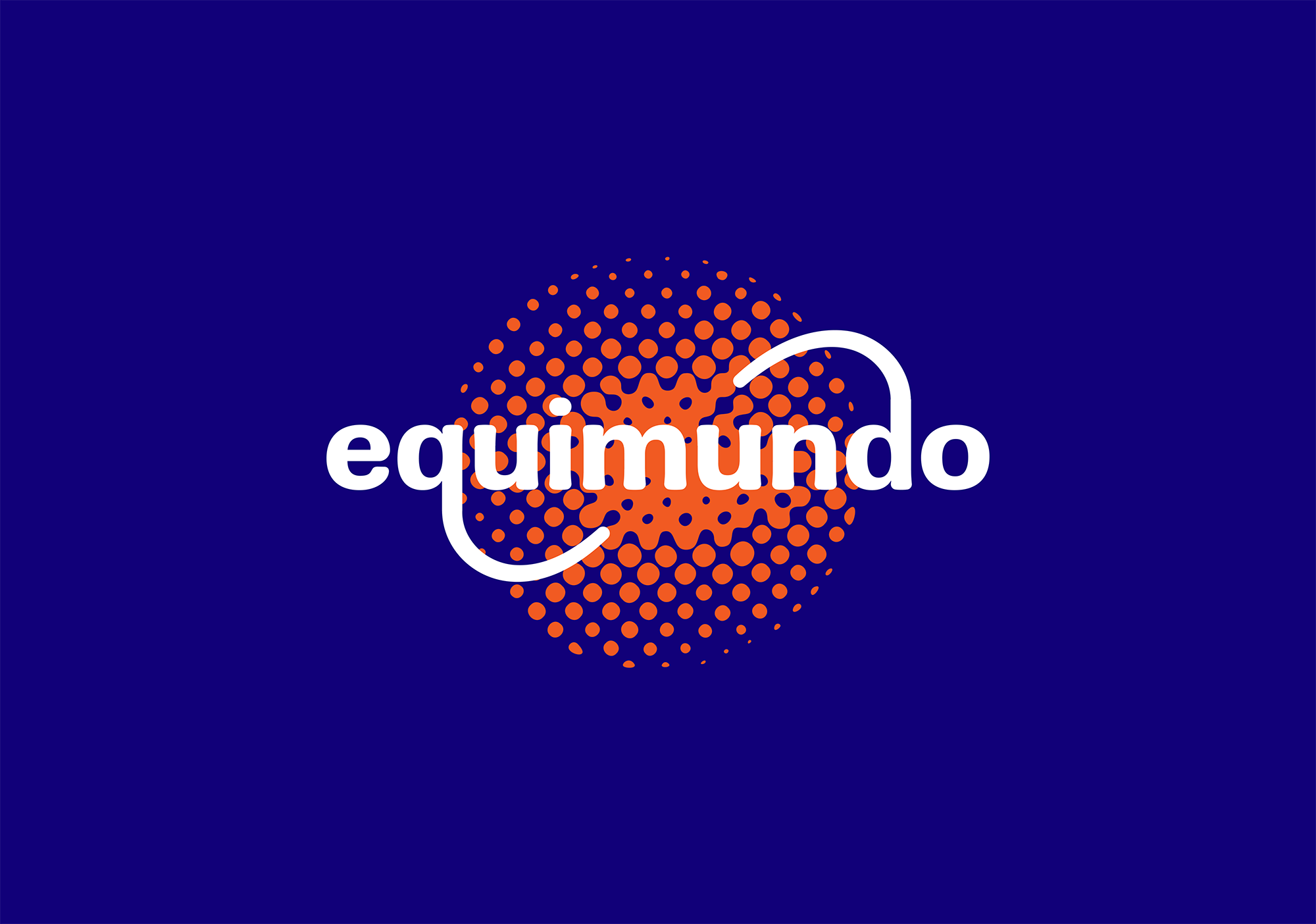
To complement Equimundo’s new name, they needed a logo that would represent the core of the organization’s work and values: representing their focus on gender and equality, as well as their global impact. The logo needed to be comparable to similar organizations, while also being distinctive, memorable, and clear.
Through a brand audit, and qualitative research with the organization, we identified attributes that would frame our logo design: it should feel international, cross-cultural, human-centered, bold, and clear.
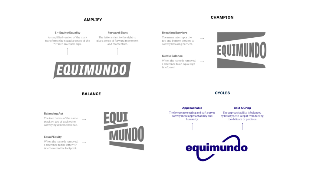
With all of our research, and design inspiration in hand, we began exploring four different concepts, each emphasizing a crucial part of Equimundo’s work. These concepts were named: Amplify, Champion, Balance, and Cycles: