The Nonprofit Association of Oregon

Nonprofit Association of Oregon Brand

An Ode to Oregon

The Nonprofit Association of Oregon (NAO), a statewide nonprofit membership organization representing and supporting charitable nonprofits of all sizes, geographic locations and missions across Oregon, reached out to Radish Lab to overhaul their branding in tandem with a new website. The existing brand identity no longer felt tied to their work, and had major accessibility concerns. Their goal was to have a new brand that represented the power behind the organization and the resources it provides to the nonprofit community in Oregon. The NAO team jumped in head first to the rebrand process, starting from zero to ensure the new visual identity reflected who they are now with room to grow as they grow.
  
NAO and the Radish Lab team determined a few key guardrails to keep in mind throughout the project: the brand needed to reflect the diversity of their members, be sustainable and easy for their small team to maintain, and, as always, comply with WCAG AA standards. Guided by NAO’s goals and learnings from our Discovery sessions for their new website, Radish set out to build a new brand for NAO that captured their role as a cornerstone of Oregon’s nonprofit community.

Virtual Collaboration and Stakeholder Engagement

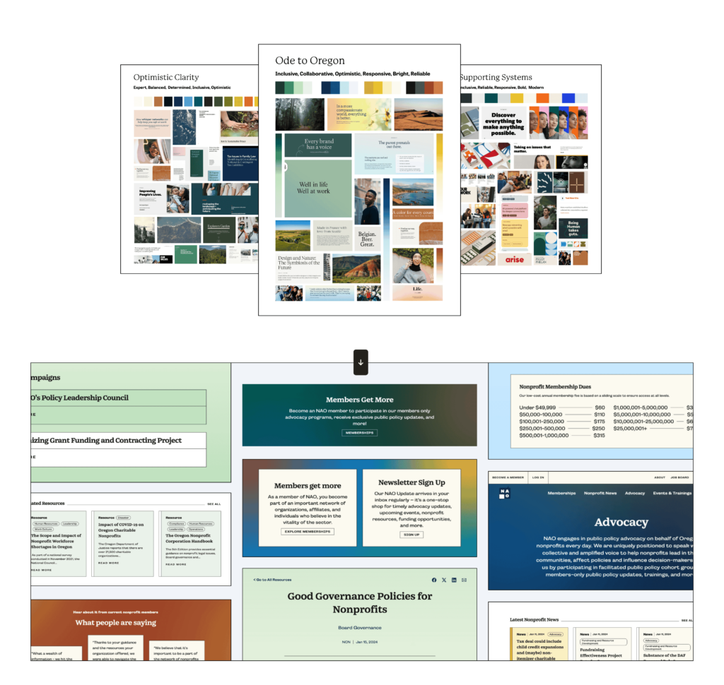
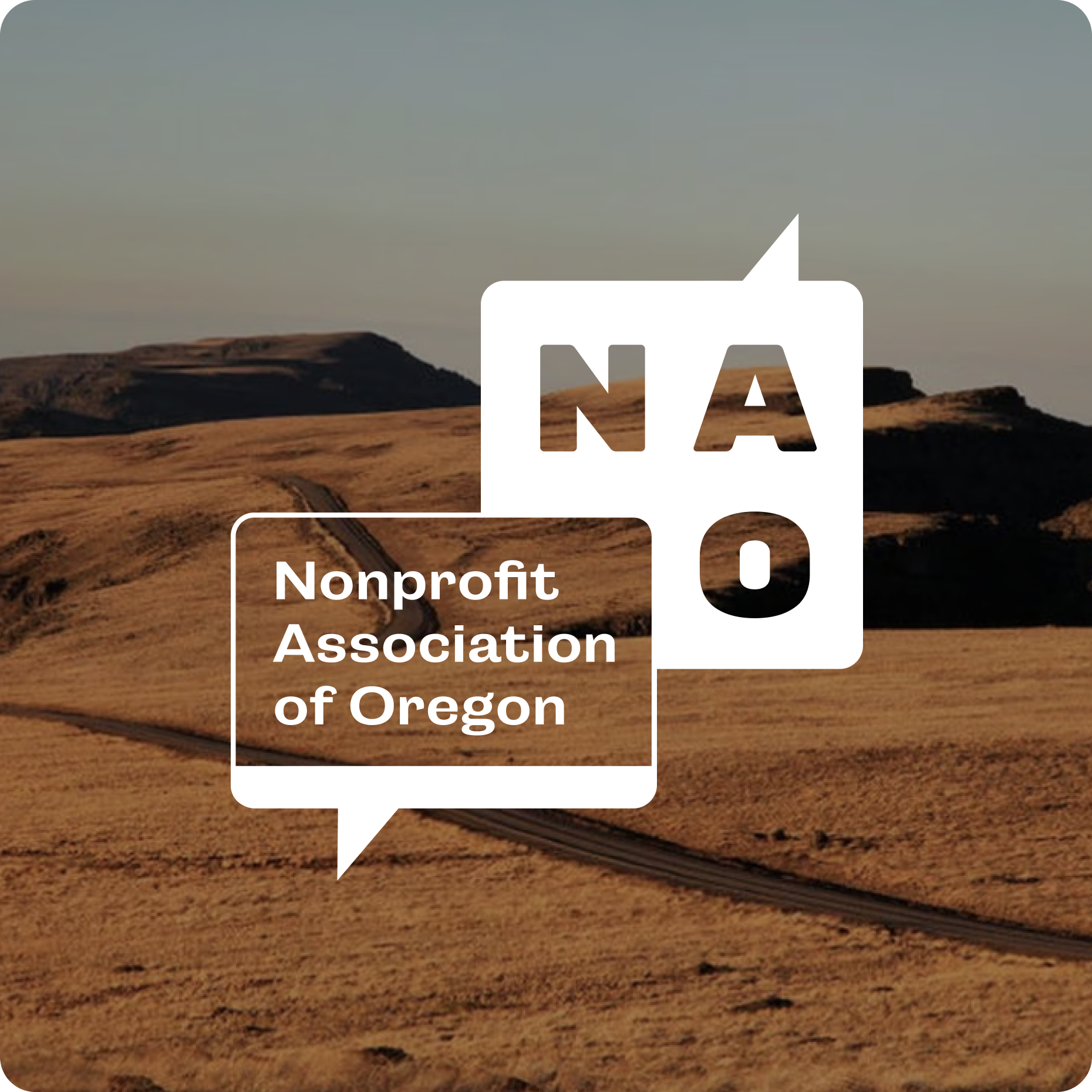
With a small core group of stakeholders, Radish led a creative workshop exploring how each person pictured the next era of NAO’s brand. Because their team had little attachment to their existing brand, we started with a big picture approach, exploring color, type, logo and overall energy. Each stakeholder came in with a different level of design experience, so we spent time ensuring that everyone was on the same page with the terms we were using and the decisions we were making. By utilizing digital collaboration tools like Figma comments and Figjams, we were able to engage actively with the NAO team despite being on opposite sides of the country.

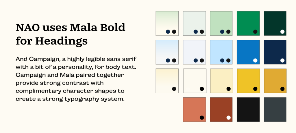
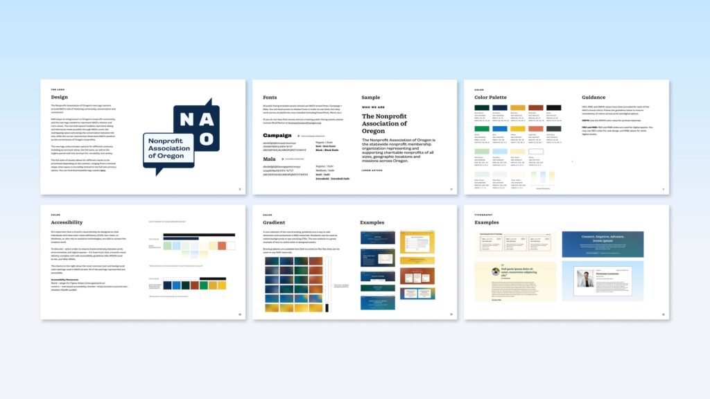
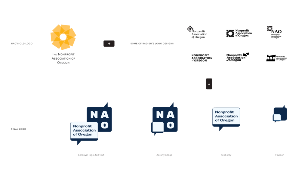
Playspaces and guardrails identified, the team moved on to producing concepts that we felt captured the essence of NAO’s work and demonstrated clear brand evolution, thinking first and foremost about digital usage on their new site.  At the end of the day, the NAO team leaned into their community-oriented mission and chose the concept most deeply inspired by Oregon as a place.

Brand Color Palette: Accessible Oregon

With Oregon at the core of the concept, we pulled color inspiration from the diverse landscapes that make Oregon unique – the deep green forests, the rich blues of the coast line, and the yellows and ambers of the desert and farm lands.

We layered bold tones together in rich gradients, relying on spot gradients rather than linear ones – distinct bright spots in Oregon’s communities, interacting in a unified space – as a nod to the community engagement portion of NAO’s work. These bold pops are balanced with inviting, soft neutrals. As with all Radish projects, we prioritized accessible-first design, ensuring that brand color combinations would be WCAG AA compliant when applied to digital spaces. With brand sustainability in mind, we thoroughly documented  accessible color usage to make it easy for NAO’s small team to produce accessible assets.

Building a Sustainable Brand

Like many of the nonprofit organizations we have worked with, NAO has limited resources and team members to manage their brand and produce content, so making sure that the brand would be easy to use was key. Their team was eager to embrace typography, so Radish prioritized cloud based fonts from Adobe to avoid burdensome font licensing fees and ensure that NAO’s brand font would sync seamlessly with their new website and digital tools like Canva. We landed on fonts that strike a balance between playful and serious, reflectingNAO’s industry-leading status and their warm and inviting personality.  

Because they work primarily to support various nonprofits working throughout the state, NAO does not have a robust photography library. We worked with their team to identify attributes of on-brand photography and utilized free open-source stock resources to build a small library for their team. We also made sure that photography would be totally optional, creating a brand strong enough to hold its own with just typography and color.

An organization’s website is the biggest moment their brand is seen by the public.  Radish prioritizes digital-first branding to ensure that all the work we do on a brand directly serves the website. For NAO, we produced comprehensive and easy-to-use documentation for the NAO team that details best practices and brand usage in digital tools.

The Cornerstone of a Good Logo

The NAO team’s main pain points with their existing logo were that it was hard to use, unadaptable to different contexts, and disconnected from NAO’s personality and mission. So, the new logo needed to prioritize three things: usability, flexibility, and intentionality.

As with the rest of the brand, Radish Lab had full freedom to start from a blank slate for the new mark. Originally, the NAO team felt strongly that their primary logo needed to include their full name, rather than relying on an acronym, as their work is frequently circulated outside of their website or co-produced with other organizations. As the process moved along, the team gravitated toward an option that worked with both the acronym and full name to provide additional flexibility for different use cases.

Dialogue, cornerstone, community, engagement, and connection were the keywords that the team identified as the most important for their new logo to represent. After a thorough feedback process, the team landed on a mark that takes a big, contemporary stride away from their existing mark and puts their connective role at the forefront.

We produced several versions of the final logo – full name, acronym-only, favicon, and tagline – to ensure that, no matter the context, NAO has the right mark to meet the moment.

Launching: New and Improved

NAO’s rebrand happened in tandem with a brand new website build, culminating in an exciting joint launch. Read more about Radish’s approach to Nonprofit Association of Oregon’s website here.

Check out the live site here to see the brand in action.

up next

Ending pandemics through strategic partnerships

(RED)
Designing to fight the world’s biggest health emergencies