TNTP

A Flexible New Brand

A Transformational New Brand for an Organization Transforming Education

TNTP – the leading national organization advancing equity in education through a strategic combination of on-the-ground work in schools and communities, original research, and public advocacy – worked with Radish to revamp their branding. Leaving their logo untouched, we stepped in to reshape TNTP’s visual identity and messaging to better reflect their diversity and serve their mission.

Inspiration

As Radish Lab collaborated with TNTP on the foundational research for their new brand, inclusivity and diverse representation quickly emerged as keystone values. Accordingly, the Radish team focused on diversity at every level of the branding process – from seeking out color inspiration from diverse sources to prioritizing inclusive type foundries during font research. 

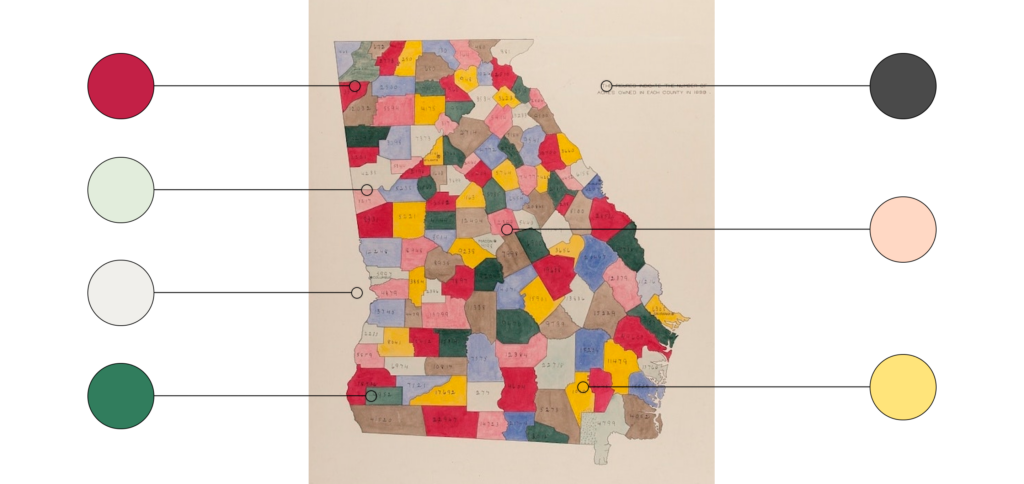
During the Design Research phase, W.E.B. Du Bois’ iconic infographics hit home with the TNTP team. Presented at the Paris Exposition Universelle in 1900, the infographics sought to explain institutionalized racism.  The Radish team stood on Du Bois’ shoulders, giving jewel tones, light pastels, and graphic brand elements evocative of information design pride of place as cornerstones of the visual brand.
An Inspired Color Palette

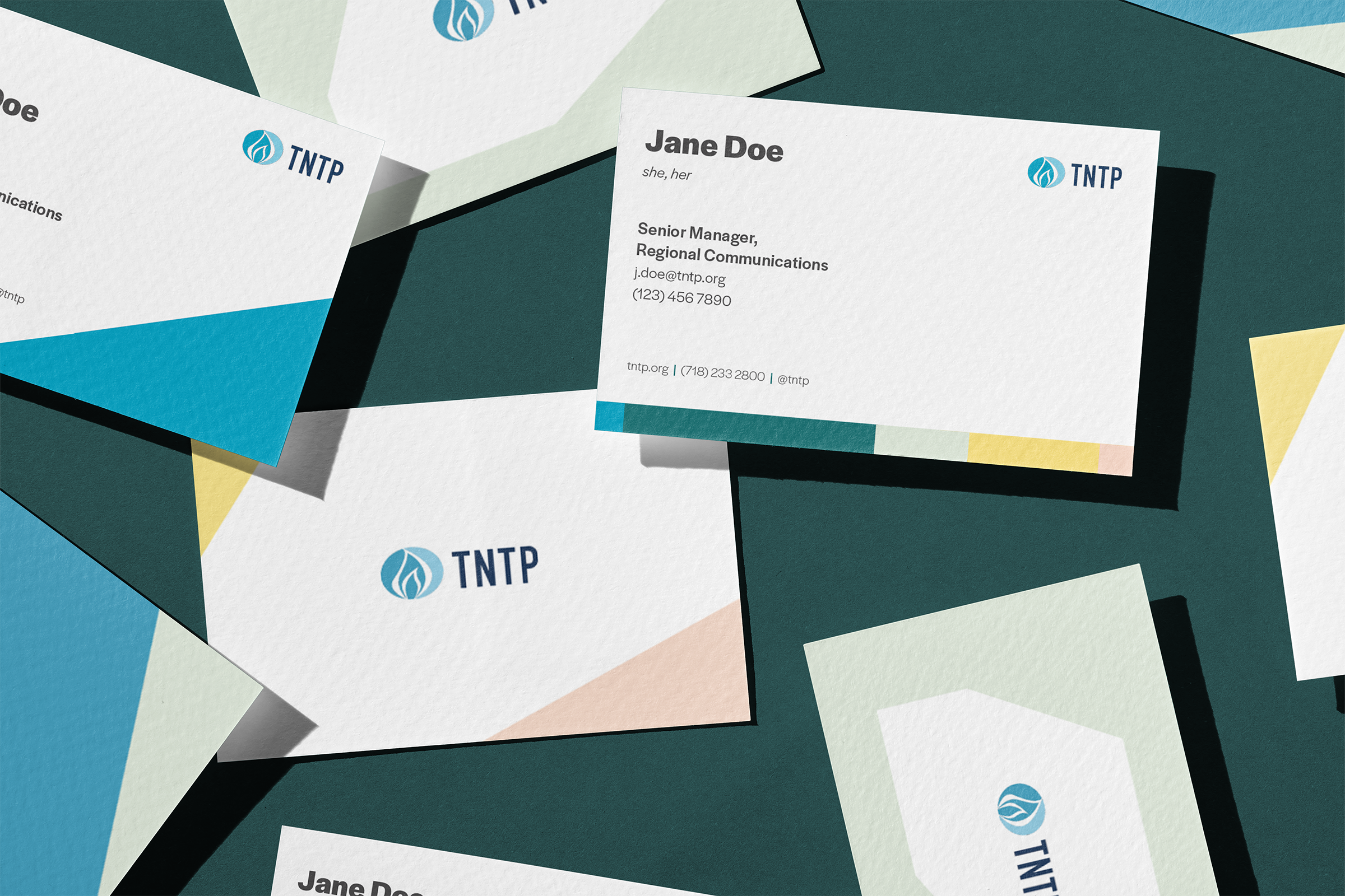
An homage to W.E.B. Du Bois’ infographics, the color palette utilizes a broad range of tones. A combination of bold saturated greens and blues, soft  yellows and pinks, and light grays lend the brand versatility, allowing for striking contrast in high-impact moments and a softer aesthetic in areas with dense information.

As with all Radish projects, we prioritized accessible-first design, ensuring that brand color combinations would be WCAG AA compliant when applied to digital spaces.

Typography

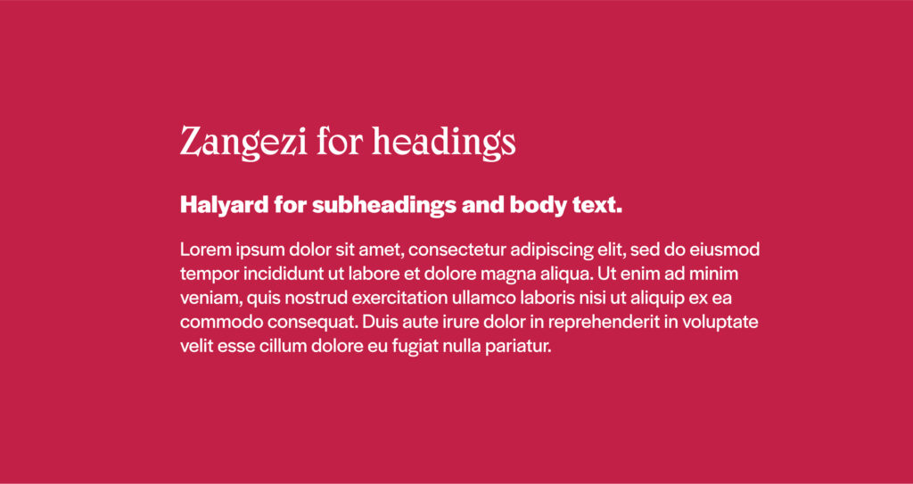
The type system is anchored in Halyard, a workhorse sans designed by Joshua Darden, the first Black typeface designer. With adaptability to different weights and sizes, Halyard lays a flexible and accessibility-friendly foundation for TNTP’s visual brand. Bold statistics and callouts utilize Zangezi, a distinctive, playful font designed by independent type designer Daria Petrova. Halyard’s legible characters and many weights and Zangezi’s high contrast and unusual shapes combine in a utilitarian yet playful pairing.

Graphic Intersections

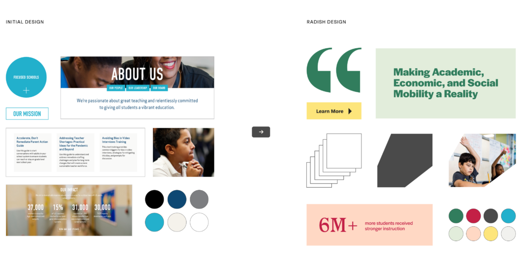
Inspired by Du Bois’ infographics, the Radish design team began with basic geometric shapes evocative of those in his data visualizations. Then, we iterated: multiplying, overlapping, and outlining rectangles, triangles, and circles to create a robust collection of graphic elements and containers. The dynamic layouts and containers the shapes create nod to TNTP’s values and mission, reflecting the intersectionality, the possibility of generational growth, and the pathways that education creates to economic mobility. By starting simple and iterating systematically, the Radish team ensured that the brand would balance flexibility, dynamism, consistency, and ease of use, giving the TNTP team plenty of options – but not too many.

Diversity in and out of the Classroom

Like many of Radish’s clients, TNTP sought to showcase the diversity of their community through their brand. Radish worked with key stakeholders to ensure that photography represents students of diverse races, ethnicities, ages, locations, learning styles, and interactions. In addition to prioritizing diverse representation in the subject matter, Radish provided stylistic guidelines delineating the look and feel of TNTP’s imagery: photography should convey a sense of hope and focus, centering learning and showcasing students’ individual experiences and bright futures.

Designing A Brand System For Two

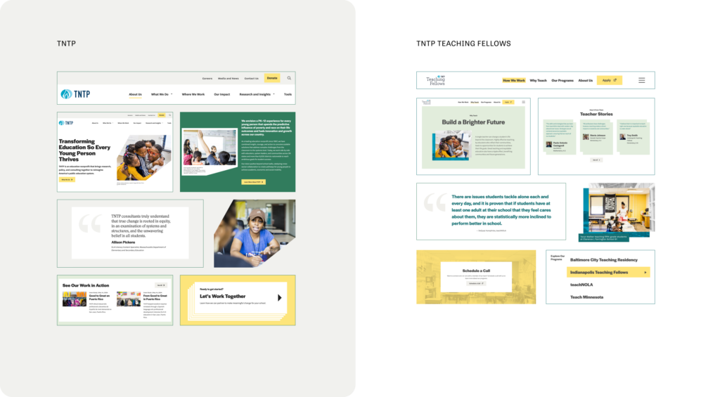
In addition to working to reimagine America’s public education system, TNTP also has a teaching fellowship program: TNTP Teaching Fellows. TNTP Teaching Fellows offers young adults a more affordable, faster path to a teaching certification through job-embedded training. As an offshoot of the main TNTP brand, TNTP Teaching Fellows needed to look like a part of the TNTP ecosystem. But as a separate program from the main nonprofit, it also needed to have a distinct look and feel. Accordingly, Radish worked with both the TNTP and TNTP Teaching Fellows teams once the main TNTP brand was established to identify the places where TNTP Teaching Fellows could stray from TNTP’s visual brand. 

The result is a strong parent brand with a unique child application that maintains brand integrity and ease of use for their internal team. TNTP Teaching Fellows utilizes the same brand fonts, primary color palette, and imagery guidelines as TNTP. Where TNTP utilizes a rich true green, Teaching Fellows leans into a cooler dark teal; where TNTP utilizes dynamic shapes and graphic layering, TNTP Teaching Fellows restricts their shape use to rectangles and squares, but still incorporates the parent brands’ graphic layering to ensure a tight connection between the two.

Launching: New and Improved, Times Two

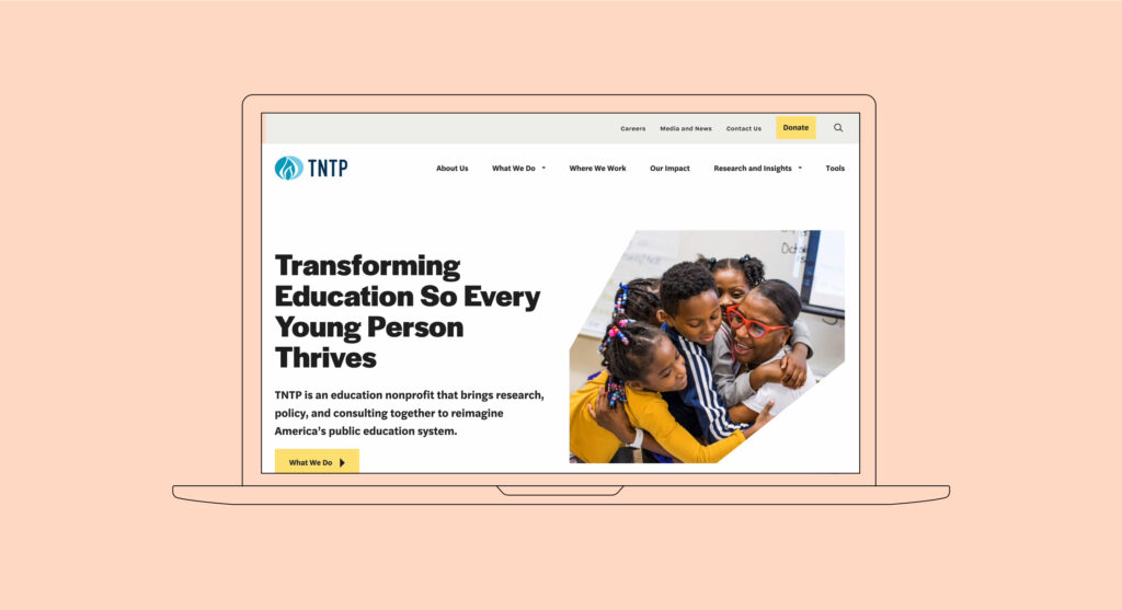
The final outcome of TNTP’s work with Radish Lab was not only a new, beautiful brand, but also two new and improved websites. Leveraging all of what Radish Lab’s team has to offer, TNTP worked with Radish to design their brand, sub brand, main TNTP website, and TNTP Teaching Fellows’ website in tandem. Read more about Radish’s approach to the TNTP and TNTP Teaching Fellows websites here.

Check out TNTP’s Brand In Action Here
Check out TNTP Teaching Fellows Sub-brand Here

up next

Ending pandemics through strategic partnerships

(RED)
Designing to fight the world’s biggest health emergencies