Skip to content

Research for Action

Pairing creativity with restraint to elevate educational expertise.

Breaking boundaries in education research.

Research for Action (RFA) is passionate about high-quality education and advancing racial and social justice. They came to us because their website wasn’t serving them: Users couldn’t quickly locate the content they needed, or understand the full breadth of RFA’s expertise as a national program and policy organization.

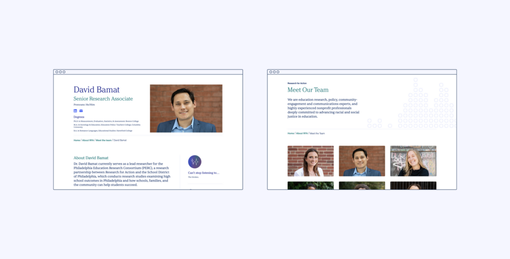
We set out together to create an engaging, boundary-pushing website that would communicate RFA’s expertise in a clear, beautiful, and grounded way, to an audience ranging from educators to policymakers.

Honing messaging, positioning, and narrative to convey expertise.

We not only wanted to polish the site from a design perspective, we also wanted to support and strengthen Research for Action’s position as a leading voice on educational equity. We approached this with RFA by collaborating to: sharpen their messaging, elevate their experts, and refresh their narrative.

First, we worked together to align RFA’s brand messaging with their identity and expertise. Then, we built out RFA’s team profiles and tagging taxonomy to ensure their in-house experts were positioned as such, and finally, we developed nuanced content relationships, so that as users work through the website, they would be presented with an interesting and full story of RFA’s impact. We prioritized:

Clarity

Streamlining and translating the ‘who’, ‘what’, and ‘why’

Ease

Providing content for ‘skimmers’, ‘swimmers’, and ‘divers’ within a scalable structure

Engagement

Moving beyond awareness-raising to perception-shifting
Balancing authority with subtlety in design.

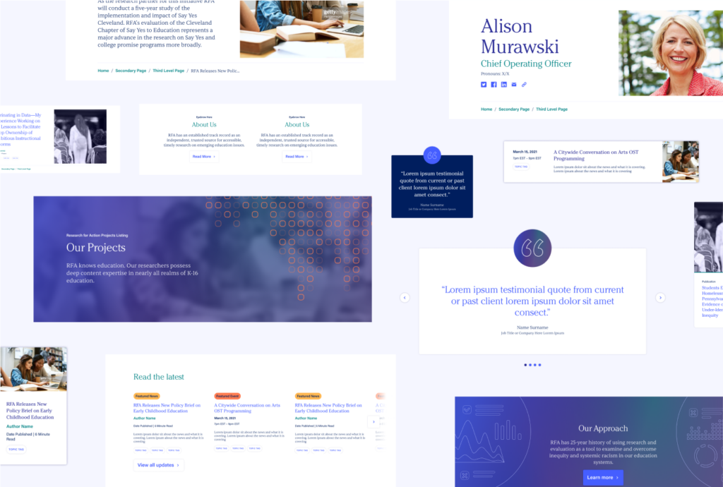
When it came to the look and feel of the website, we wanted to communicate that RFA brings a rigor to their work and is driven by research – and we wanted to do it in a way that felt community-focused as well.

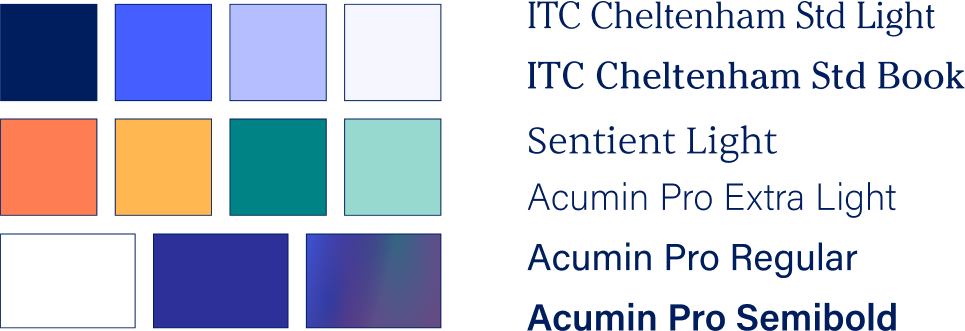
For the website’s visual and design approach, we leaned into warm, subtle, and organic colors, layering in tonal background patterns and cool gradients. For the typography, we selected a softer and more traditional serif for big statements, complemented by a cleaner and more utilitarian serif and sans combination for body copy and details.

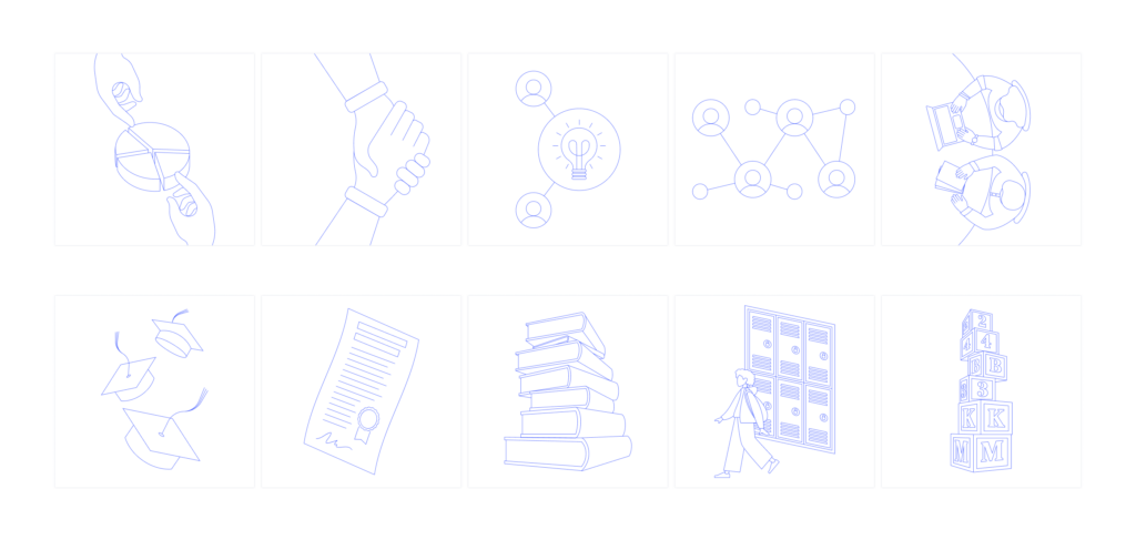
Designing illustrations to create movement and warmth.

When it came to bringing RFA’s expertise to life, we needed to balance ideas of creative expression and professional restraint, while generating the feel of an inviting, authentic, and hands-on organization.

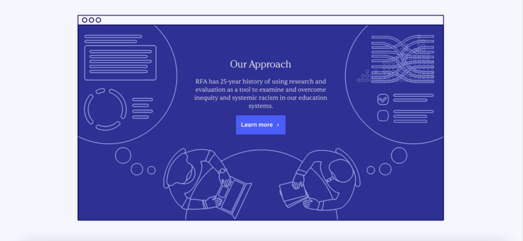
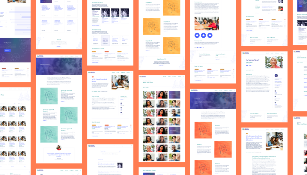
To accomplish this, we designed custom illustrations, and applied them throughout the website to bring warmth, and a personal touch to the descriptions of RFA’s expertise, projects, and approach.

Categorizing with clarity, for an improved user experience.

As a research-focused organization, RFA has an incredible amount of information to share with a variety of audiences: policymakers, practitioners, philanthropists, and the public at local, state, and national levels.

To make sure that each of their audiences would be able to find exactly what they need, we performed an audit to build a picture of RFA’s content universe. Then, we collaborated to develop a ‘mega menu’ and highly filterable resource library – allowing users to navigate multiple levels of content to find exactly what they are looking for, right when they need it.

Let’s Talk

We’re always excited to connect with potential clients, partners and people – whether you have an active RFP, are looking for a new vendor, or just want to learn more about what makes Radish Radish.