Skip to content

GEO

A Strategic Approach to a Membership Organization Website

Transforming Philanthropy: Embracing Equity and Access for a Membership Organization

Grantmakers for Effective Organizations (GEO) – an organization that fosters a robust community of funders and organizations to transform philanthropic culture and practice through resources and relationships – came to Radish looking for a partner in rethinking their website and positioning. Wrapping up a huge strategic planning process, GEO had realized that they needed their website to better reflect their impact and goals to propel organizational growth.

Radish Lab collaborated with the GEO team on a brand new website and updated brand messaging to help them reposition for the next phase in GEO’s evolution. Hitting the ground running with a bounty of insights from their recent strategic planning, Radish led their team through a comprehensive Discovery phase to define their new organizational needs and goals. This phase included tackling internal team challenges, reorganizing resource structures, and clarifying the specifics of GEO membership.

View live site

Project details

Stakeholder Alignment
Messaging Architecture
Content Strategy
Information Architecture
User Experience
User Interface Design
SEO
Web Development
Analytics & Optimization

Strategic Repositioning

At the beginning of our partnership, GEO was undergoing a comprehensive strategic overhaul with an external vendor to reassess their direction and future goals. Radish leveraged the insights from this strategic exercise as a foundation for our own Discovery phase, honing in on how GEO’s new strategic plan would impact their website.

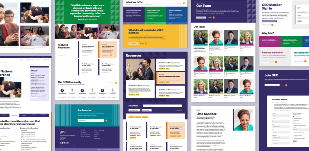
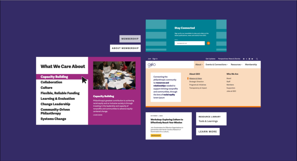
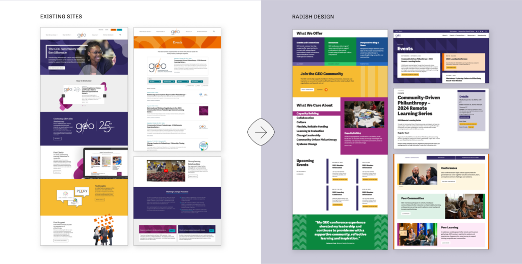
Through a series of interviews, focus groups, and in-depth analysis, the Radish team sought to understand what was most important to GEO. While their strategy was evolving, two core pillars remained true: GEO connects people to people, and people to information. With those pillars in mind, we established a guiding principle for the new website: to ground all work in Equity.

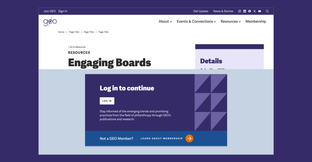
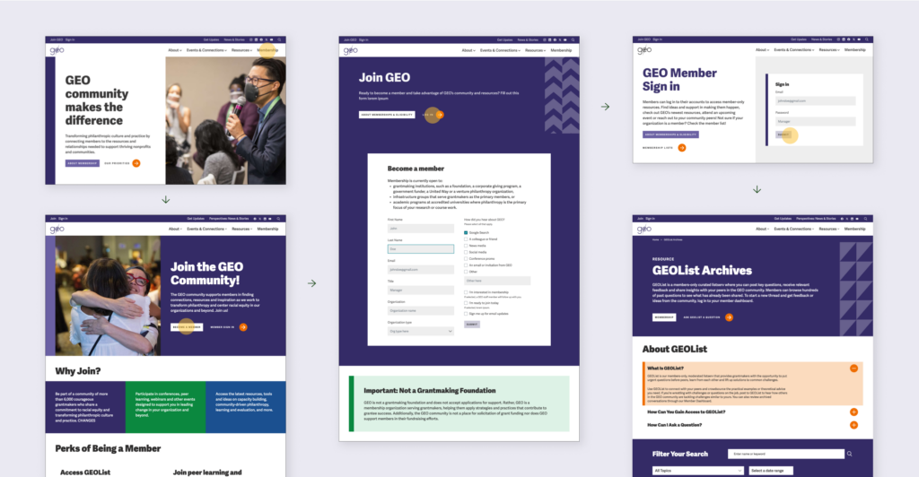
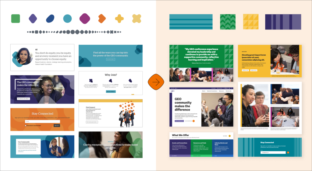
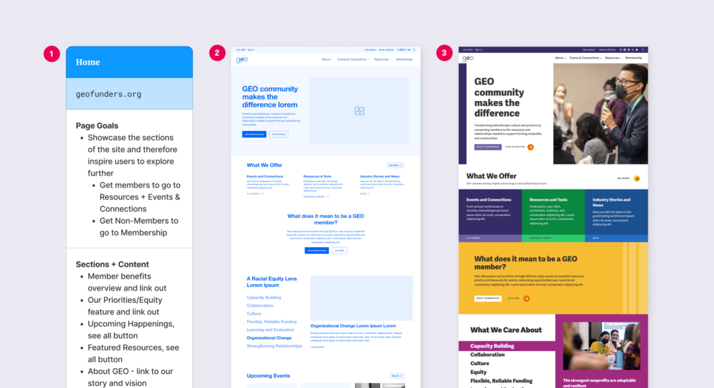
This principle shaped our entire approach as we restructured their site, redefined post types, reorganized taxonomies, and refined the updated brand. By removing Equity as a separate taxonomy topic, we underscored that Equity is not just one aspect of GEO’s work but the lens through which they view all of their work. Making more resources and events accessible to everyone advanced our goal of amplifying GEO’s impact on people.

New Messaging

Building from the Discovery phase, Radish collaborated with the GEO team to align their core messaging with their new strategic positioning and website insights. Updated messaging, tone and voice, and brand attributes informed the information architecture and content strategy for all content across their new website.

With Brand Messaging locked in, the Radishes and the GEO team collaborated on a new tagline. Workshops with key stakeholders allowed Radish to identify  essential words, phrases, and themes to incorporate into the tagline, and equity emerged as a central value. We crafted several tagline options that encapsulated GEO’s mission and set the stage for GEO’s next chapter.

Membership Perks: Balancing Exclusive Content with Open-Access Resources

Membership is central to GEO’s mission. Their reason for being is to create community, connecting people to people and to curated resources. With this in mind, we dedicated time in the Discovery phase to  redefining the parameters of GEO membership— whether it would continue to be exclusive, come with material benefits, or offer a medley of perks like early access to content and events. Think: Costco, where paid membership gets you exclusive access vs PBS, where paid membership supports the work of PBS and offers early access. Ultimately, GEO chose a model that aligns with their community-centric mission, providing early access to popular resources and events without fully gating content – which had the added benefit of preserving SEO visibility.

Once aligned on GEO’s membership approach, we evaluated the structure of content within GEOList and the GEO website. GEOList, a members-only Q&A listserv archive popular among savvy users, was previously buried within general resources, leading to user confusion. We established a dedicated listing page for GEOList, streamlining the process for members to find GEOList content and initiate discussions via the member dashboard.

Powerful Salesforce Integration

Every organization has preferences and needs unique to their internal team when it comes to third party tools and integrations. At Radish, we’re well versed in managing external tools and integrations – especially for membership organizations like GEO. The GEO team relies on Salesforce to manage members, prospective members, details, payments, and more.

Conversations around Salesforce integration started at the very beginning of GEO and Radish Lab’s partnership, ensuring that our Strategy process would capture any necessary context, pain points, or goals for Salesforce use on the new site. During the User Experience phase, we focused on the key touch points leading into the Salesforce funnel, like New Member Flows.

With close communication in the backend of the new website, the Radish developers created a communication system with Salesforce through which the GEO team can control leads and members within Salesforce. Access to restricted areas of the site also uses the Salesforce API, providing the information necessary for a custom authentication system and seamless user experience.

A Stripped Back Brand

The GEO team came to Radish with a jigsaw puzzle of a brand: the pieces were all there, but the picture was incomplete. Their extensive palette, graphic shape library, and open-ended application rules around patterning made their brand feel unruly. With accessibility modifications in mind, the Radish design team sifted through and thoughtfully curated the pieces of GEO brand, aiming to maintain its flexibility while giving GEO team members clearer, more sustainable guidelines for usage.

The end result makes minor accessibility tweaks to their robust color palette and provides guidance for applying the brand in a way that breathes new life into the website without stepping completely out of line with existing collateral and content. We narrowed down their extensive set of shapes, patterns, and compositions to three simple options – rectangles, chevrons, and triangles – each with defined pattern templates for consistency. Removing the soft-edged shapes, the limited set adds definition to layouts and sharpens GEO’s messaging.

As for typography, their existing brand used a licensed font that made it expensive to maintain and expand their weight options. We recommended a comparable cloud-based font that provided them a more affordable, flexible type system.

Accessibility and Actions

GEO’s primary orange presented a challenge for the new brand. Though the GEO team saw the primary orange as a key part of the existing brand that needed a place in the updated palette, they hoped to tamp down its use – especially as a background color. The Radish team also had concerns about the accessibility of their brand orange, as it consistently failed accessibility testing when layered with white text on the existing site.

To ensure their primary orange would feel prominent – as befits a central color in their brand identity – and address accessibility concerns, during the User Interface phase we decided to use orange to indicate active states – button hovers, card hovers, arrows, navigation dropdowns – in interactions throughout the experience. This system solved for the desire to minimize full-background usage of the orange and ensured WCAG accessibility compliance, while clarifying its role throughout the entirety of the new experience.

Flexible, Robust, and Easy to Use CMS

One of the most frequent pain points our clients have coming into a website overhaul is that their existing site is challenging to manage, update, and grow. The GEO team came to us seeking a new site that would be  both beautiful and functional for their audiences, and a breeze for their internal team to manage.

To tackle this problem, Radish Lab approaches all of our web projects with the internal end users in mind from day one, resulting in flexible sites that stand the test of time. Starting in our User Experience phase, we build sites modularly so that clients can intuitively understand how sections of a page can be reordered, removed, and added with ease to serve each pages’ content and goals. In User Interface, we push module design a step farther – indicating how changeable color options and other variations can create sustainable, systematic flexibility within the brand. Once our developers are finished building the new site, we provide clients with robust documentation – using the same language from UX and UI and matching the backend CMS setup – to ensure a smooth handoff.

Check out the live site here.

Let’s Talk

We’re always excited to connect with potential clients, partners and people – whether you have an active RFP, are looking for a new vendor, or just want to learn more about what makes Radish Radish.