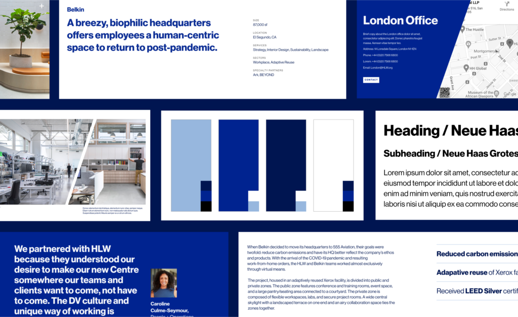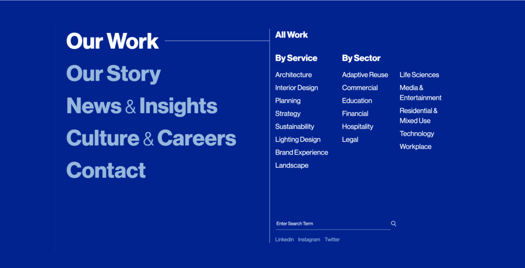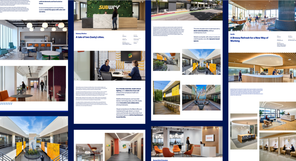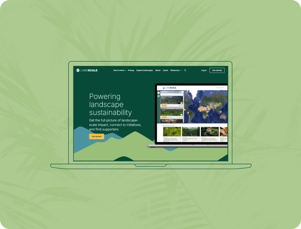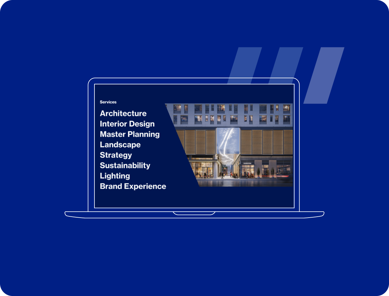
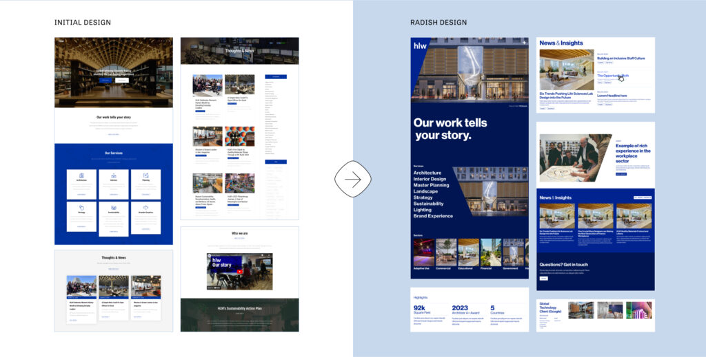
Bold Visuals and A Clean Design System
With an incredibly lean primary brand – a bold, blue-heavy color palette and a strong sans serif – HLW needed a strong design system for their new website. We focused on balancing bold backgrounds with intentional white space, delineating minimalist type styles, setting clear rules around color usage, and aligning all content on a strict grid. As with all Radish projects, we prioritized accessible-first design, ensuring the application of their palette is WCAG AA compliant.
The design system provided the backbone we needed to make HLW’s story spring to life. We emulate their cutting-edge work in every detail of the new user interface. Embracing the sharp aesthetic of their brand, creating a sense of space through container shapes and transitions, and encouraging exploration through engaging interactions, we designed all parts of the digital experience to reflectHLW’s approach to physical experiences.