Community Change

Empowering Change: Crafting a Dynamic Digital Presence for Community Change

Sister Sites

Community Change empowers low-income people across the US, especially people of color, to fight for lasting social and economic justice. The Community Change ecosystem consists of two organizations: Community Change and Community Change Action – and the nature of their work requires separate websites to reflect their 501(c)(3) and 501(c)(4) status. They brought Radish Lab in to overhaul their digital presence across both websites, creating one cohesive design system and CMS to serve both domains.

A Brand Call To Action

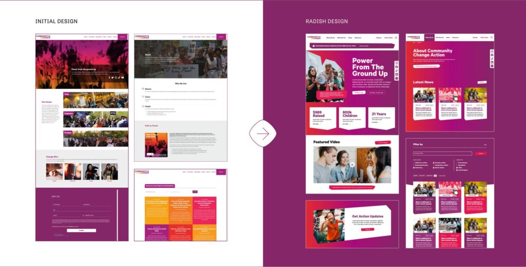
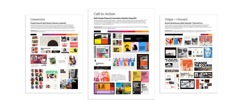
The Community Change team told us early in the process that they felt their websites didn’t live up to their brand’s full potential. Community Change’s existing branding set a strong foundation that lent itself well to a powerful visual execution, featuring bold colors and strong typography that gave Radish an incredible jumping off point. We set off to amp up their brand (with an accessibility-first mindset) to better tell their story, amplify their mission, and reflect the big impact of their work.  
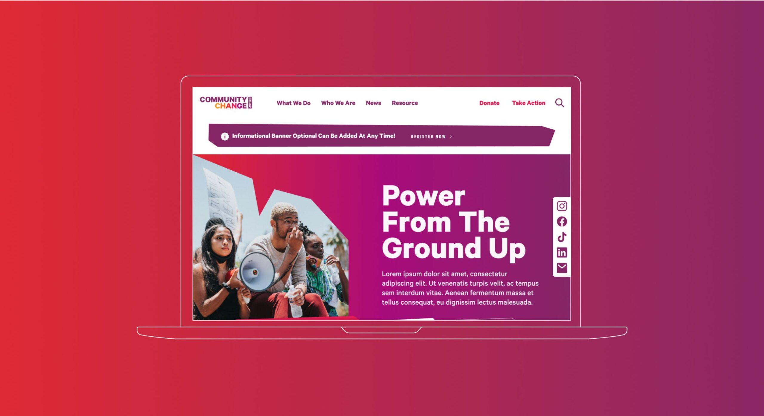
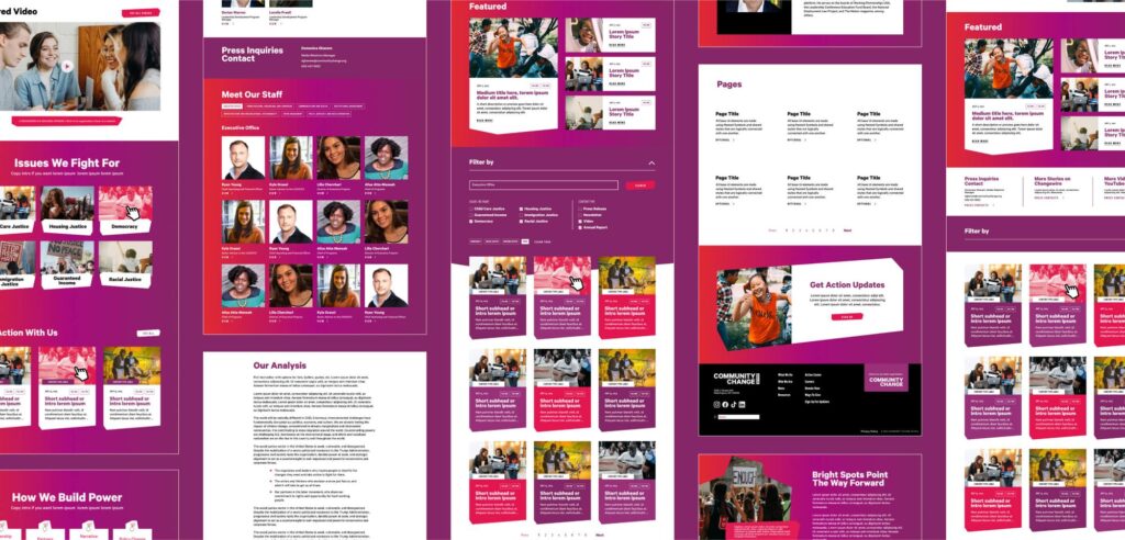
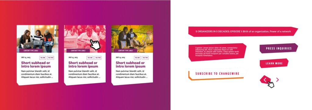
The final creative direction embraces the action-driven nature of Community Change’s work, with no shyness around color usage or bold typography. Our modular approach allows for graphic interjections throughout each page: jagged container shapes nod to grassroots advocacy (a little rough around the edges, but all the more impactful for it), gradients create dynamic backgrounds, and high-contrast moments clearly direct users how and when to take action. Embracing the collective spirit of grassroots action, the site serves as a visual reminder that the work of the community does not fit into perfect boxes.

It has been a joy working with Noelle and the wider Radish Labs team to bring our renovated websites to life! The team worked with us through every step of the process, from design accessibility, to site maps, to ensuring a fluid user experience for each of our audiences.

Mikka Kei Ito Macdonald,
Creative Director Community Change

Accessibility Considerations

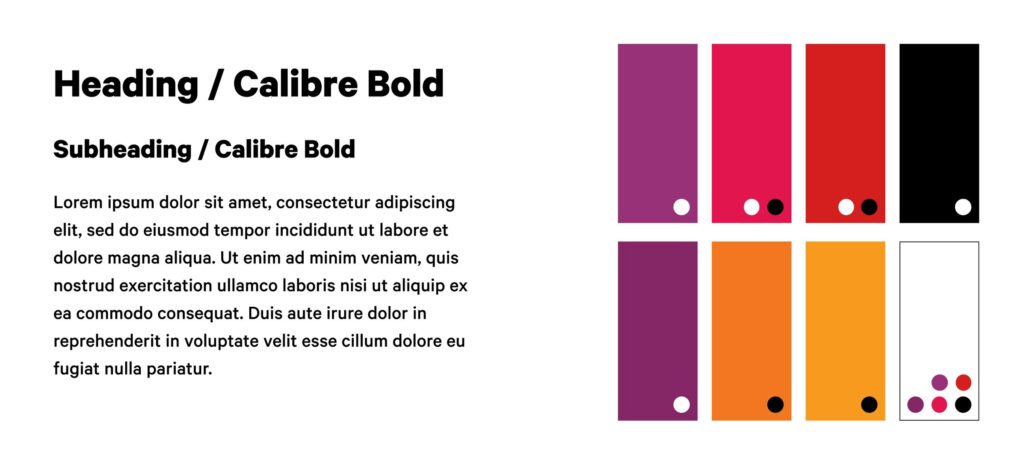
As with all Radish projects, we prioritized accessible-first design. For Community Change, Radish was tasked not with redesigning their brand but rethinking how it could be applied. Their palette only required minor tonal adjustments to allow for adequate contrast, so we focused on how color was being used across the two websites. At the end of the design process, Radish provided clear documentation of how colors should be used in other client-produced assets to ensure all content meets WCAG AA compliance standards.

Clear Calls To Action for All Audiences

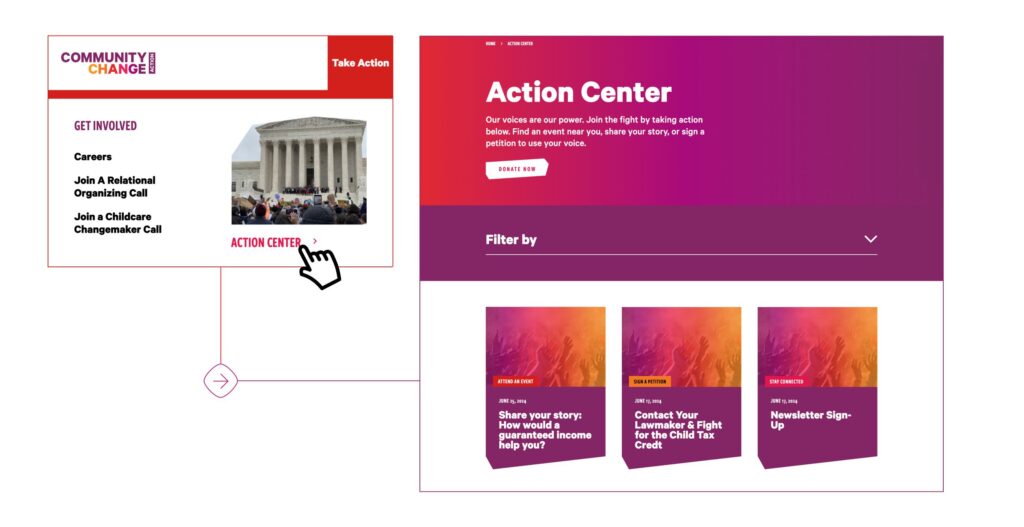
With the two separate websites for Community Change (CC) and Community Change Action (CCA) came unique considerations around how to segment audiences and what information to prioritize on each site. The Community Change Action site is where the majority of information about CC’s work is housed, as well as where the majority of community engagement takes place. But the existing CCA site lacked clear calls to action for allied users. To address this, Radish Lab developed a new section of the experience called The Action Center. The Action Center serves as a hub for action-oriented visitors, giving them access to a one-stop-shop where they can engage with issues they care about. Through intuitive filters for issues and action types, users can personalize their results, increasing the likelihood of sustained engagement. 

For the Community Change website, which focuses less on action and more on fundraising and storytelling, Radish overhauled the donation experience and restructured the “About” section to better convey Community Change’s impact, history, and vision. Though the two sites pursue different objectives, both aim to engage users through their particular interests and abilities. We designed navigations that make it easy for visitors to interact with the CC community – whether by contacting members of congress in the Action Center on C4 or digging into the organization’s vision for the future on C3.

Clarifying “What We Do” Through a User Lens 

Because Community Change’s work spans many methods, issues, and locations, their past site often fell short in showcasing the breadth of what they do. Like many of our nonprofit clients,  Community Change was using internal, programmatic language in a way that made sense to staff, but was not clear to their audience. As well as missing the mark for communication with website visitors, this programmatic language made it challenging for generations of site administrators to build a sustainable and well-tagged content system.

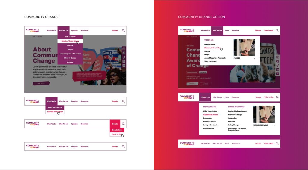
We helped Community Change tackle this challenge in two ways: with an updated navigation and new taxonomies. For the navigation, we implemented a dropdown menu with two columns: Solutions We Fight For, and How We Build Power. By distinguishing the issues from the methods, users gain clarity on the scope of impact and tactics at play. In keeping with this separation, we implemented an ‘issues’ taxonomy. Now, users can filter resources, news, and actions not only by type but also by the issues they care about most.

Designing A System For Two

From the start of Radish’s collaboration with the Community Change team, we knew the final result would be two separate experiences. So, Radish was able to think strategically from very early on in the process about how we could apply one brand and one modular system to two distinctive experiences that maintained brand integrity and ease of use for their internal team to update. 

Mindful that most of their active engagement with the community took place on the Community Change Action site, the Community Change team opted to revamp the CCA site first. Radish leveraged the full power of their brand for the CCA site, leaning heavily into the gradients and warm tones throughout the experience. For the CC site, we maintained all of the structural design elements – the graphic containers, module layouts, and typography system – but removed the gradients in favor of their cooler purple tones. These subtle, systematic design choices allow for two distinctly different appearances while fully maintaining brand integrity across their multiple domains.

Easy to Use CMS

At Radish Lab, we understand that managing, updating, and growing your website can be a daunting task. We ensure our web projects are easy to manage and maintain from day one, creating flexible and enduring sites. 

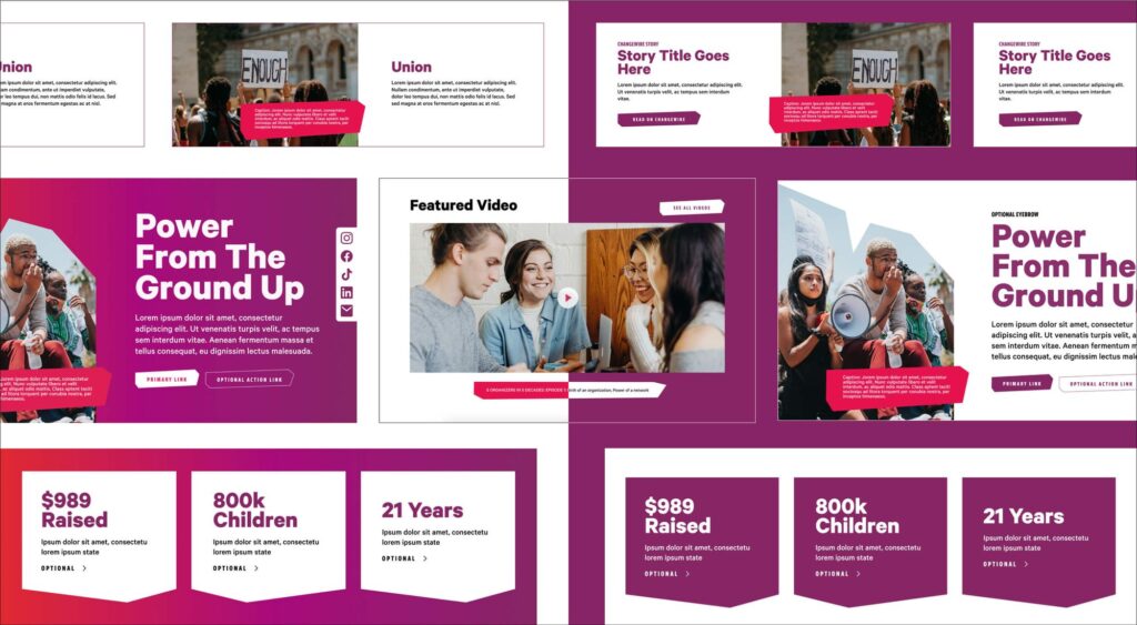
When Community Change began this project, they faced an even larger challenge than many nonprofits, managing multiple outdated websites.  We started with wireframes, adopting a modular approach that uses building blocks that are easy to add, rearrange, and adapt to various content types. This method allowed both our team and Community Change stakeholders to visualize a vast number of pages across their sites, and see the potential they’ll have with this system as their organization continues to adapt and grow. We utilized the same modules and theme setup across both sites, ensuring that management would be as simple and intuitive as possible. 

This modular strategy seamlessly transitions from wireframes to user interface design to CMS. It also makes rearranging, editing, and creating new pages quick and effortless, ensuring your site is dynamic and easy to manage.

Check out the sister sites: Community Change Action and Community Change

up next

Ending pandemics through strategic partnerships

(RED)
Designing to fight the world’s biggest health emergencies