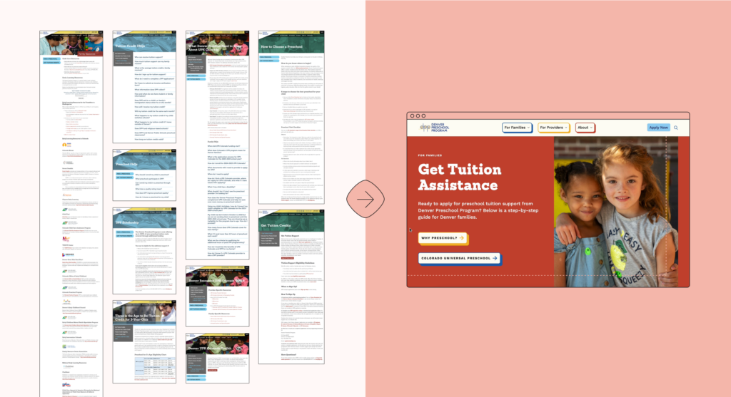
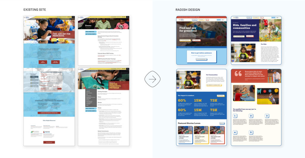
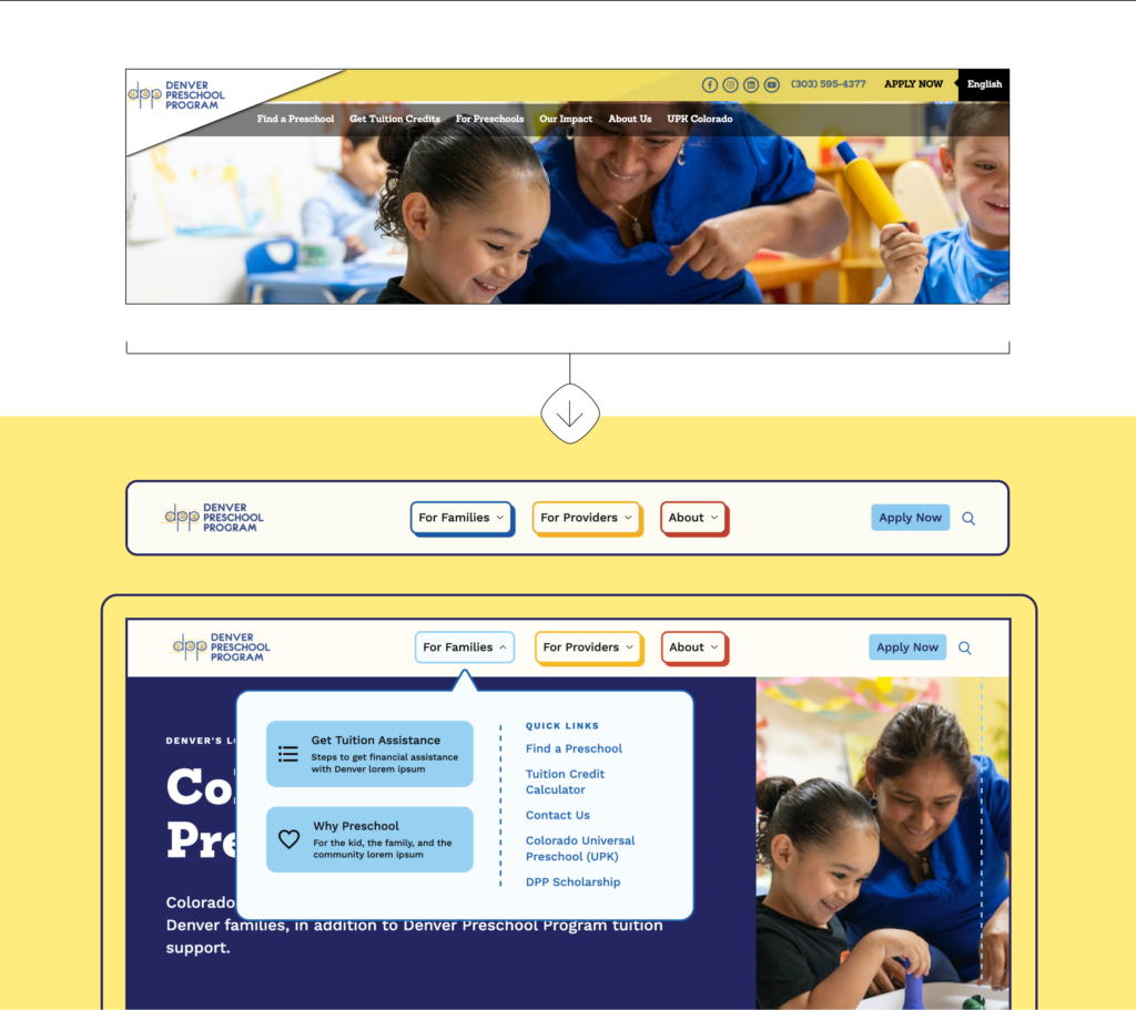
A Minimalist Approach to Navigation
Drawing inspiration from streamlined transactional experiences designed to get users in and out quickly, we reduced the main navigation from six items to three. By naming two of the dropdowns directly after their intended audiences—”For Families” and “For Providers”—we ensured users would know exactly where to click first. Within the “For Families” dropdown, we listed items in order of priority and described them with user-focused language.
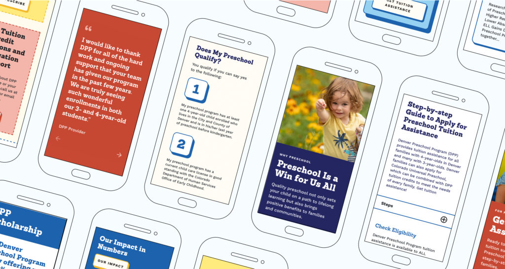
The simplicity of the new navigation and page structure also allowed for an easy translation to mobile, ensuring all users get the same streamlined experience on all devices.One of the primary challenges in revamping the DPP website was tailoring the navigation for its main audience: parents and caregivers of young children, who often have only a few minutes to understand how DPP works. For families, the process of applying to DPP can sometimes feel convoluted and complex, involving income verification and government jargon. The original site’s navigation was cluttered with redundant options, unexplained acronyms, and unfamiliar terms, lacking the clarity and direction that families needed. Simplifying the navigation was essential to improving user experience.