Fulcrum makes an intuitive app that enables businesses to collect field data with no-code mobile apps. These apps can instantly be deployed for use, and collect data without an internet connection.
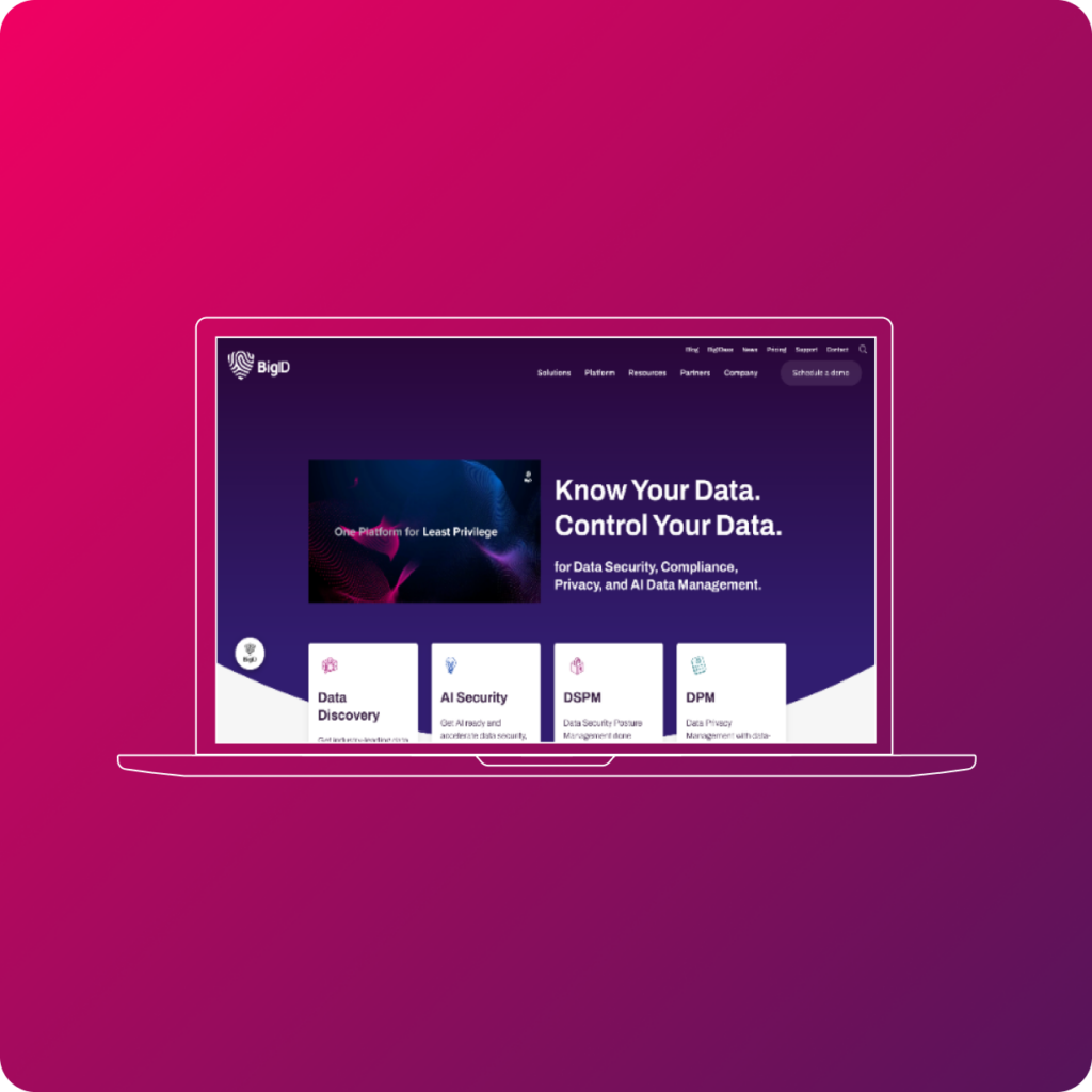
We worked closely with Fulcrum to reposition their app, provide a consistent design, and help them create messaging that resonates with their ideal audience, giving them a web experience you’d expect for an innovative SaaS product.
Rather than showing features first, we targeted who would benefit from using Fulcrum.
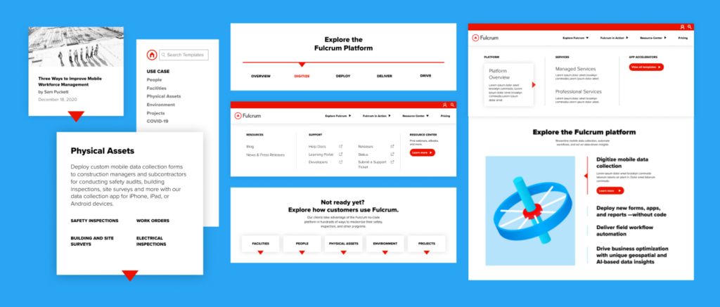
Each page was reorganized to prioritize that information. Then target audiences could learn exactly how Fulcrum solves their industry-specific problem.
The new value propositions convey the benefits clearly, and the most persuasive points are emphasized.
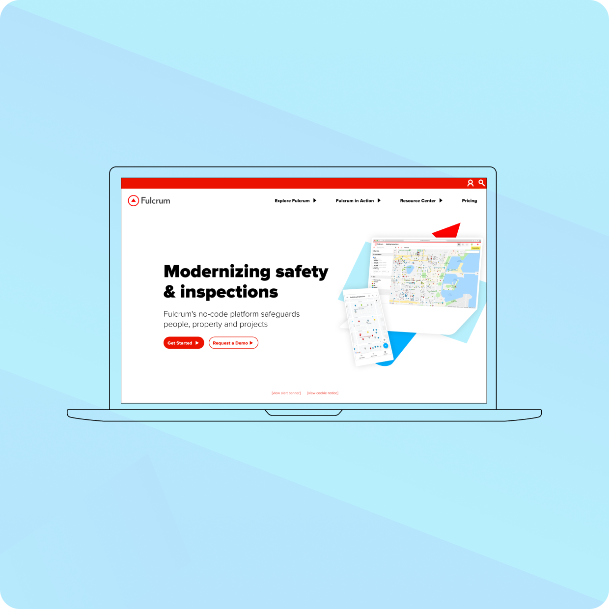
Compelling copy works best with a realized and thought-out approach to design. We improved visual consistency across the website, building a distinct brand image among the competition. Strong visuals of the app were designed to demonstrate the app’s use cases with clarity.
Users can find everything they need to know without effort, because the site navigation is clear and the UX is smooth and intuitive. Visuals explain what words can’t.
It all comes together in harmony with their lead generation strategy.
We developed a library with a mix of gated and non-gated resources for Fulcrum to use as lead magnets.
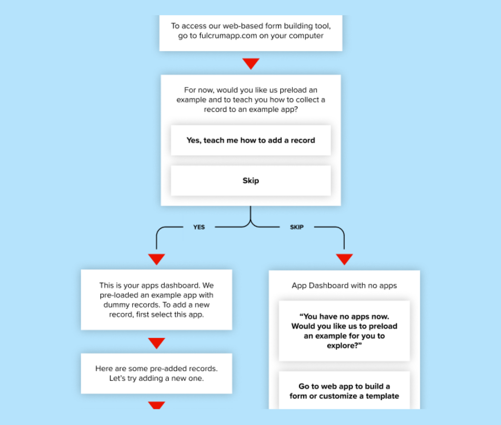
To further iron out acquisition, we created a better onboarding process by extensive user testing and tweaking the results.
Our work with Fulcrum is ongoing. We provide continual updates to the website, tracking soft conversions, optimizing CTAs, and making a visually appealing resource center.
It has been a joy working with Noelle and the wider Radish Labs team to bring our renovated websites to life! The team worked with us through every step of the process, from design accessibility, to site maps, to ensuring a fluid user experience for each of our audiences.
It’s always a joy to work with Radish on brand and web strategy projects. Their enthusiasm and commitment to our mission shines through in the final product. We couldn’t be happier with our new site!
Radish Lab’s research-led approach to refreshing our visual identity made all the difference and meant that this process could impact much more than our brand visuals. It has truly been transformative.
"Radish Lab’s strategy enabled us to grow from simply showcasing our identity to engaging park users online. The team analyzed data about park users and built an inclusive, focused user experience that will inspire support for our Olmsted Park System."
Radish Lab has been a trusted partner in helping us reimagine a new digital home and approach for engaging our partners and audiences in the story of the Foundation’s work and impact.
"We are so proud of and grateful for our collaboration with Radish Lab on Wings' brand refresh and website overhaul project. From day one, the Radishes approached this project with extreme care, compassion, creativity, and reverence for the needs of adult survivors of childhood sexual abuse.
They brought what is intrinsic in their DNA as a company to this effort, which fully aligned with all aspects of trauma informed care – and partnered with us to achieve a beautiful, resilient, impactful outcome. This project exceeded our expectations and sets Wings on a powerful trajectory going forward."
"We have had the pleasure of working with Radish Lab for several years now, and they have become a trusted partner and close collaborator of ours. They guided our rebrand process with creativity and have consistently exceeded our expectations with their high-quality work.
The Radish team demonstrates a deep understanding and dedication to our mission and goals, which shines through in the products they create for us. They are an invaluable partner in our work."
Our monthly search meetings with Radish allow us to take a step back, think big picture and move beyond what’s up, what’s down to focus on true goals and objectives.
For us, Radish’s biggest strength is their strategic advice. [...] They don’t just dive in to make something look nice. They force you to think about audiences, purpose, usability – and for that we are very grateful.
The site is beautiful and functions so well. We are very excited to share this product with our partners and have a site that demonstrates how we are evolving and expanding our work. [...] You have made this experience so seamless, painless, and enjoyable for us.
What was really impressive was their willingness to stand behind their creative vision, which is really what we were paying them for. They did more than offer technical expertise or put up a website; they gave us guidance on how to best demonstrate our strengths to the world.
They foster good communication and make sure both teams are on the same page. Their support makes it much easier for us to make informed decisions.
Their exceptional communicative style made this project run more smoothly than I've experienced with other vendors; they were open, honest, and clear, which are incredibly beneficial to the successful execution of a project.
Radish Lab takes an amazing, holistic approach to client work. They were extremely adept at helping us develop our vision for the site, keeping to our established schedule, and finding creative solutions for any obstacles that arose. They are highly talented, motivated, and exceptionally personable.