Renowned global architecture and design firm HLW brought Radish Lab onboard to rethink their website. Finding their existing site inflexible and lackluster, the HLW team hoped their new site would make light work of updates and maintenance, provide an intuitive experience for users, and showcase the breadth and exceptional quality of their work.
The revamped experience puts the information architecture first, enabling users to quickly navigate, search, and filter their ways to the information they need – all within a CMS that’s easy for the HLW team to manage. Plus, it embraces a bold interpretation of their brand that embodies HLW’s leading-edge design.
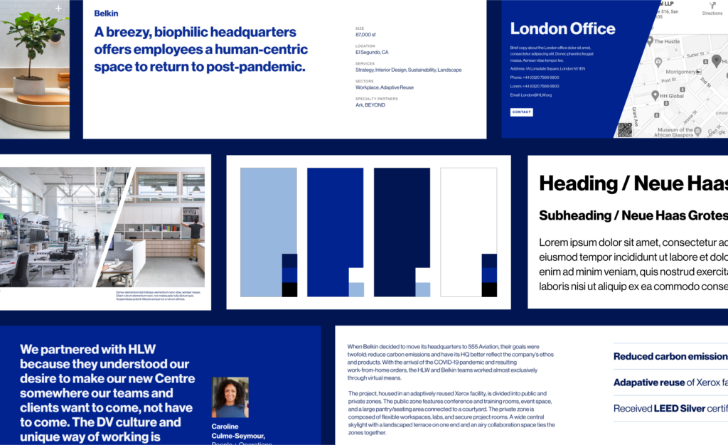
With an incredibly lean primary brand – a bold, blue-heavy color palette and a strong sans serif – HLW needed a strong design system for their new website. We focused on balancing bold backgrounds with intentional white space, delineating minimalist type styles, setting clear rules around color usage, and aligning all content on a strict grid. As with all Radish projects, we prioritized accessible-first design, ensuring the application of their palette is WCAG AA compliant.
The design system provided the backbone we needed to make HLW’s story spring to life. We emulate their cutting-edge work in every detail of the new user interface. Embracing the sharp aesthetic of their brand, creating a sense of space through container shapes and transitions, and encouraging exploration through engaging interactions, we designed all parts of the digital experience to reflectHLW’s approach to physical experiences.
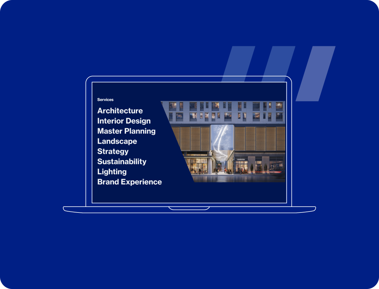
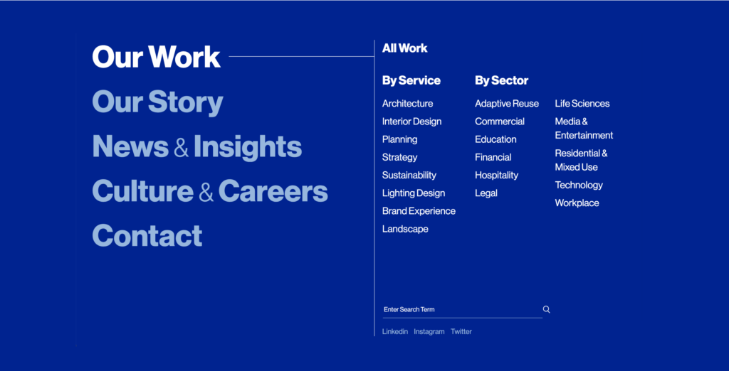
Users exploring architecture firms want to understand both the services they offer and the sectors they serve. During the Discovery phase, we found that HLW did a good job of featuring their services but could shine a brighter spotlight on their sectors. We created sector-specific pages that showcase projects, processes, staff highlights, and historical projects. They provide a comprehensive view of HLW's sector-specific expertise – and a much-needed alternative to rummaging through individual project pages for sector information.
By segmenting HLW’s work by both Service and Sector, we supported two key user journeys: directing users to specific services, like Lighting Design, and directing users to experts in a specific niche, like Workplace Design. This approach also enhances SEO and simplifies sharing with stakeholders.
Once we locked in their site information architecture and solved for the user experience side of making sure their new site showcased every element of the work they do, we moved on to the user interface side of that challenge.
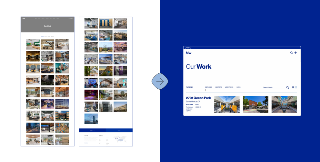
Their existing work listing page suffered from poor search and filter functionality and a layout that obscured project details and muted the shine of HLW’s brilliant work. We set out to meet distinct users’ needs and elevate HLW’s portfolio. With a structured grid and minimalist design system at the foundation, we developed two distinct portfolio views: A listing view ideal for research – blowing up each project’s name, location, size, and services utilized alongside photography – and a grid view designed specifically for browsing – amplifying photography while keeping minimal identifying project information in sight.
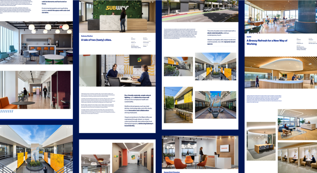
Beyond the portfolio page, individual case study pages were another key pain point for the HLW team. The existing site’s case study template was rigid, making it difficult to tailor pages to unique project content. Prioritizing flexibility, we made sure that the template’s structure, module options, and text styling gave the HLW team freedom to thoughtfully curate case studies. Prominent image treatments and minimalist typography give HLW’s design prowess pride of place and direct attention to the details. Together, their new listing and case study pages make for a clean user experience and let their expertise shine.
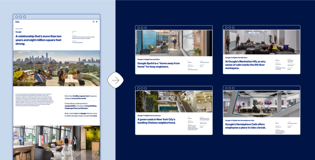
HLW’s impressive repeat client list is a testament to their reliability and sector-specific expertise. To make the strongest possible impression on prospective clients, it was essential that HLW be able to present a portfolio of projects for big-name clients in lieu of individual case studies. Radish developed a flexible collections feature to enable HLW to group projects beyond standard taxonomies like sectors or services. This allows HLW to showcase curated collections of projects based on taxonomies like client, industry, personnel, topic, and more. Collection pages offer users a more personalized way to view HLW’s work, making it easier to find the projects that match their needs.
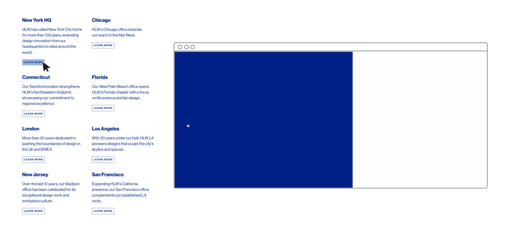
As a global firm with offices and clients spanning continents, HLW needed to make it easy for prospective clients to find geographically relevant information. By giving each location its own dedicated page, rather than a tab with a hashtag in the URL, we improved local search result power and shareability. This approach not only enhances SEO but also highlights HLW's global presence and capabilities in each unique market.
HLW’s architects, interior designers, and environmental designers create physical experiences. The way people interact with their work informs every decision they make – from lighting selection to window and furniture placement to the flow of a space. To mirror this part of their work in a digital space, Radish leveraged interactions and animations that pull the user into the experience and set the flow: from deliberately paced content load-in animations to subtle background color shifts as users scroll, to high-impact moments like the homepage load-in (an ode to the signature HLW bevel).
In the same way that designers prioritize certain areas of a new building for impact, the HLW team identified a handful of moments where they especially wanted to leverage interaction design to maximize impact. One was their History page. Though undeniably contemporary (they work with cutting-edge clients like Google, after all) HLW has been around for nearly 140 years. Balancing legacy and longevity was key in developing a content strategy to tell their story. We showcased HLW’s history in a sharp, distinctly modern interactive timeline: an essential storytelling feature that establishes HLW as a leader in the past and future alike.