MenCare

A Bold Rebrand

MenCare: Embracing a bold accessible new brand with a global footprint

MenCare is a global campaign promoting equitable caregiving and healthy gender dynamics. Continuing our long-term relationship, Equimundo reached out to Radish Lab to rebrand MenCare and revamp their website. The existing branding, especially in its digital existence on the MenCare website, did not capture the dynamism of  MenCare’s work and mission. Going into the rebranding process, the MenCare team hoped to invigorate their visual presence while paying special attention to how the new branding would coexist with both Equimundo and their partner Sonke’s brands.  Creating a visual throughline between the brands was a priority.

Both MenCare and Radish Lab centered the end users of MenCare’s work, keeping accessibility top of mind. Ensuring that digital manifestations of the brand would meet  WCAG AA compliance standards, we aimed to create an experience that would engage all users. MenCare’s global footprint also called for close attention to culturally significant color combinations and representation within photography. With client pain points and goals in mind, Radish set out to build a flexible, accessible, digital-first brand that better highlights the power of MenCare’s work.

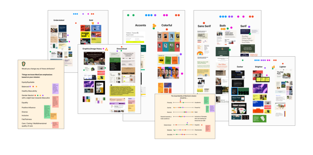
The Process: Global Organization, Global Stakeholders

Because MenCare is not a standalone organization, uplifting the voices of both Equimuno’s and Sonke’s stakeholders throughout the rebranding process was key to ensuring that the new brand would fit seamlessly into the parent organization ecosystem.  The project team was distributed across three continents and at least five time zones, making clear communication and a highly streamlined process essential for successful collaboration. Radish ran virtual workshops with key stakeholder groups in order to efficiently capture a wide range of perspectives. We also recorded each session so that scheduling would not become a roadblock. By utilizing digital collaborative tools like Figma comments and FigJams, we were able to embrace the team’s global distribution and the different perspectives each stakeholder brought to the table.

It’s always a joy to work with Radish on brand and web strategy projects. Their enthusiasm and commitment to our mission shines through in the final product. We couldn’t be happier with our new site!

MenCare

Embracing Vibrant Color

Through the workshops, Radish aligned with the client stakeholder team around what MenCare is and how it should be represented visually. We discovered the nuance inherent in their work and explored how descriptors like “gender neutral” might translate into a visual system that is both broadly inclusive of all caregivers and particularly mindful of their target audience: those who identify as men or fathers. Balance rose to the top of the list as a guiding principle of the visual brand – balance between boldness representing the power of MenCare’s work, and gentleness representing the care at the core of their mission.

The palette embraces color. Deep purples, blues, and greens join forces with  bright tints that create opportunities for bold contrast and subtle tonal layering. The primary palette is neither overtly feminine nor masculine – reflecting equitable caregiving and appealing to a broad audience – while pops of yellow and orange serve as direct visual ties to Equimundo and Sonke’s brands. Dark, bright, and light values represent the many facets of care, while contrast combinations of different colors aim to unite balance and boldness.  

As with all Radish projects, we prioritize accessible-first design. We created a new palette that is WCAG AA compliant, ensuring that color combinations used in digital spaces meet accessibility requirements, and clearly documented how colors should be used in other, client-produced assets.

MenCare uses
Tablet Gothic Wide

Lorem ipsum dolor sit amet, consectetur adipiscing elit, sed do eiusmod tempor incididunt ut labore et dolore magna aliqua. Ut enim ad minim veniam, quis nostrud exercitation ullamco laboris nisi ut aliquip ex ea commodo consequat.

A Healthy Dose of Whimsy

Equitable caregiving is central to MenCare’s work, and we wanted to make sure that the new brand had an element of play to represent the childhood at the center of caregiving.

Inspired by the transformative medium of sidewalk chalk – which gives the artist the power of revision, that aims not to fully erase the past but to build  upon it and create something new and improved – we incorporated small gestural elements. The end result balances  playful elements with a human touch and with a bold, powerful color and typography system.

Clear Communication: Logo That Must Play Well With Others

The MenCare team wanted a clean, clear, and flexible logo that would also play well with other logos – particularly those of their parent organizations, but also those of the range of partners that collaborate with MenCare. Making sure the new logo could adapt to different contexts and scales, fitting comfortably into logo grids, was a metric for success.  

The final outcome takes inspiration from both of MenCare’s parent brands, incorporating Equimundo’s logo typeface and nodding to the fluid curves in Sonke’s mark. A bold font places visual emphasis on care, while a strong typeface with soft edges reflects the balance inherent in healthy masculinity.

Part of a Sustainable Ecosystem

Knowing sustainability and usability of the brand were key goals from the client side, Radish created a lean design system informed by the parent brands. As Equimundo’s team was responsible for the production of most MenCare assets, the new brand maintained their primary font, Tablet Gothic, ensuring consistency across brand assets. We wanted the new brand to be exciting and easy for a small team to implement – not an obstacle to production.

A bold sans serif font that works at both large and small scales was a perfect pairing with the bold palette. Taking a digital-first approach, the system strikes a balance between confident, impactful headlines and clear, concise body text.   On MenCare’s previous website, large blocks of body text didn’t allow  users to skim, navigate horizontally, or digest the layers of information present on each page. In our application of MenCare’s new brand to their  website, we prioritized a type system that allowed for improved information hierarchy and clear, engaging communication.

Launching New and Improved

Conversations about the wider Equimundo ecosystem happened in tandem with this work, (check out that case study here), so a full website overhaul was not in the cards. However, the MenCare team still wanted to make sure their website reflected their new and improved brand. Collaborating with the MenCare team to determine what pages and content types were top priorities, Radish rebuilt key pages of the website using a modular approach in our Wordpress CMS. This allowed MenCare to launch the new brand with select key pages complete, accessibility concerns addressed, and the building blocks to gradually update the rest of the website on a schedule that works for them.

up next

Ending pandemics through strategic partnerships

(RED)
Designing to fight the world’s biggest health emergencies