(RED)

Ending pandemics through strategic partnerships

Designing to fight the world’s biggest health emergencies.

(RED) partners with the world’s biggest brands to create products and experiences that work to end pandemics, including: HIV/AIDS, Tuberculosis, and Malaria. The money raised by (RED)’s partners and campaigns goes directly to the Global Fund, one of the world’s largest funders for global health.

(RED) came to Radish Lab seeking a creative partner that would help them get their new Squarespace website across the finish line. Building on their existing work, they needed a hand fine-tuning their site to create a platform that would be functional and adaptable.

Our monthly search meetings with Radish allow us to take a step back, think big picture and move beyond what’s up, what’s down to focus on true goals and objectives.
 , 
(RED)

Building a visual identity that stands apart.

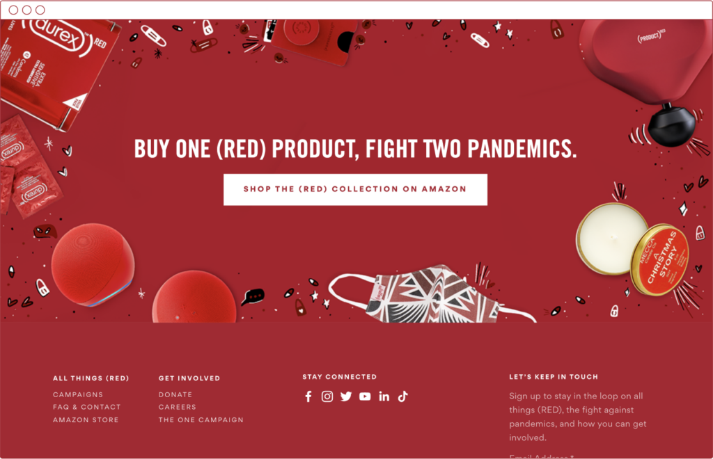
Honing in on a human-centered, impact-focused content strategy and design, we supported (RED) in building a website that illustrates who they are outside of their partnerships. We leveraged their strong foundation of assets and bright, crisp imagery to tell their story to consumers and encourage users to join (RED) in the fight against global health emergencies.
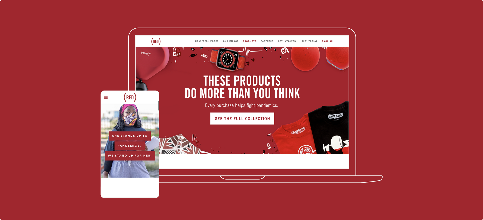

Stylistically, we customized the Squarespace base to make (RED)’s website feel unique and tailored to their needs — while also maintaining ease of content updating. We helped them achieve their vision of a consistent and straightforward design by standardizing style across items like headlines, body content, and buttons.

Along the pathway to launch, we also provided maintenance to their previous WordPress website and helped the (RED) team navigate setting up a new donation platform.

Creating a fun, engaging festival experience.

We have also had the opportunity to collaborate on exciting new projects, as part of our ongoing collaboration. (RED) asked us to create a microsite experience for their first all-digital summer festival SUMMER REDISCOVE(RED) in three months.

Through a series of rapid discovery workshops, we collaborated with (RED)’s creative team – directors and designers – to develop the user experience and interface. We developed subtle interactions and leveraged relationships among content types to make the experience feel engaging and fun. We also created a modular design that was easy for the (RED) team to edit and update on the fly, to accommodate last minute changes.

Cultivating a long-term collaboration.

Ultimately, we not only successfully redesigned red.org and created summer.red.org, but we have also developed a strong, sustainable creative partnership. We have continued to support (RED)’s search engine optimization (SEO) strategy, through which we support the organization to track and use their data to drive conversions and meet (RED)’s organizational goals.

up next

Pairing creativity with restraint to elevate educational expertise.

Research for Action