Scratch

Designing the Web for the Future of the Web

Streamlining a sprawling digital presence

Scratch, one of the world’s leading coding education platforms for kids, enlisted Radish Lab to overhaul their digital brand presence. Scratch has undergone exceptional growth during their lifetime – evolving from a graduate student project at MIT to a globally recognized brand in children’s education. But outside of the product, their digital presence  developed in isolated microsites, lacking a central spot where users can access resources, answer questions, and make donations. Radish worked with the Scratch team to consolidate their brand presence into one cohesive experience that better serves current and prospective Scratch users.

Embracing the fun, creative energy at the heart of Scratch’s product and mission, Radish created an accessible website that uses bright colors, lighthearted illustrations, and simplified information architecture to create an experience that bursts to life for the millions of children, parents, and educators who use Scratch every day, all around the world.

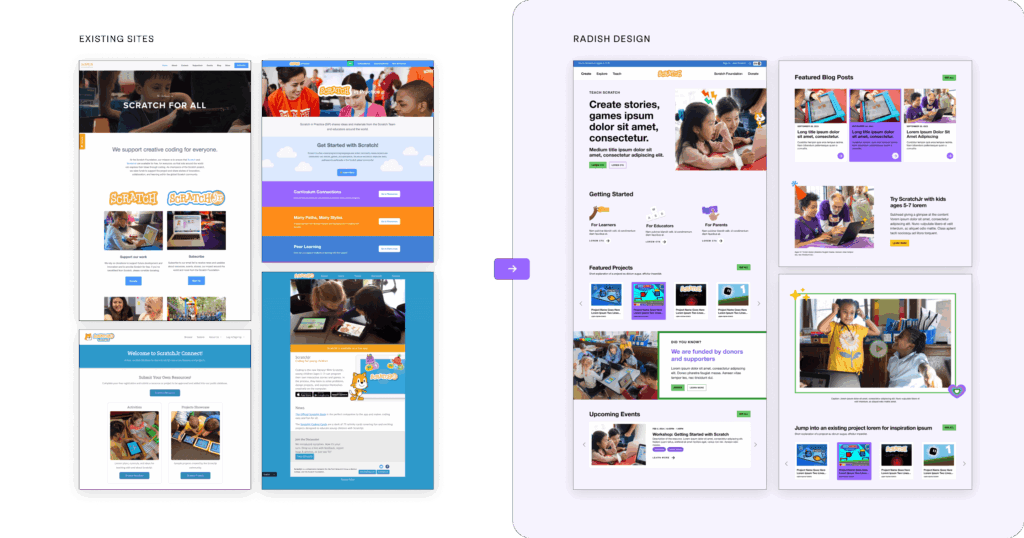
Merging Multiple Experiences for Different Audiences

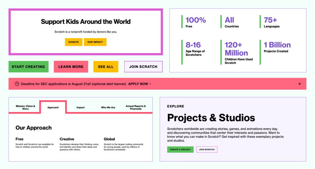
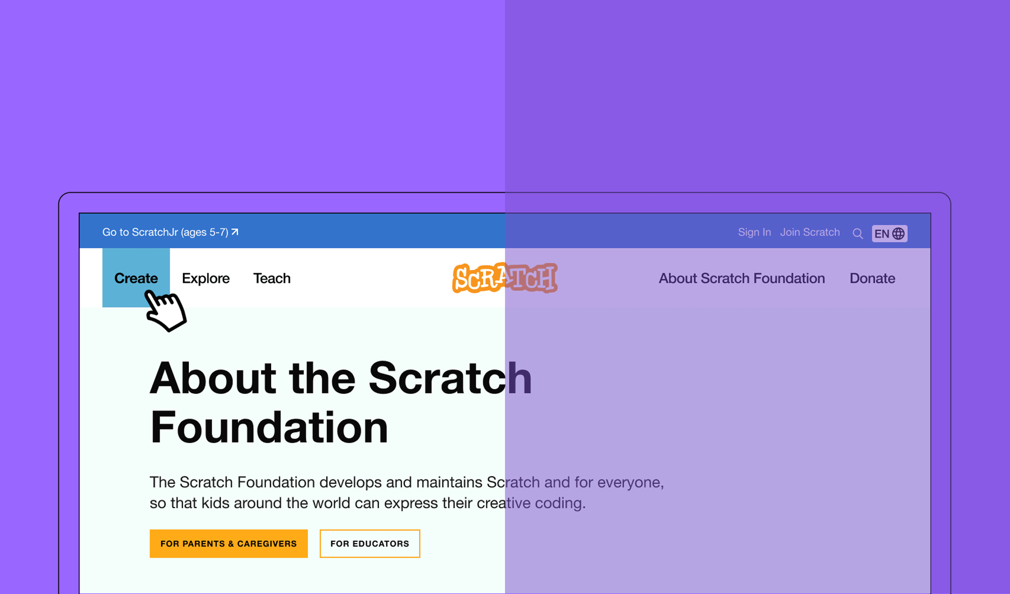
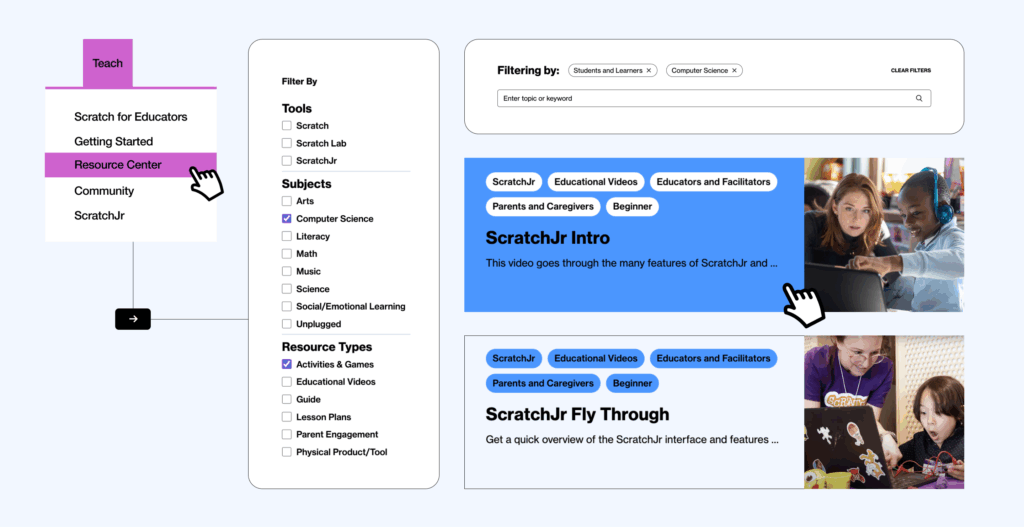
Defining Scratch’s brand ecosystem has been a challenge as the organization has grown. They are a software company, but also a 501(c)3. They primarily provide resources to parents and educators, but their biggest user demographic is children under the age of 15. These complexities meant that Scratch’s brand comprised five siloed divisions – and five separate websites – rather than a symbiotic brand ecosystem. Scratch’s primary goal in working  with Radish Lab was to unite those separate experiences in a way that harmonized with Scratch’s organizational structure and made intuitive sense for the structure of Scratch as an organization, as well as for their key audiences.  

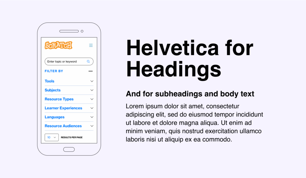
In conversations with the Scratch team during the the strategy and user experience phases of the project, Radish teased out insights into the needs of each unique audience and user type in order to fully understand the implications of the merger. With a firm grasp on each audiences’ needs, we designed a new information architecture that is equally optimized for providing resources for educators and parents, encouraging users to learn about and contribute to the foundation, and ensuring kids have inviting entry points into the tools themselves.

An Experience for Educators and Users

The new site navigation caters to users of the Scratch web tool (learners ages 8+, educators, parents, and caregivers), the ScratchJr downloadable app (parents and caregivers of 5-7 year olds, and educators), and those looking to engage with the Foundation’s work as partners, donors, and grantees. To help these unique audiences find what they need quickly and intuitively, we implemented a split navigation system.  

One side offers direct access to resources, guides, lesson plans, and more for anyone interacting directly with the Scratch tool. The other side is dedicated to those interested in the Foundation's mission, projects, and impact. Mindful of ScratchJr's unique audience, the Radish Lab team created its own top navigation link within the utility navigation, allowing users to easily switch between ScratchJr and other sections of the site.

A Resource Hub for All Educators

The Educator Resource Center is a newly launched section that consolidates previously scattered resources from various sites, Google Drives, and other platforms into one centralized location. Educators can now easily filter resources by tags like Age/Grade, Learner Topic, and Learner Experience to find exactly what they need. This feature is designed to be accessible to experienced educators, new teachers, and parents alike who may not be familiar with educational terminology.  Since many Scratch educators have little to no teaching experience, we also built a landing page offering a comprehensive starting point for educators, wherever they’re at. As an added bonus, gathering dispersed resources into one place improved SEO for Scratch and their incredible database of informative content.

Color Systems and Sparkles

Conversations with the Scratch team during our discovery and user experience phases – focused on defining Scratch’s distinct audiences and considering how to ensure a seamless experience for each one –  shaped creative direction and user interface decision-making. Scratch’s existing brand color palette was robust, but was not leveraged in any of the existing websites. Segmenting the colors into three buckets representing Scratch Jr, Scratch, and the Foundation, the Radish Lab design team created a visual system that assigned specific colors to each audience.

Scratch’s website is unique in that the primary users of the site (educators and parents) are not the primary product users (kids learning to code). So, the brand and overall experience needed to be both tailored to adults’ needs and definitively child-friendly. The educators and parents using the scratch.org site primarily are not the product users, but the brand and overall experience needed to be child friendly. The Radish Lab team sprinkled small illustration moments – inspired by the Scratch and Scratch Jr products – throughout the experience to add a touch of fun and whimsy to a clean and clear website design. With each of Scratch’s  three main audiences in mind, we thoughtfully curated the illustrations to be age-appropriate for the Scratch Jr, Scratch, and Foundation sections of the experience.

Accessibility First

With an extensive global footprint, Scratch serves audiences and users with differing levels of technology access and bandwidth quality, so it was important for Radish to pay close attention to accessibility across multiple factors.

Because many Scratch users access the site on a mobile device – often in areas with limited bandwidth – we needed to optimize responsiveness and load time. All Radish Lab websites are built to be fully responsive across five breakpoints, but for Scratch, we paid special attention to how high-touch sections of the experience translated to smaller screens, consolidating dense content areas to reduce scroll and load time and ensuring that no information was buried. We also avoided animations, heavy image uploads, and native-hosted videos to guarantee speedy load times across the globe.

Visually, following the Radish standard of accessible-first design practices, we ensured the application of Scratch’s brand was consistently WCAG AA compliant.

Complexities of Static Hosting

Scratch has a big digital footprint, with over 100,000+ people using their coding software per second. You read that right! With traffic like this coming and going, the usual hosting plans were insufficient to meet this demand. We worked closely with the Scratch engineering team to create an innovative solution, meeting every week and sharing working sessions to solve problems together. 


We opted for a fully static approach, tapping Amazon’s S3 scalability and Fastly’s ability to efficiently manage requests between the website and the Scratch tool itself. Ultimately we implemented a static site generator that met the site’s traffic and hosting requirements while giving users an excellent experience as they move from the website to the tool and back again.


Check out the new Scratch experience

up next

Ending pandemics through strategic partnerships

(RED)
Designing to fight the world’s biggest health emergencies