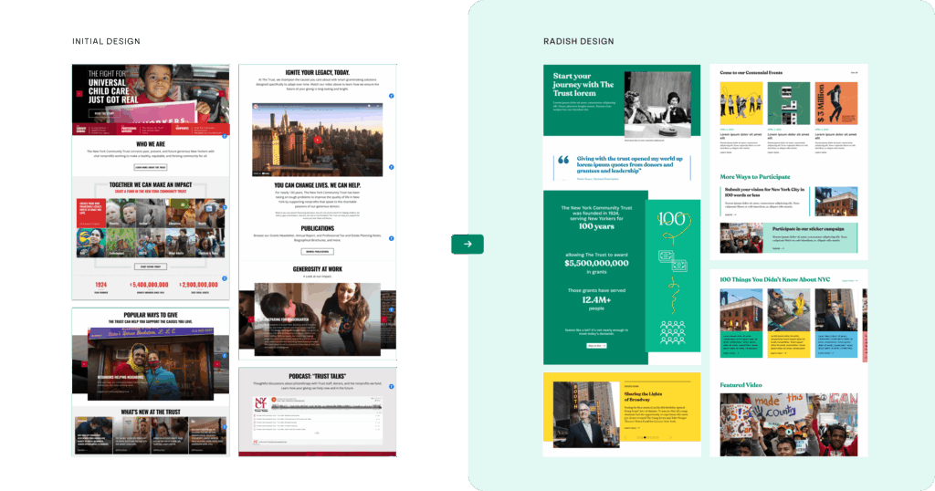
The New York Community Trust is a pillar of the New York philanthropic community, providing grants to organizations that improve quality of life for all New Yorkers across New York City, Westchester, and Long Island. This year they are celebrating their 100th year serving the people of New York, and with a new brand ready to go, they brought Radish Lab in to overhaul their digital presence to showcase their incredible legacy.
In the midst of this momentous milestone, Radish Lab partnered with The Trust to put their story and their users first. With improved navigation, clear audiences and user journeys, and a shiny new brand, we merged three separate experiences into one cohesive website that celebrates the scale of their impact, represents the reach of their programming, and tells the story of who The New York Community Trust is to a new generation of donors.
The New York Community Trust (NYCT) serves diverse audiences, including potential donors with no knowledge of how trusts work, experienced financial advisors, and nonprofits seeking funding. Each group plays a crucial role in NYCT's mission but has distinctly different needs and calls to action.
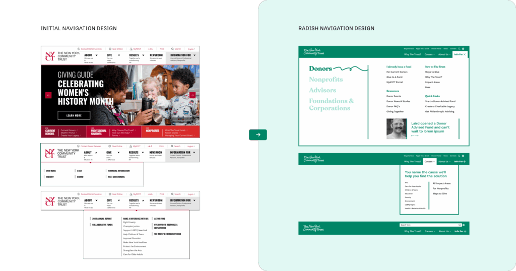
The existing site attempted to cover every audience within a layered navigation system, but rather than ensuring all users were prioritized, it made for a universally confusing experience. For the new site, Radish helped NYCT prioritize four key audiences within their work, enabling each audience to efficiently find relevant information.
The new site leverages a full-screen takeover mega menu to elaborate the offerings within each audience segment. This approach to the navigation allows key high-level pages to be fully accessible at all times while making space for further guidance within the mega menu, showcasing key pages and resources for audience-specific exploration. Radish also clarified the language in the menu, changing “results” to “cause areas” to speak directly to prospective donors.
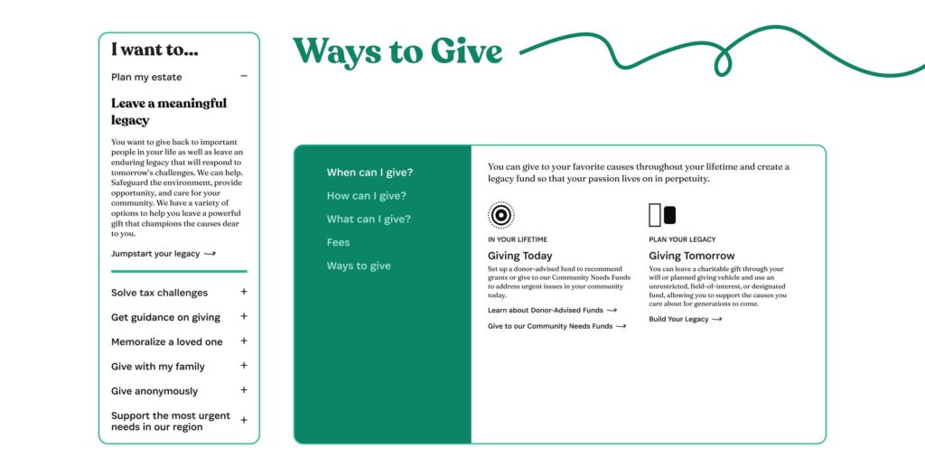
Seeking to engage a wider, more diverse audience, The Trust needed to drop the complex and daunting financial terminology in their user-facing messaging and embrace user-centric language.
Radish helped The Trust transform the "Ways to Give" page to make it more relatable and engaging, shifting away from financial jargon and focusing on the personal experience of giving. Rather than ‘start a field of interest fund’, we recommended ‘support specific causes’. ‘Start an unrestricted fund’, became ‘support NYC, Long Island, or Westchester.’ Working out these strategic updates in our content strategy process allowed us to fully optimize the new site for SEO and ensure that the language shift made an impact on users looking to get started with NYCT.
The New York Community Trust serves several communities in New York State, and previously their work was separated by region despite often having a lot of overlap. Radish took their separate New York City, Westchester and Long Island sites and merged them into one cohesive experience. Consolidating the sites improved horizontal navigation, eliminated redundant information, and made The Trust’s online presence easier to manage. At the same time, the improved information architecture and audience segmentation allow The Trust to spotlight each of its branches, ensuring that users in Long Island and Westchester could engage with the site and easily find local information and opportunities.
The Trust team faced a unique challenge in telling the story of their impact. Unlike an individual organization with single direct action, The Trust is a funding body supporting numerous projects. To succinctly communicate a complex impact narrative, we created an animated ‘Why the Trust’ page to break down the meaning of a ‘trust’ and demonstrate how the Trust supports organizations that, in turn, support people.
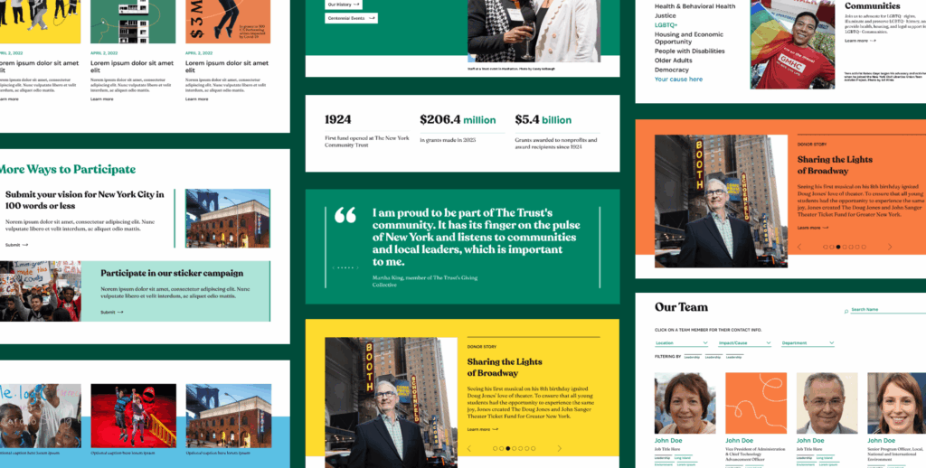
To highlight the monumental impact of the people and nonprofits at the core of the New York Community Trust’s work, we prioritized horizontal navigation throughout the site that connects users to real world stories. Putting faces to the funds, the site encourages donations by showcasing the human impact of The Trust’s work.
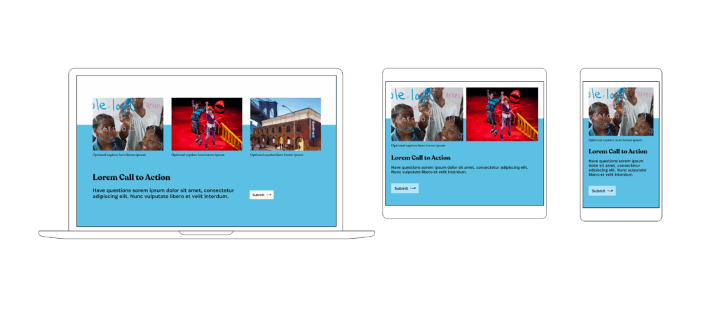
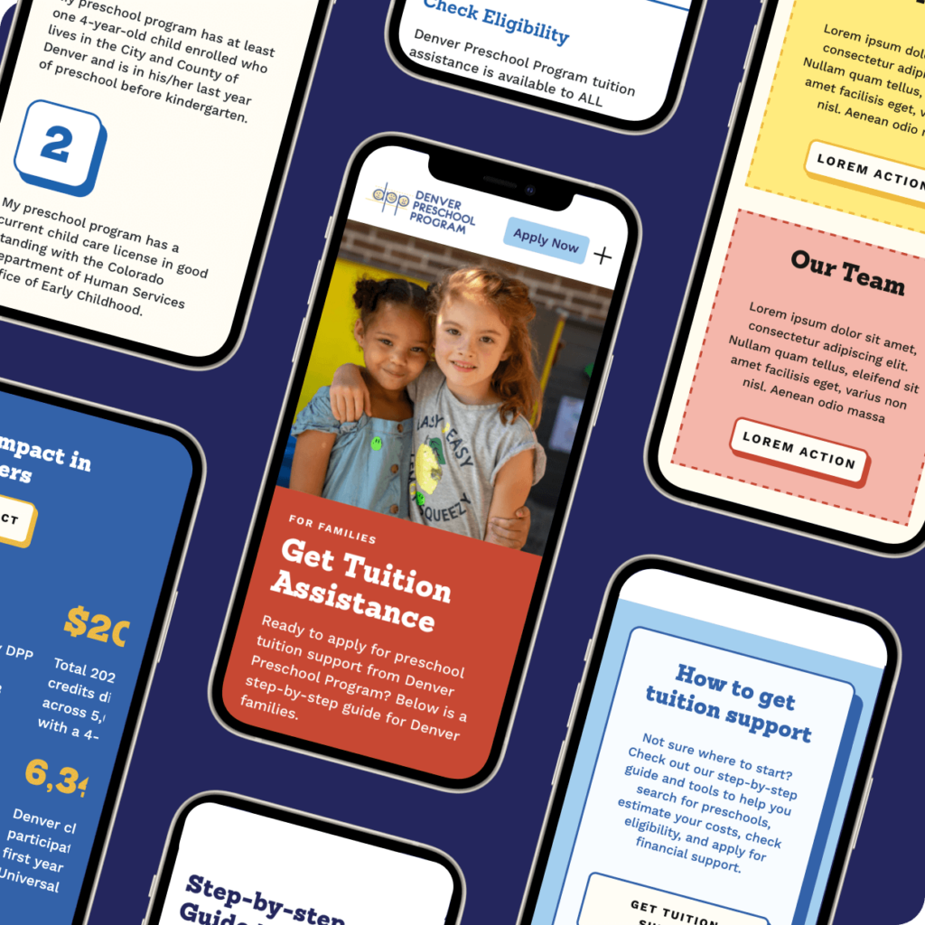
As with all Radish Lab websites, we designed the new New York Community Trust site to be thoughtfully responsive across multiple breakpoints, prioritizing mobile to ensure users on the go have a great experience. For NYCT, the main challenge when designing for mobile was ensuring that the content-rich sections of their desktop site were nested in tabs, carousels, or accordions that did not hide important information and encouraged users to explore.
One of the most frequent pain points our clients have when beginning their new website process is that their existing site is incredibly challenging to manage, update, or grow. The New York Community Trust had this three times over with their separate location websites. To avoid this problem, Radish Lab approaches all of our web projects with the end users in mind from day one, resulting in flexible sites that stand the test of time.
Starting in wireframes, we took a modular approach to building the NYCT experience, prioritizing building blocks that are easy to use and rearrange and cover all content types. This enabled both the Radish team and the NYCT stakeholders to visualize the enormous number of pages on The Trust’s robust site without starting each page from square one. Our process carries that same modular approach through from wireframes to user interface to the CMS, making rearranging, editing, and building new pages quick and easy.
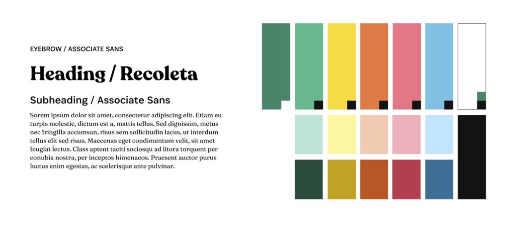
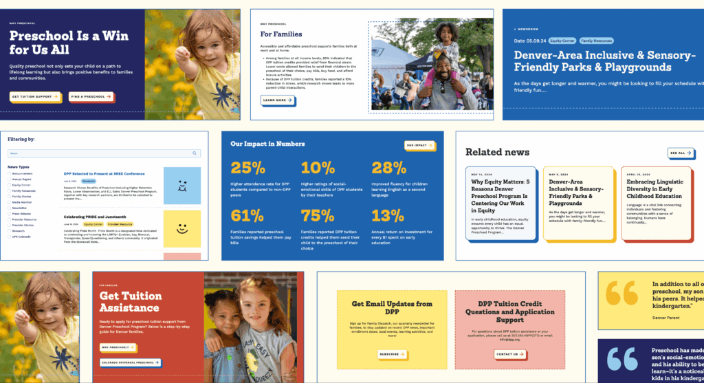
The New York Community Trust had just completed a rebrand prior to kicking off their website overhaul with Radish, so the Radish Lab team had the opportunity to apply a fresh identity to The Trust’s biggest brand moment. Starting on the website project so soon after the rebrand meant that stakeholders had a clear vision of how they hoped their brand would (and would not) be applied. Thoughtfully leveraging their broad color palette, incorporating photography, and devising dynamic storytelling were top of mind for the Radish design team.
As funders for programs in the disability community, The New York Community Trust took a strong interest in accessibility compliance. Radish developed a clear set of rules for utilizing their new brand that always ensures WCAG AA compliance and often reaches AAA standards.
Check out the live site here to see the brand in action.