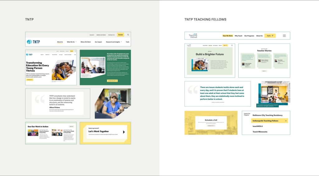
TNTP + TNTP Teaching fellows

Creating A Dynamic Experience for Two

A Dynamic Experience Putting Education Front and Center

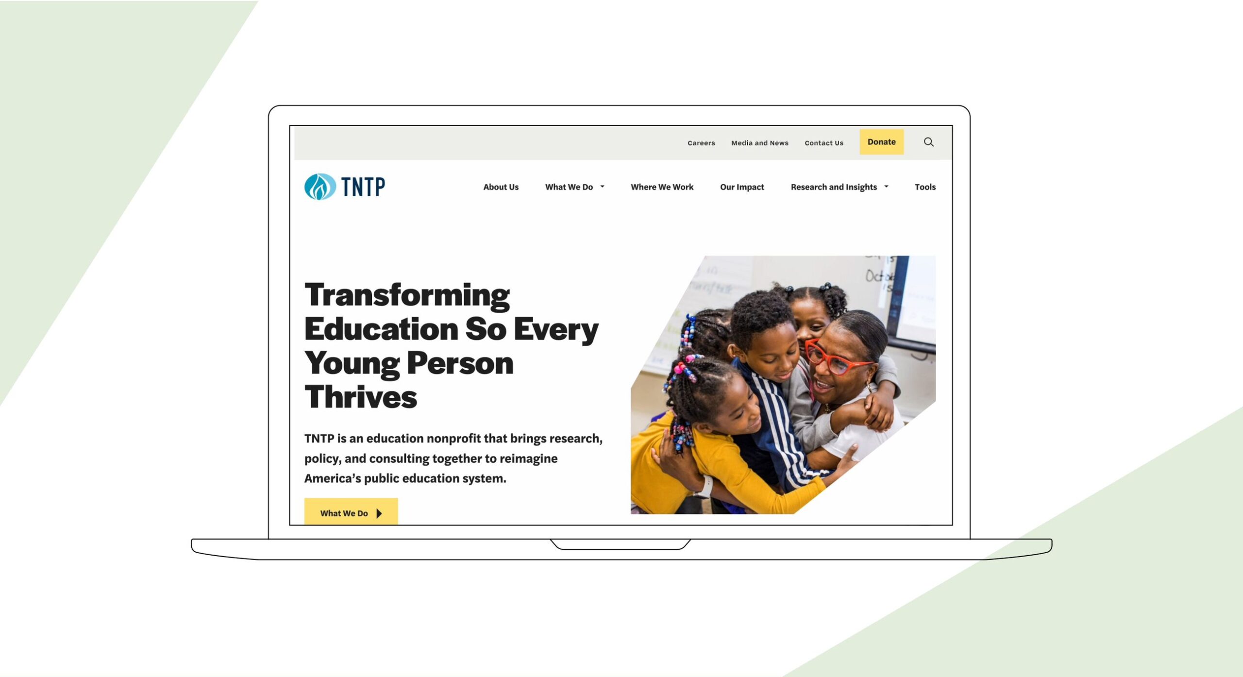
TNTP is the leading national organization advancing equity in education through a strategic combination of on-the-ground work in schools and communities, original research, and public advocacy. They worked with Radish to build two new websites – one for their main nonprofit, and another for TNTP Teaching Fellows, a program that offers recent graduates a faster, more affordable path to a teaching certification – all in tandem with a comprehensive brand overhaul. From the outset, the goal of the project was to rethink how TNTP’s digital presence could be more thoughtfully tied to their mission and values, while also improving the overall user experience across both sites.

Prioritizing Clear User Journeys

The new TNTP experience needed to solve pain points for a large number of audiences, each with very different goals, interests, and modes of engaging with TNTP content. During the Discovery and Strategy phases of the process, Radish identified the eight key audiences that TNTP engages with the most often, ranging from high-level users such as School System Leaders and Community-Based Organizations, Policymakers, and major funders to individual students, education professionals, aspiring teachers, and talent seeking a career at TNTP.  

We crafted clear user journeys tailored to each audience, ensuring intuitive experiences across the board. The first part of the journey directs users to TNTP’s core services, such as Research, Policy & Advocacy, and Community Engagement & Coalition Building. We designed each service page to be easy to understand, regardless of the user’s prior knowledge. The result is an experience that  guides users effortlessly to the information they need, whether they are looking for resources or to engage TNTP for their services.
Hubs for Resources and Regions

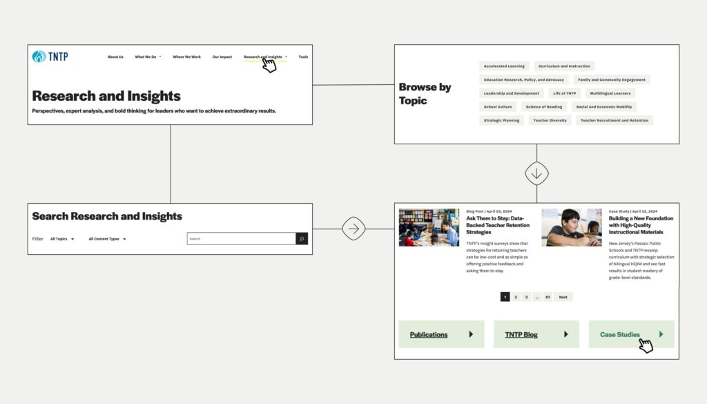
TNTP offers a robust collection of content  ranging from blogs to case studies to research publications. A key goal of the new TNTP website was to make all of the individual content verticals more accessible, searchable, and usable. To that end, Radish developed an extensive taxonomy set to make it easy for users to find related content across each vertical. The final product is a one-stop-shop resource library that showcases featured content and popular topics, as well as a single-source listing page for users to search and filter all of TNTP’s content. 

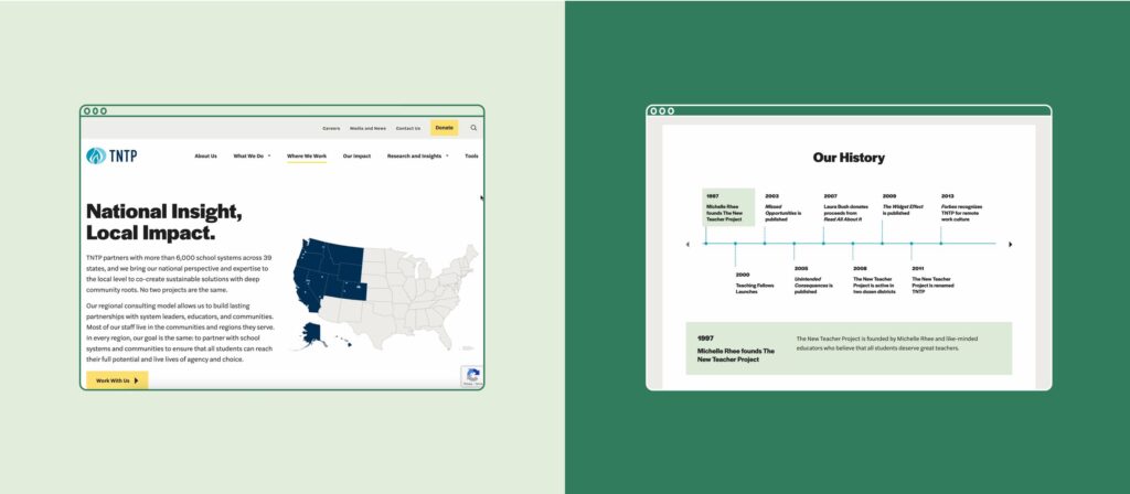
In addition to highlighting their immense collection of resources and content, TNTP needed to solve for the regional nature of their work. With similar logic to the resource library, Radish consolidated all of TNTP’s content for each region into its own page and created an interactive map experience to allow users to explore offerings in all of the regions TNTP serves. Each region showcases content, people, and information specific to that location, ensuring that future students and prospective educators have a personalized introduction to TNTP.

A Dynamic and Modular Approach to Design

From the start of our collaboration with the TNTP team, we knew the final product would be two separate websites. So, Radish was able to think strategically from very early on in the process about how we could apply one brand and one modular system to two distinctive experiences that maintained brand integrity and ease of use for their internal team to update. 

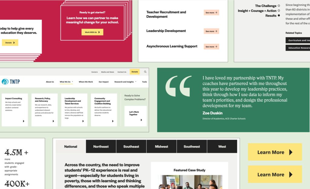
The brand application for the new website incorporated systematic color usage, dynamic shapes, and thoughtful building blocks. The established system of utilizing bold saturated colors in high-impact moments and soft tints in more utilitarian, informational moments helped the Radish design team to quickly identify guardrails and areas of opportunity for modules housing different types of content . On both the TNTP and TNTP Teaching Fellows websites, the result is a palette that guides the user's attention and steers clear of jarring transitions.

The biggest challenge in applying the visual brand to the sites was utilizing the established shape system in a consistent way that would integrate seamlessly into a responsive webpage. This meant designating specific shapes and containers for imagery, text blocks, and calls to action.

Accessibility and Flexibility

In tandem with the web project, Radish was working on a new and improved brand for TNTP and sub-brand for TNTP Teaching Fellows (check out our case study here). Working on both the brand and the web projects simultaneously  allowed TNTP to benefit from a unified process, with one team managing the evolution of their brand and applying it to a digital space. In all of our branding projects, Radish prioritizes accessible-first design, ensuring that brand color combinations are WCAG AA compliant when applied to digital spaces. This approach puts a brand’s biggest deliverable – an organization's website – at the forefront of the process. 

With the brand and subbrand for TNTP and TNTP Teaching Fellows complete, during the User Interface phase of the project, Radish leveraged the flexibility of the brand system in applying it to two distinct experiences. TNTP Teaching Fellows utilizes the same brand fonts, primary color palette, and imagery guidelines as TNTP. But where TNTP utilizes a rich true green, Teaching Fellows leans into a cooler dark teal; where TNTP utilizes more dynamic shapes and graphic layering, TNTP Teaching Fellows restricts their shape use to rectangles and squares – but still incorporates the parent brand’s graphic layering to ensure a tight connection between the two. The result maintains brand integrity and ease of use for their internal teams to use and update.

Easy and Adaptable CMS for Two

At Radish Lab, we understand that managing, updating, and growing your website can be a daunting task. We ensure our web projects are easy to manage and maintain from day one, creating flexible and enduring sites. 

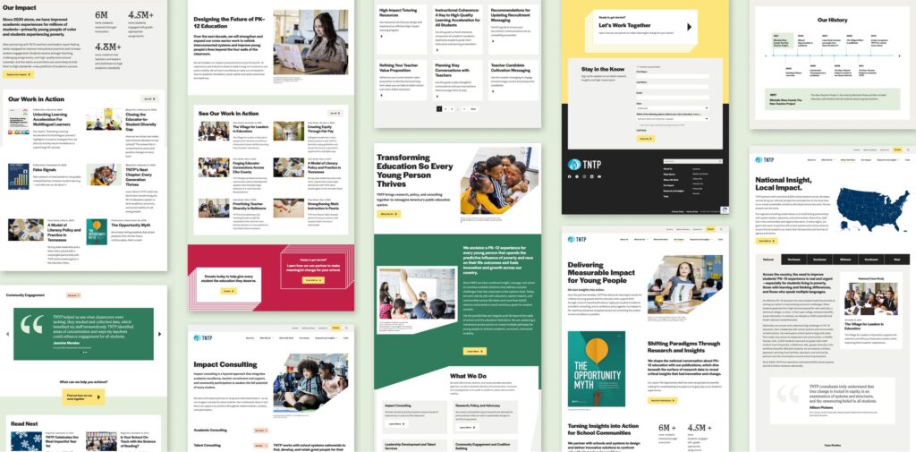
Requiring not one but two standalone experiences – TNTP’s main site and the TNTP Teaching Fellows program site – TNTP brought an even larger-scale challenge to Radish from an ease-of-management perspective. All of Radish’s sites are built to be flexible and modular, using a building-block approach that makes pages easy to add, edit, and adapt to various content types. Both TNTP sites utilize the same modular library and easy-to-use Wordpress CMS. By creating the two sites in tandem and applying our modular-first approach, both the Radish team and TNTP and Teaching Fellows stakeholders were able to visualize a vast number of pages across their sites – and see the flexibility the system will give them as their needs grow. 

Check out TNTP’s Brand In Action Here 
Check out TNTP Teaching Fellows Sub-Brand Here

up next

Ending pandemics through strategic partnerships

(RED)
Designing to fight the world’s biggest health emergencies