Streamlined Website Structure
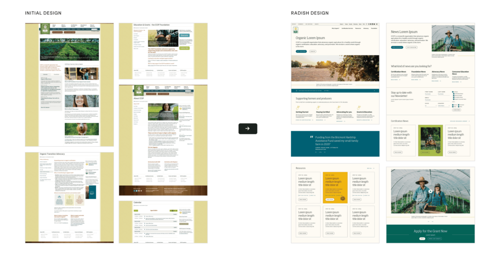
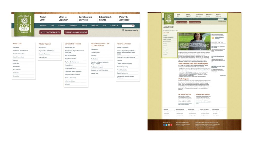
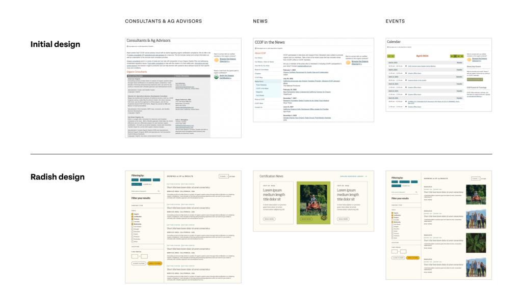
The existing CCOF site was a sprawling experience (our data discovery pull indicated at least 11,400 pages within their site) with many pages containing nested navigation – making it difficult for users to find what they were looking for. The biggest challenge for Radish during the strategy and user experience phases was to distill from their enormous site what was essential, what could be removed, and what could be consolidated to streamline the user experience.
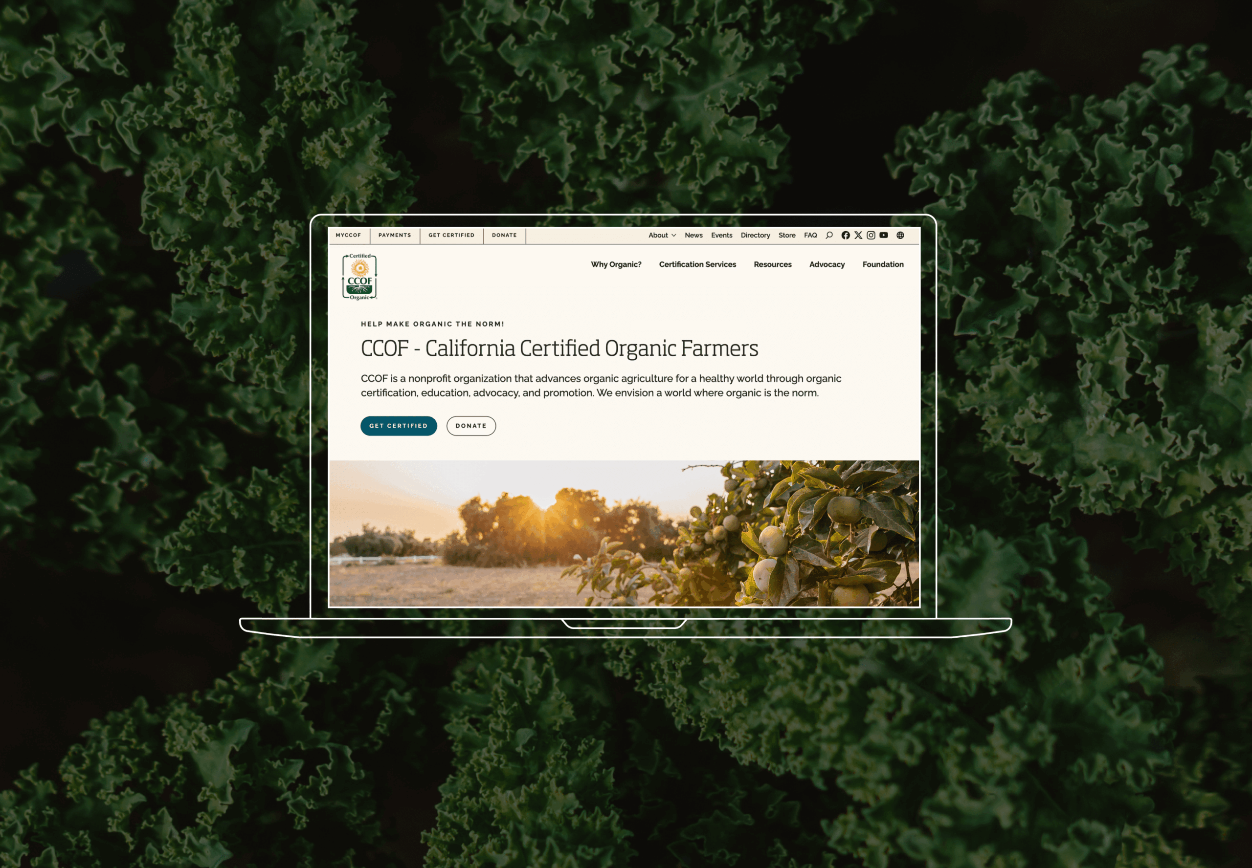
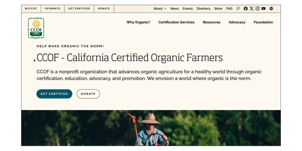
The most important area of improvement for CCOF’s new site structure was the navigation. CCOF provides resources to a wide range of audiences – some users need to log into their portal to access important documents, others are looking for basic information on organic farming, others are seeking to get certified. A distinct utility navigation that prioritizes quick links for key audiences helped to make specific resources available to users on a mission, without requiring them to engage with the high-level information housed in the main navigation. Additionally, CCOF comprises three separate entities, each with their own legal and personal requirements.
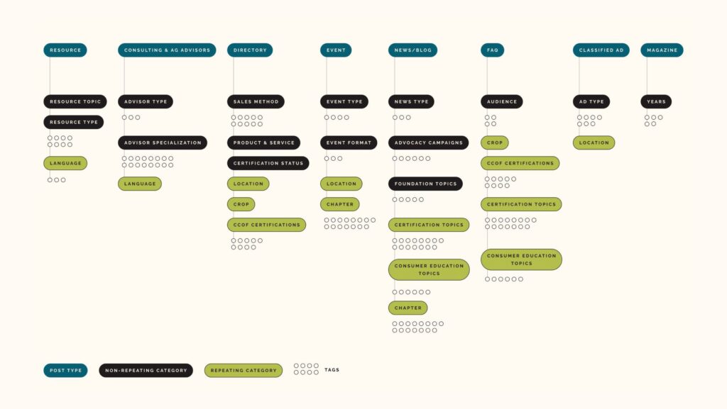
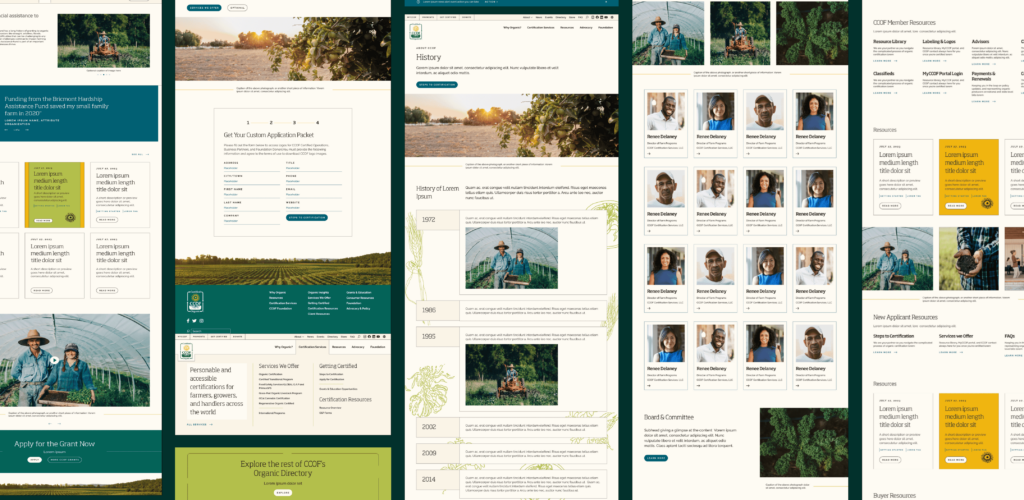
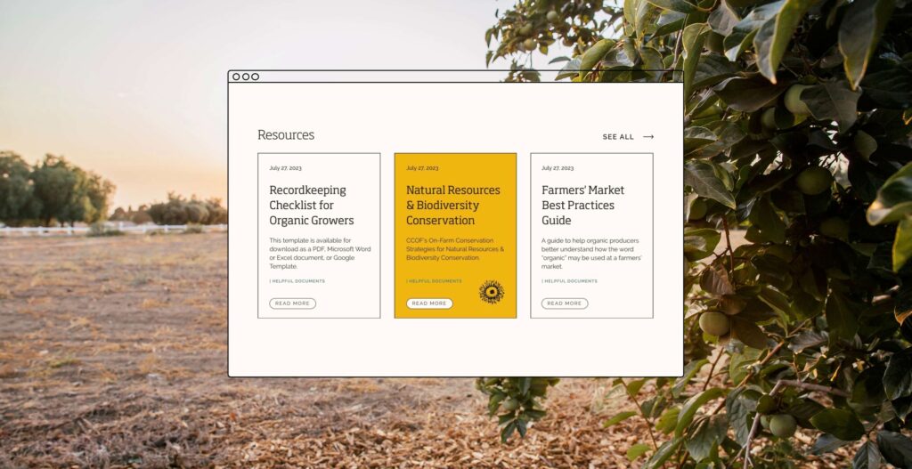
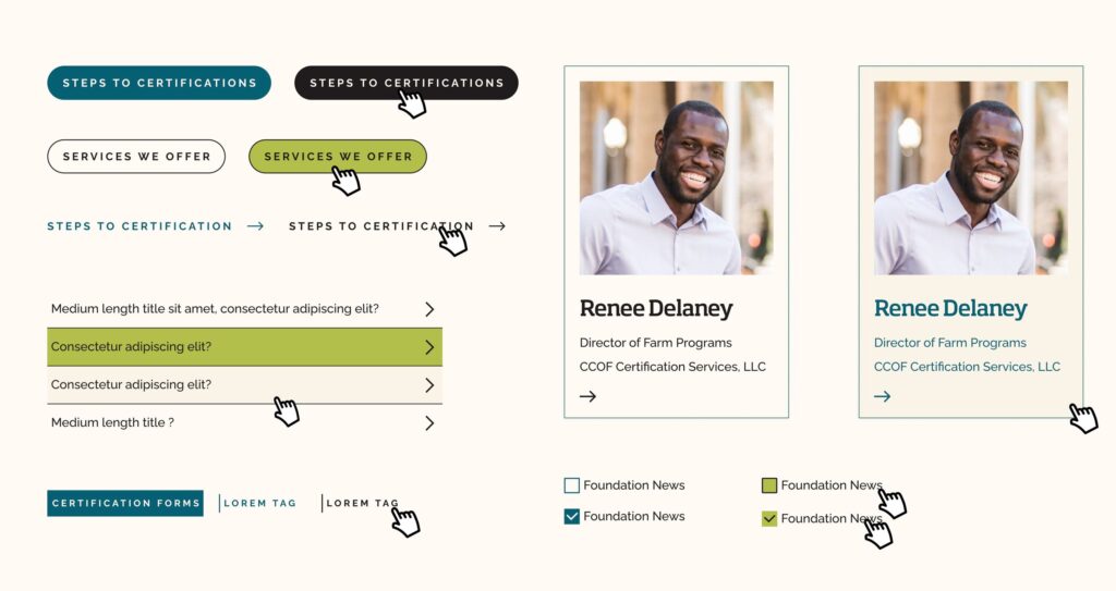
At the end of the UX process, the Radish team had consolidated many one-off pages into organized posts housed in a robust resource library and converted a large quantity of nested tabs into user-focused dropdowns and landing pages, helping users to find what they need with swift searches and few clicks.
